Search Results: scatter markerchar (59)

Data Visualization
Sanjay Matange 1
Layers vs annotation

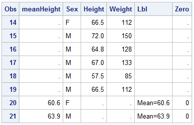
Last week a user asked about BY variable group processing for SGAnnotate with SGPLOT procedure.  The user provided a simple use case for the question (always a good idea) using the sashelp.class data set.  The graph included a display of reference lines for the mean value of height using annotation.  The

Data Visualization
Sanjay Matange 11
Sankey Diagrams

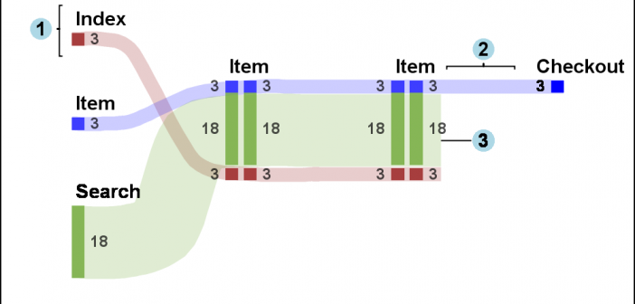
Sankey Diagrams have found increasing favor for visualization of data.  This visualization tool has been around for a long time, traditionally used to visualize the flow of energy, or materials.   . Now to be sure, GTL does have a statement design for a Sankey Diagram which was implemented only in Flex for use

Data Visualization
Sanjay Matange 0
Cancer Deaths Averted

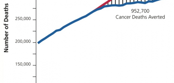
Significant progress in reduction of Cancer mortality is shown in a graph that I noticed recently on the Cancer Network web site.  This graph showed the actual and projected cancer mortality by year for males.  The graph is shown on the right. The graph plots the projected and actual numbers

Data Visualization
Sanjay Matange 4
Custom Labels

Over the Christmas Holidays I saw an graph of agricultural exports to Russia in 2013.  The part that caught my eye was the upper part of the graph, showing the breakdown of the trade with Russia as a horizontal stacked bar with custom labels. The value for each region / country

Data Visualization
Sanjay Matange 0
Fun with Bar Charts

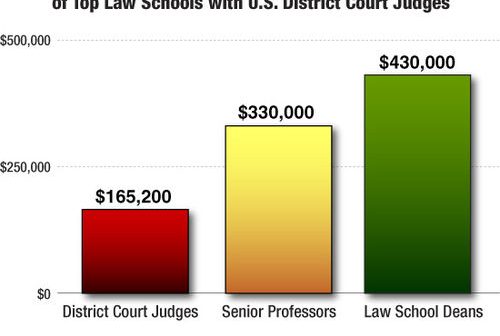
As Sheldon Cooper would say, this is the first episode of "Fun with Charts".  I did not find a cool term like "Vexillology" and "Cartography" is taken by map making, so let us go with "Chartology". Yesterday, I saw a couple of interesting bar charts as shown on the right.  I thought

Data Visualization
Sanjay Matange 1
Epidemic Curve Graph

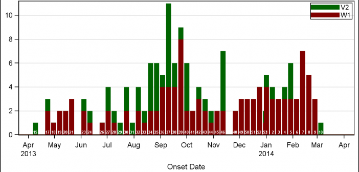
A few weeks back I wrote an article on Grouped Timeline for creating a stacked timeline for onset of different virus.  The idea in that article was to display a stacked needle on a time axis using a HighLow plot. Such graphs are also referred to as EPI or Epidemic Curve

1 2 3 4 6