Search Results: panel (76)

Data Visualization | Programming Tips
Warren F. Kuhfeld 0
Advanced ODS Graphics: Examining and processing templates

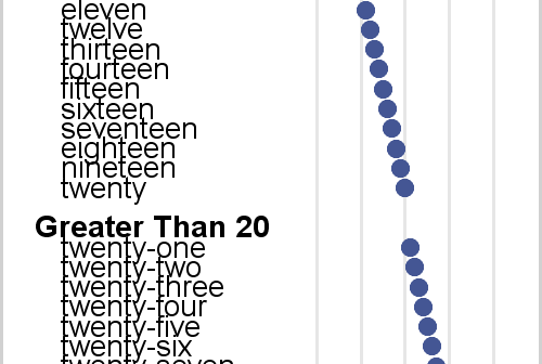
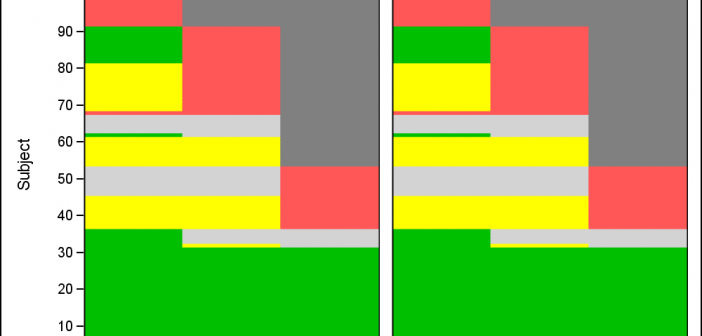
This post shows a variety of techniques including how to use PROC TEMPLATE and the SOURCE statement, PROC SGPLOT with multiple Y-axis tables, create comparable axes in two side-by-side graphs, create a broken axis, write and use a table template that wraps text, and find and display examples of certain statements in graph templates and fonts in style templates.

Data Visualization
Sanjay Matange 6
Scalable Turnip Graph

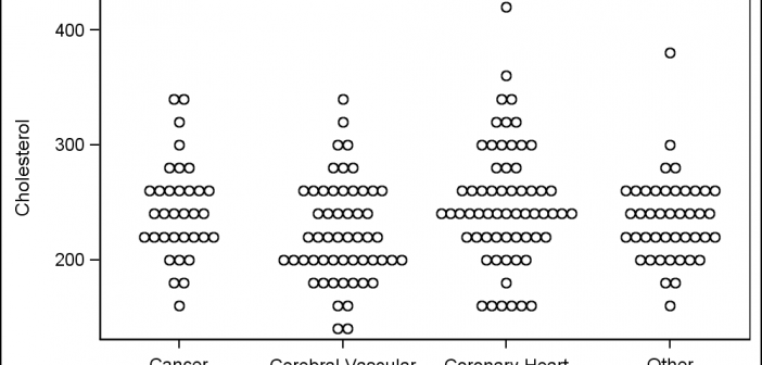
A Turnip Graph displays the distribution of an analysis variable.  The graph displays markers with the same (or close) y coordinate by displaying the markers spread out over the x-axis range in a symmetric pattern.  Recently, a question was posted on the SAS Communities page regarding such a graph. Here is an example of

Data Visualization
Sanjay Matange 2
Coffee Recipes

For a long time, Starbucks represented to me as the good coffee cup, with me paying upwards of $4 for a Latte.  But on a recent visit to San Francisco, my son introduced me to a few other options. Philz crafts a great cup of java, with the barista making

Data Visualization
Sanjay Matange 6
Infographics Bar Chart

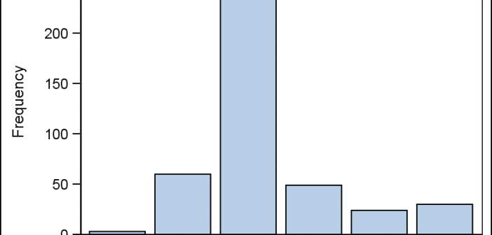
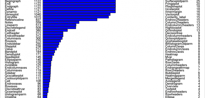
Last week I posted an article on creating Infographics using SAS.   The interest shown by the SAS community in this topic came as a surprise.  Also, it so happened by coincidence, a SAS users also  called into Tech Support just about the same time with a query about creating  Infographics type graph

Data Visualization
Sanjay Matange 4
Infographics using SAS

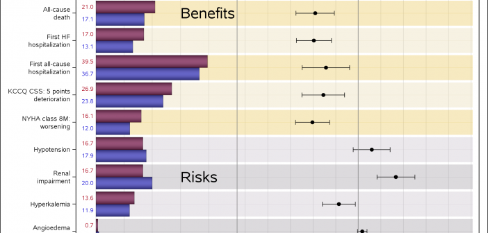
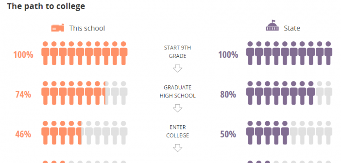
Infographics are all the rage today.  Open any magazine or newspaper and we see data and numbers everywhere.  Often, such information is displayed by adding some graphical information to add context to the data.  A couple of good examples are Communicating numeric information, and Facts about Hot Dogs. Riley Benson, our UX

1 2 3 4 5 6 8