Get the right information, with visual impact, to the people who need it
Simulate proportions for groups

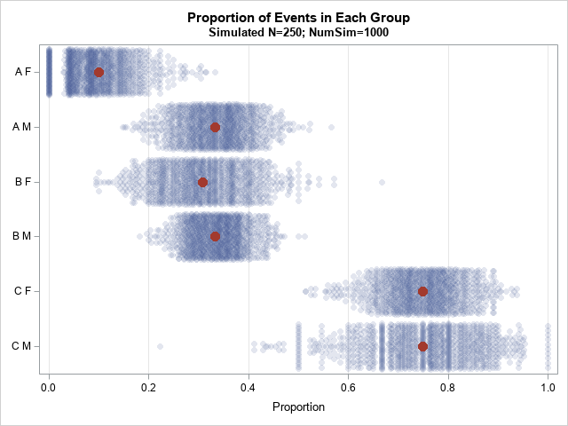
A statistical programmer asked how to simulate event-trials data for groups. The subjects in each group have a different probability of experiencing the event. This article describes one way to simulate this scenario. The simulation is similar to simulating from a mixture distribution. This article also shows three different ways