Data Visualization

Get the right information, with visual impact, to the people who need it
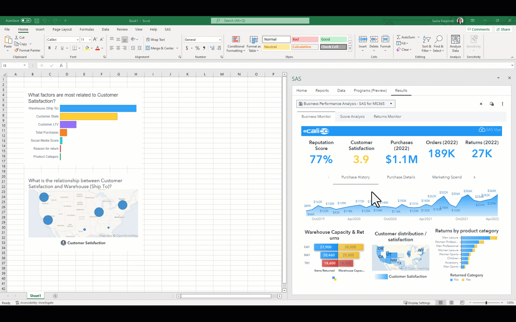
Analytics | Data Visualization | Students & Educators
Markus Grau 0
SAS Analytics Zertifikat für weitere 51 Studenten in der Schweiz

SAS Applied Business Analytics - Im Rahmen ihrer Ausbildung zum Bachelor Wirtschaftsinformatik erhielten dieses Jahr weitere 51 Studenten an der SML der ZHAW (Zürcher Hochschule für Angewandte Wissenschaften) das begehrte Zertifikat SAS Applied Business Analytics. Dieses wird von SAS an Studenten vergeben, welche einen umfassenden Anforderungskatalog an Aufgaben – unter anderem

Data Visualization | Learn SAS | Programming Tips
Sanjay Matange 0
Spark table

In the previous post, I discussed creating a 2D grid of spark lines by Year and Claim Type.  This graph was presented in the SESUG conference held last week on SAS campus in the paper ""Methods for creating Sparklines using SAS" by Rick Andrews.  This grid of sparklines was actually the

Analytics | Data Visualization
Jeanne (Hyunjin) Byun 0
빅데이터, 태양 탐사의 새로운 가능성을 열다

그래비티(2013), 인터스텔라(2014), 마션(2015), 컨택트(2016), 패신저스(2017)까지, 여러분은 이중 몇 편의 영화를 보았나요? 최근 우주에 대한 공상과학(SF) 영화가 한해도 빼놓지 않고 박스 오피스를 기록해왔습니다. 컴퓨터 그래픽(CG) 기술 발전의 공이 크겠지만, 1969년 아폴로 11호의 인류 최초 달 착륙을 시작으로 혁신을 거듭해온 항공•우주 과학 기술 역시 큰 영향을 미쳤을 텐데요. 과학 기술의 진보와 함께

Data Visualization | Learn SAS | Programming Tips
Sanjay Matange 0
Spark grid

The 25th annual SESUG conference was held at in the SAS campus this week.  I had the opportunity to meet and chat with many users and attend many excellent presentations.  I will write about those that stood out (graphically) in my view. One excellent presentation was on "Methods for creating

Data Visualization | Learn SAS | Programming Tips
Sanjay Matange 0
Long category values

The South East SAS Users Group meeting wound up yesterday.  The 25th anniversary conference was held on SAS Campus and it provided a great opportunity to meet with many enthusiastic SAS users and attend many informative presentations.  More on this in a follow-up article. During one of these presentations, Mary

Data Visualization | Programming Tips
Warren F. Kuhfeld 0
Advanced ODS Graphics: A deeper dive into documents, dynamics, and data objects

You can modify all of the components of the graphs that analytical procedures produce: the data object, graph template, and the dynamic variables. This post takes a closer look at dynamic variables (which you can see by using PROC DOCUMENT) and data objects and explores graphs that are constructed from more than one data object.

Data Visualization | Learn SAS | Programming Tips
Sanjay Matange 0
Legend order redux

Once in a while you run into a pesky situation that is hard to overcome without resorting to major surgery.  Such a situation occurs when you have a stacked bar chart with a discrete legend positioned vertically on the side of the graph.  A simple example is shown below. title

Data Visualization | Learn SAS | Programming Tips
Sanjay Matange 0
Legend items

Plot statements included in the graph definition can contribute to the legend(s).  This can happen automatically, or can be customized using the KEYLEGEND statement.  For plot statements that are classified by a group variable, all of the unique group values are displayed in the legend, along with their graphical representation

Analytics | Data Visualization
Jeanne (Hyunjin) Byun 0
분석 스토리텔링, 데이터 시각화를 이용한 설득의 기술

‘호모 나랜스(Homo Narrans)’라는 단어를 들어보셨나요? ‘이야기하는 사람’을 뜻하는 라틴어로 1999년 미국의 영문학자 존 닐(John Niels)이 동일 제목의 저서를 통해 처음 소개했습니다. 그는 인간은 태생적으로 이야기하려는 본능을 가지며, 이야기를 주고받지 않고서는 살아갈 수 없고, 이야기를 통해 사회를 이해한다고 설명했는데요. 이야기는 기억에 남으며, 사람과 감정적으로 연결되고, 행동을 고취시킵니다. ‘이야기하다’라는 뜻의 ‘스토리텔링(Storytelling)’은 지속적이며

Data Visualization | Learn SAS | Programming Tips
Sanjay Matange 0
Tips and tricks: Segmented discrete axis

The previous post on Multiple Blank Categories showed how to include multiple blank categories on the axis.  But, given the purpose for this was to separate different segments in the data, I also included ideas on how to segmented a discrete axis using reference lines or Block Plot.  A similar idea

Data Visualization | Learn SAS | Programming Tips
Sanjay Matange 0
Tips and tricks - Multiple blank categories on axis

Off and on, users have expressed the need to include multiple blank categories on a discrete axis.  Often, this is desirable to separate groups of bars (or categories) in a graph due to some difference their definition.  Such a case was discussed in this blog article on using non breaking

Data Visualization | Learn SAS | Programming Tips
Sanjay Matange 0
New Features in SAS 9.40M5 - Gradient fills

ODS Graphics procedures primarily strive towards the following goal:  "Make simple graphs easy and complex graphs possible".   SGPLOT procedure allows you create simple graphs with a single plot statement, and create complex graphs by layering together or combining multiple plot statements.  Generally, the appearance follows the guidelines set by industry

1 23 24 25 26 27 56

Back to Top