Get the right information, with visual impact, to the people who need it
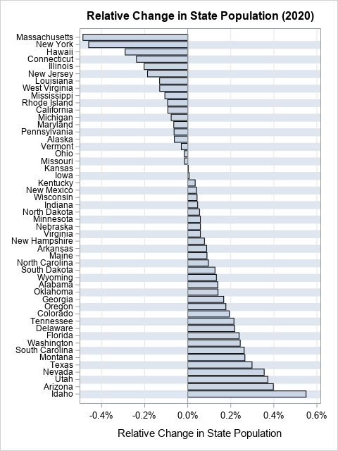
Data visualization tip: Plot rates, not counts

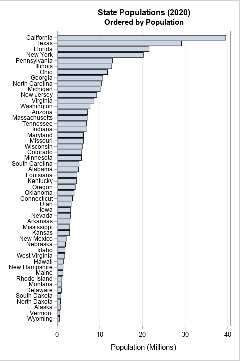
Plot rates, not counts. This maxim is often stated by data visualization experts, but often ignored by practitioners. You might also hear the related phrases "plot proportions" or "plot percentages," which mean the same thing but expresses the idea alliteratively. An example in a previous article about avoiding alphabetical ordering