Get the right information, with visual impact, to the people who need it
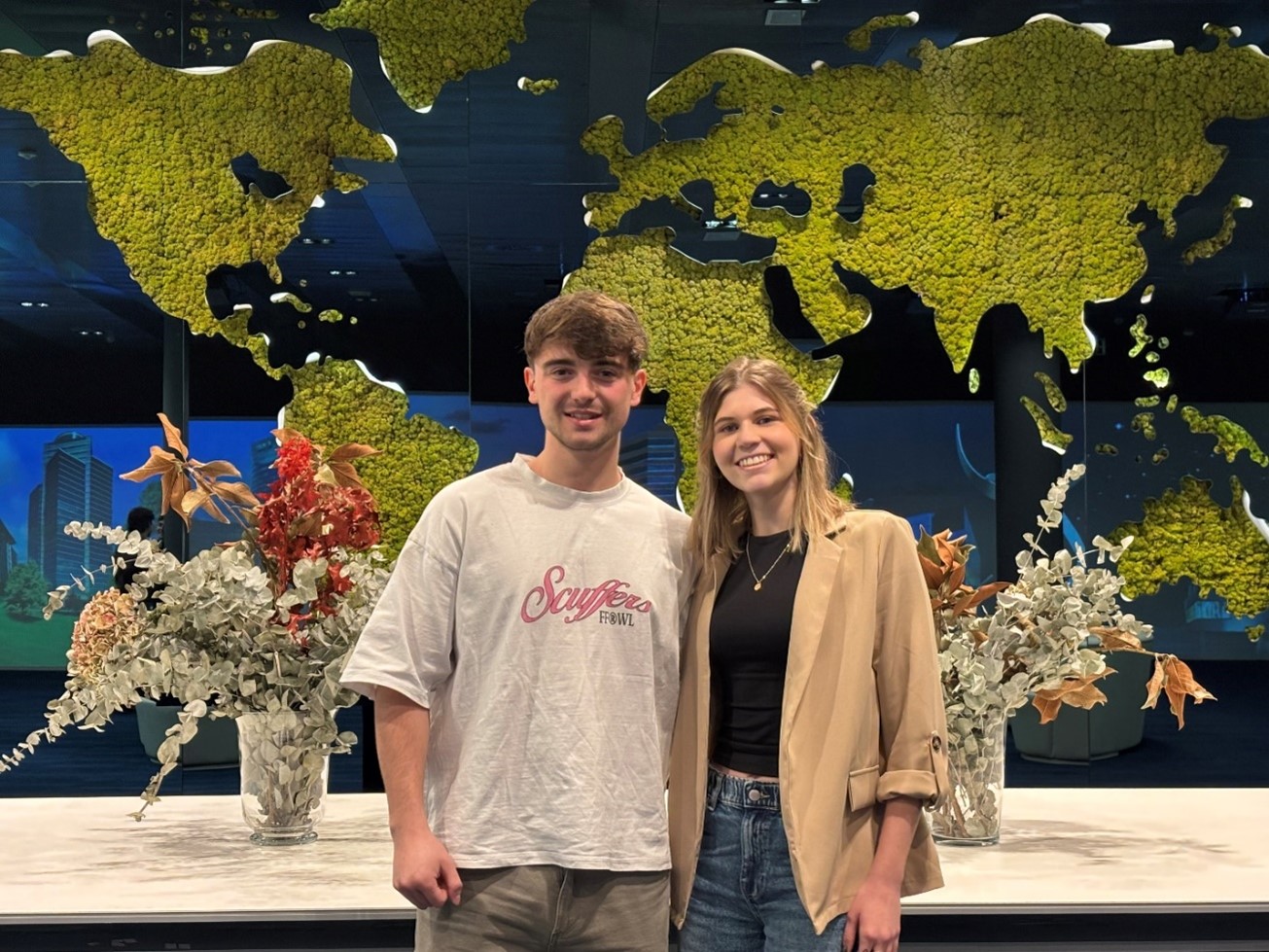
Formando a la Próxima Generación de Analistas: mentoring de SAS en la UC3M

En el vertiginoso mundo de la analítica, la teoría es fundamental, pero la experiencia práctica es la que realmente marca la diferencia. En SAS, lo sabemos bien. Por eso, hemos forjado una alianza estratégica con la Universidad Carlos III de Madrid para impulsar el talento emergente, brindándoles la oportunidad de