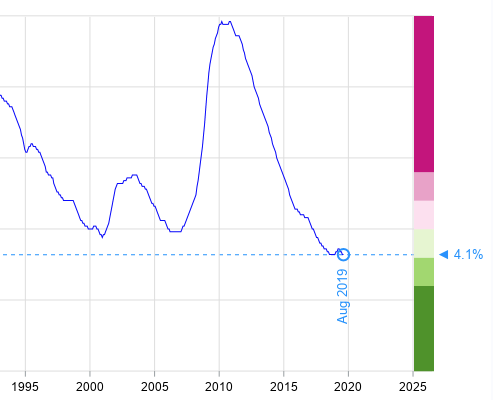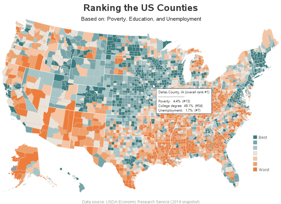
Manifesting a 'Crazy Good' county ranking map

I was recently reading David Mintz's excellent SESUG 2018 conference paper on Five Crazy Good Visualizations and How to Plot Them, and saw a map that caught my eye. David showed how to create a similar map, but with completely different data - I decided to try creating a map