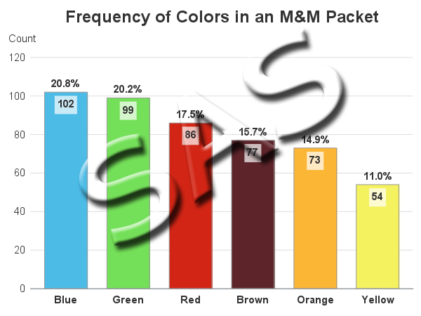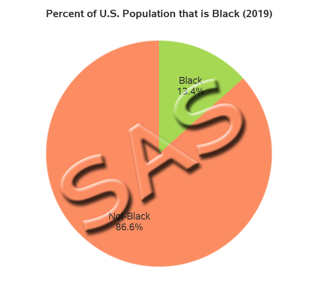
SAS graphs for R programmers - pie charts

This is another in my series of blog posts where I take a deep dive into converting R graphs into SAS graphs. Today we'll be working on pie charts. I know, I know ... you visualization 'purists' might be wagging your finger at me, and saying "pie charts are no good."