With all this sitting at a desk writing code, I have to do something to keep in shape. And for me, that something is paddling boats ... as fast as I can - and occasionally trying to race them. This past weekend I entered the race at Hunting Island, SC.
Tag: Jitter
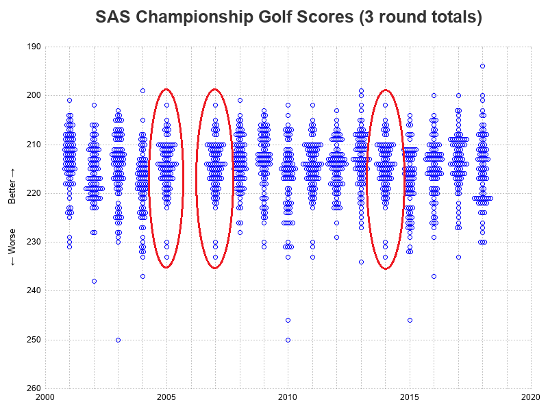
The SAS Championship golf tournament is happening this week, here in Cary, North Carolina! If you're following along and watching the scores, you might wonder how they're doing compared to past years, and what kind of scores it generally takes to win. Follow along as I plot the data from
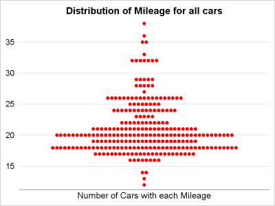
Last year, a user asked about creating a "Turnip Plot" as used in this study of Caesarian Section Rates. Primarily, this is similar to a histogram on the y-axis for each unique value on the y-axis. A marker is drawn for each occurrence, starting from the center. Back then, I
There was a recent comment on the original 'Unbox Your Box Plots', where a user wants to see the original data for the box, but only label the outliers. As noted in the comment, labeling all the scatter markers and turning on the outlier display is not ideal. But there
A frequent question we get from users is how to create a box plot with custom whiskers lengths. Some want to plot the 10th and 90th percentile, while other want the 5th and 95th percentiles. The VBOX statement in the SGPLOT procedure does not provide for custom whiskers. Also, unlike GTL,
At the 2012 SAS Global Forum, one of the questions from a user was about showing the original data used for the box plot. While you can use outliers in conjunction with the box features to get a feel for the data, for some situations you may need to see exactly