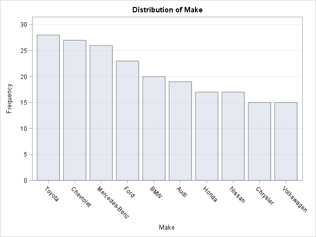
Years ago, I wrote an article about how to create a Top 10 table and bar chart. The program can be trivially modified to create a "Top N" table and plot, such as Top 5, Top 20, or even Top 100. Not long after the article was written, the developer
A previous article showed how to use a calibration plot to visualize the goodness-of-fit for a logistic regression model. It is common to overlay a scatter plot of the binary response on a predicted probability plot (below, left) and on a calibration plot (below, right): The SAS program that creates
In my article about how to construct calibration plots for logistic regression models in SAS, I mentioned that there are several popular variations of the calibration plot. The previous article showed how to construct a loess-based calibration curve. Austin and Steyerberg (2013) recommend the loess-based curve on the basis of