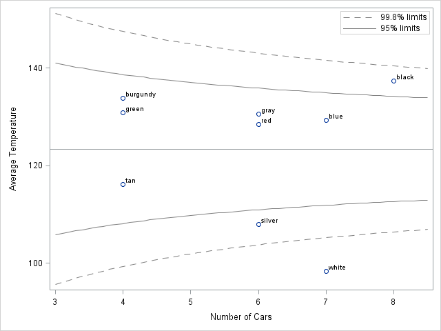
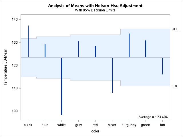
Tag: Data Analysis

Rick Wicklin 0
Funnel plots: An alternative to ranking

In a previous blog post, I showed how you can use simulation to construct confidence intervals for ranks. This idea (from a paper by E. Marshall and D. Spiegelhalter), enables you to display a graph that compares the performance of several institutions, where "institutions" can mean schools, companies, airlines, or

Rick Wicklin 0
The sound of the Dow...in SAS

At the beginning of 2011, I heard about the Dow Piano, which was created by CNNMoney.com. The Dow Piano visualizes the performance of the Dow Jones industrial average in 2010 with a line plot, but also adds an auditory component. As Bård Edlund, Art Director at CNNMoney.com, said, The daily

1 157 158 159 160 161 170