
A team of SAS employees recently participated in a data-for-good project focusing on forest fires in the Amazon. In conjunction with the Amazon Conservation Association (ACA), the team explored options to collect and analyze publicly available imagery and fire data to better understand the drivers for forest fires as well as to try and predict the future behavior of fires in different parts of the Amazon region.
The Challenge
The scope of this project was to find answers to the following questions:
- Can we model where next year's forest fires will happen or predict where an existing forest fire will spread considering a variety of factors like weather, underlying ecology and land use?
- How do we build an alert system that draws on weather, land and fire occurrence data to forecast which locations are fire-prone?
Each of these questions target the overall goal of how AI and machine learning can prevent or reduce future fires in the Amazon. The team quickly realized that bringing together all of the relevant fire data including potential drivers, is the most critical task in this project. We identified a number of key data sources for this project:
- Air Quality (Aerosol/CO2).
- Land Cover / Land Use.
- Weather (Temperature/Rainfall).
- Ecology (Forest Loss).
- Demographics (Population).
- Infrastructure (Mining concessions).
- Topography (Digital Elevation Model).
Data Management
Many of the data sources required for this project are geospatial in nature. Whether it’s topography describing the terrain or land cover helping to understand the type of biomass at a given area - all data points will reference specific locations on Earth. The majority of data is publicly available and provided by government agencies such as NASA or institutions such as Global Forest Watch. Data of this type are typically shared using a raster format of gridded or pixelated data where each pixel represents a small area, such as 100x100 meters or 1kmx1km. The challenge was not only to import and process such a high volume of data but also to transform different file formats and resolutions into a standardized data structure.
The team also used NASA's Fire Information for Resource Management System (FIRMS) to determine where fires had been detected in the past. Data provided are the result of both the MODIS and VIIRS satellites which provide values such as brightness and radiative power for a given pixel. NASA also provides a model based on such drivers to determine whether a fire was detected (along with a confidence measure).
Geospatial Transformation
The data management strategy adopted for this project included the use of the NATO Military Grid Reference System (MGRS) as our common base to reference data points.
This grid-based coordinate system is widely used in other projects and provides automated processes such as machine learning to reference geographical locations like any other data value. The use of MGRS allows us to bin together various different data sources regardless of resolution and act as a base aggregation level for any subsequent analysis.
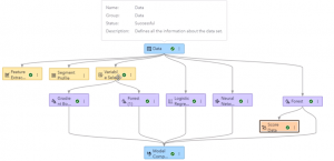
While MGRS supports a variety of different levels of precision, we decided to use the 1kmx1km resolution given that the majority of our data sources provide this level of geospatial detail. We also restricted our analysis to a 10x10 degree tile (0-10 South, 70-80 West) covering parts of the Amazon just east of Brazil on the border of Peru, Bolivia and Colombia. The benefit of using MGRS is the fact that every cell in its grid coordinate system can be referenced by a unique key in a tabular structure. This grid cell is then described by a variety of metrics identified as potential drivers for forest fires later in the analytical modeling.
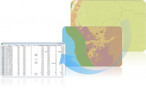
The right-hand example shows such a transformation process, where a 40m resolution land cover imagery data set from 2020 has been aggregated to the desired 1km resolution and then aligned to the MGRS grid. The actual value assigned to a grid cell was determined by the dominant value for land cover in each 1kmx1km cell. The final tabular structure shows one row for each of the MGRS cells with corresponding metrics.
Feature Engineering
The team also decided to take into account locations from nearby geographical features such as infrastructure or industry. When analyzing data in a geospatial context, it’s important to take into account and weight locations given their distance (or closeness) to certain other features. For example, if recent forest cover loss and road construction are potential drivers of forest fire, then we need to account for the closeness to such features when applying an analytical model.
We identified a number of potential interesting geographical features including:
- Infrastructure & Industry (Agriculture, Mining, Powerplants, Oilfields etc.).
- Indigenous Communities or Territories.
- Topographic properties (elevation, terrain roughness, slope, etc.).
- Associated information.
Data is typically provided in Esri Shape Files format as either polygon, polyline or point structures.
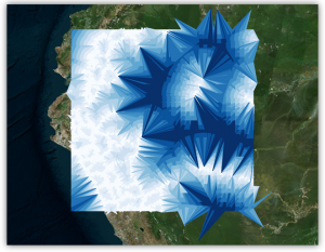
We then calculated spatial attributes, such as the distance from every MGRS cell to a feature of interest, and stored those values in the resulting table. The example to the right shows the calculated distance to roads from any point in our grid with darker blue lines indicating cells further away than cells connected via white lines.
Historical Climate Data
The team also incorporated weather information into the data model. We wanted to include metrics such as temperature, wind speed or rainfall. There are a number of sources available including the Global Historical Climatology Network (GHCN) and NASA - POWER that provide weather information at different levels of detail. Data for weather is naturally very sparse and only provided by the related weather station in a particular area. For the 10x10 degree area that this project focused on, we were able to access nearly 35 weather stations; the challenge became how to assign weather-related values to individual 1km grid cells that did not directly contain a weather station. Not only were there a relatively small number of weather stations from which to choose, but the data provided were not always accurate or complete: due to weather or technical failures, some stations did not provide valid values (e.g. values were out of range) and some provided no data at all for some days in our analysis.
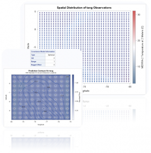
Besides data cleansing and pulling in missing data elements from neighboring weather stations, we also had to distribute and smooth out those values over our entire MGRS grid. The process of spatial smoothing is well known and SAS provides all the tools required. As part of the SAS/STAT Spatial Analysis toolset we applied kriging and spatial prediction for spatial point referenced data. This resource-intensive process was executed for each day of our time frame (~59 days) and resulted in metrics being applied to every single MGRS cell in our grid.
Advanced Analytics
To understand the main drivers for fire and to predict potential future fire hot spots, the team started to build an analytical model using SAS Model Studio. As part of the data preparation, the team created a single data set containing the MGRS cells for the given 10x10 degree tile along with predictor values for each day. At a 1km precision level this resulted in exactly 1 million rows for each day. Of course, just a very small fraction of these cells have a recorded fire. If a fire was detected, the cell will be populated with values for the fire’s measured brightness and radiative power - providing a basic Boolean flag for whether or not there was an active fire.
Modelling Fire Risk
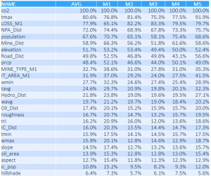
As noted, given our grid system, fire events are extremely rare, only accounting for about 0.0127% of all cells. To reduce the overall amount of data to process, we only considered cells where the land cover indicated a forest (land cover value = 2) and ignored rows with locations that were missing data. The final data set consisted of 26 input variables that act as risk factors for fire.
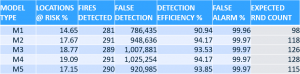
To build our training and test data sets, we decided to use one week of data as validation and all others as actual training data. Because of the very rare occurrences of fires, our model needed to avoid being unbalanced. To achieve this, we decided to create five different random sample data sets to better balance fire occurrences with their risk factors. These five data sets resulted in five different models.
Having multiple models also helped the validation process by showing whether some geographic areas were favoring particular risk factors when compared to others. The model process included the use of Random Forest, Gradient Boosting, Logistic Regression and Neural Network models. Fully automated in Model Manager, the system picked a Random Forest as our champion model providing the most accurate prediction for fire risk.
For visualization purposes, we decided to create a risk of fire by day. This means the model outputs the 'estimated' possibility of a fire by providing a value between 0 and 1. We can classify a location 'at fire risk' if the estimated possibility is greater than a given threshold. There are tools in SAS Model Manager to provide an estimate of the optimal threshold. Given those thresholds, we created an ensemble model classifying each location given a risk level described by a value between 1 and 5 with 5 representing the highest risk of fire as predicted by all 5 models.
The following table shows the variable importance as determined by each model - indicating that factors such as CO2 emissions, temperature and tree cover loss are among the highest-rated.
Data Visualization
Active fire information, useful fire predictors and the results from analytical processes have all been incorporated into a final SAS Visual Analytics dashboard. This report represents a combined platform to visualize trends in the data, details about fire locations and future fire risks. The tool not only provides a great platform for building reports and dashboards like these but also helps perform the following analytical tasks
- Trend analysis.
- Hot spot analysis.
- Distribution.
- Geospatial clustering.
- Alerts / Subscription.
- Geographic routing / distance calculations.
- Segmentation / Correlation.
To further enhance the analysis, this dashboard also tightly integrates custom-built Esri ArcGIS Web Maps and 3D scenes. This allows GIS administrators to provide additional context around areas of interest.
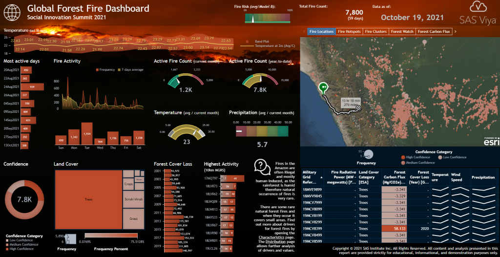
The screenshot above shows the main report page describing the current state of active fires (current count, YTD) as well as fire hotspots and their locations on a map. The investigator can interact with the dashboard and filter by dates of interest or by specific geographical locations. A KPI indicator at the top also shows the current overall fire risk as determined by our analytical model.
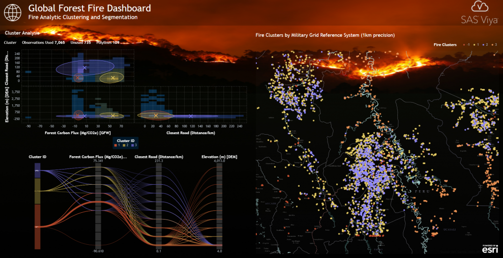
Users are also able to perform ad-hoc clustering and segmentation using the built-in Cluster Analysis tool by selecting desired risk factors and exploring fire locations given their corresponding cluster details on a geographical map. In the example below, the system determined three different clusters given metrics Forest Carbon Flux, Distance to Roads and Elevation. As a result, a cluster such as #1 represents fire locations with low or negative CO2 emissions, a location close to a road, and diverse elevation levels. The right-hand geographical map shows all fire locations colored by their corresponding cluster-ID.
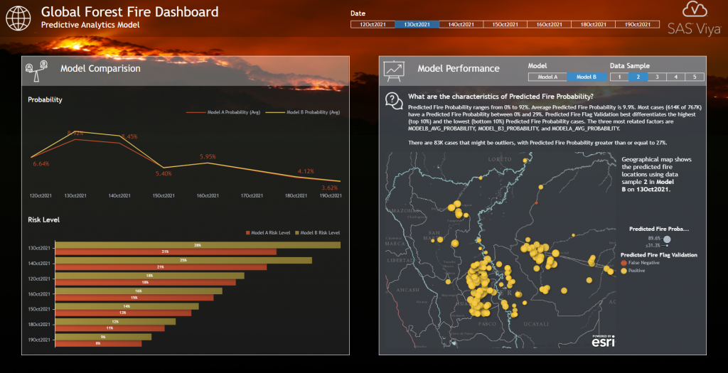
Given our analytical model, this dashboard page now compares both the actual fire data and predicted fire locations. This allows for detailed comparisons of how each individual model performs and detects potential areas of interest. Predicted fire locations are color-coded by their related validation flag: correctly predicted locations (Positive) are shown in yellow, while locations that the model predicted incorrectly (False Negative/Positive) are shown in red.
Conclusion
The state of the climate is a topic that is on everyone’s minds. In partnership with the Amazon Conservation Association, this project demonstrates that advanced analytics and machine learning can be powerful tools in the fight against climate change, deforestation and its associated forest fires. Not only can AI predict future changes in our landscape, but it can also help governments and agencies around the world to adjust their policies in advance to prevent or reduce the detrimental impact of human behavior.


1 Comment
Pingback: The power of AI and analytics to combat deforestation - SAS Voices