This is the fourth post in my series about a computer vision project I worked on to identify liver tumors in CT scans. In my previous post, I had taken a break from my deep learning model to work on data management and data labeling.
Now, I’ll return to the model and try to refine it for better results. At this point in the project, I was granted access to a GPU cluster at SAS, which allowed me to train my models at much higher rates, giving me the ability to test more parameters in less time.
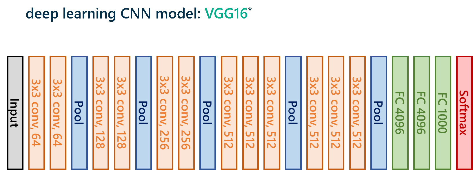
I’ll spare you the gory details (feel free to connect with me if you’d like to discuss), but in the end, I decided on a VGG16 model with modifications to the fully connected layers, where I added a dropout rate of 0.5 in hopes of preventing overfitting, which is basically when the model memorizes the training data too well and can’t perform well on new data that it sees later.
For those deep learners out there, here’s the model architecture:
3D visualization of segmentation results
Once the model classifies all of the patches in a given 3D CT scan, the next step is to reassemble the results into something visual. So, the last step in the pipeline is taking those raw classification outputs from the VGG16 model and using SAS to visualize, in 3D space, the segmented lesions that the network has identified.
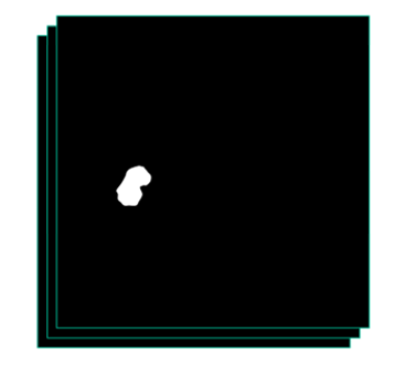
After transposing the rows of pixel-wise classifications determined by the model into a single row representing a linearized flat image, this row of pixels is condensed into a 2D image that visualizes the segmentation result of a particular slice in the CT scan. Once this is done for each of the 2D slices in a given scan, we now have segmentation results for the entire scan. The resulting output would ideally look something like the ground-truth classification given by the radiologist:
Here’s an example of the output from the actual pipeline, when viewed in our good Python friend Mayavi:
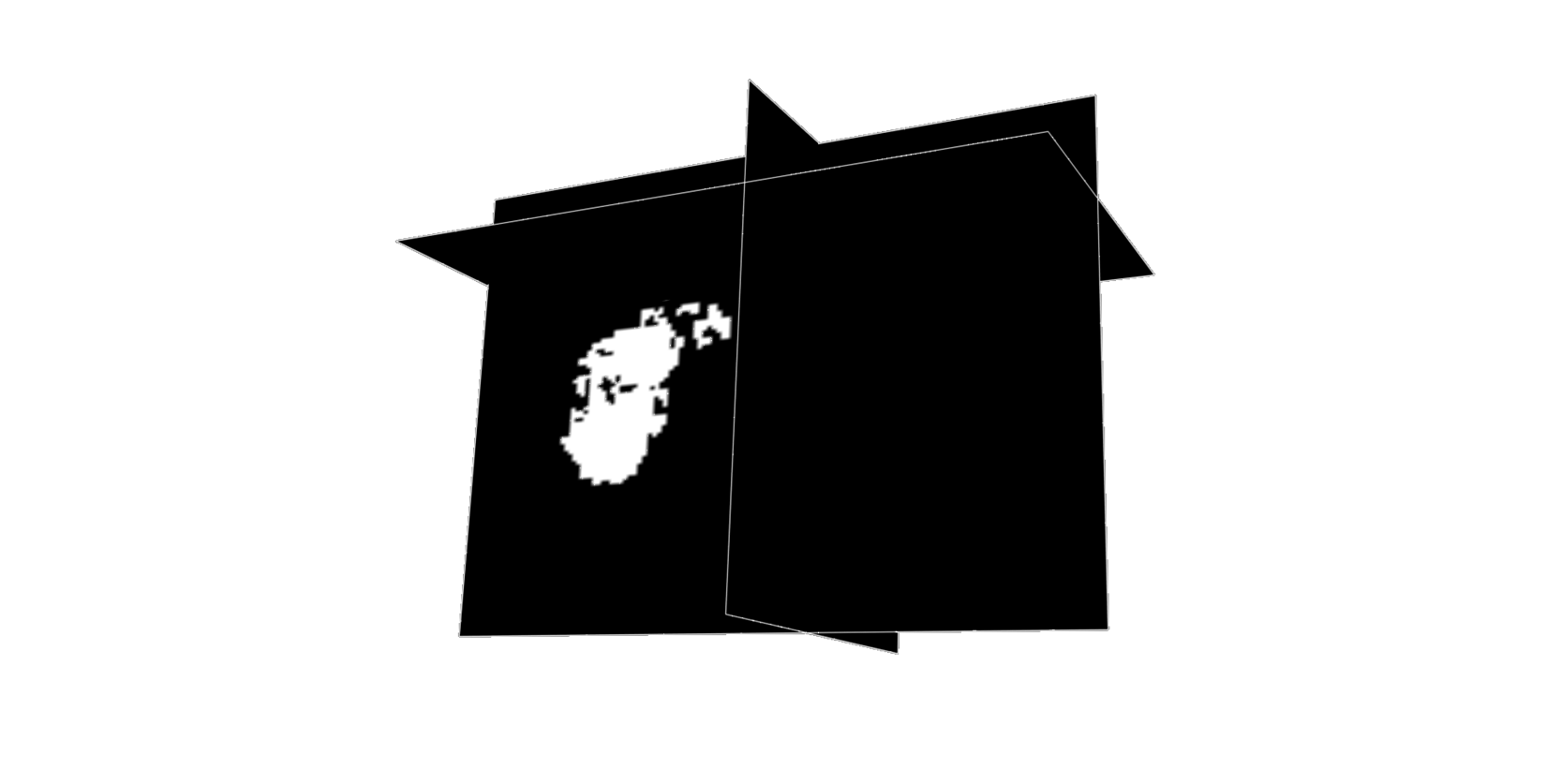
I found this visualization to be incredibly cool (and validating). It’s so different from just looking at linear metrics of model performance, and just fun to drag around and play with!
Luckily enough for me, I managed to complete this 3D visualization before the final demo of my project. After spending a good deal of time combing through all of my Jupyter notebooks that contained various pieces of the pipeline and compiling the code that illustrated the complete end-to-end system, I was more excited than ever to present my work!
I’ll tell you all about that final presentation and the model’s accuracy in my next post.
Learn how to do deep learning with SAS


1 Comment
Pingback: Demo of deep learning to detect tumors in liver CT scans - The SAS Data Science Blog