SAS Learning Post
Technical tips and tricks from SAS instructors, authors and other SAS experts.
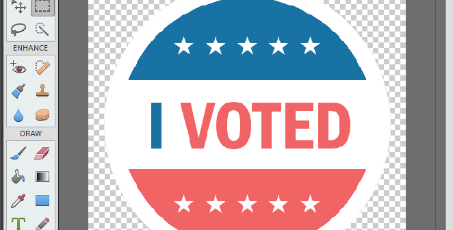
With today being an election day here in the US, I see a lot of people wearing the 'I Voted' sticker. This got me wondering if I could create my own sticker ... using SAS software and simple graphics primitives. :-) So I started by using Proc Gslide to create

Who says technical people can't have fun!?! Similar to Throwback Thursday / #TBT (when people post one of their old/nostalgic photos on social media), I like the tradition of Fun Friday when I use a fun data topic to test our software - a test can be just as rigorous using

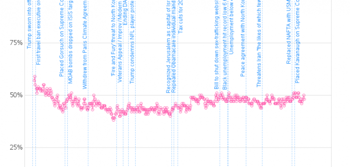
President Donald Trump - people seem to either love him or hate him. Which makes for an interesting data-analysis topic ... tracking Trump's approval rating. Follow along as I explore some data! I'll start with what I consider the 'best' approval-rating graph I've found so far. Here's a screen-capture of
