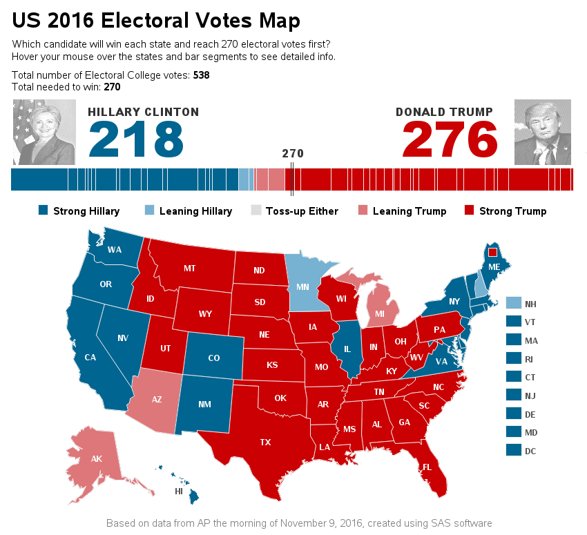
Parents are always proud of their kids, and think their kids are better than all the other kids. I guess it might be a little bit that way with mapping software ... but I really do think I've got a pretty compelling example to show that SAS maps are better
English
Editor's note: This series of blogs addresses the questions we are most frequently asked at SAS Press! Ever thought about writing your own SAS or JMP book? Here are a few reasons why writing a SAS Press book can be a fantastic career move! 1. Your book establishes you as
When I was a kid, I always looked forward to Casey Kasem's American Top 40 song countdown at the end of the year. Did I listen to check whether my favorite songs had made the list, or to critique how well the people making the list had done in picking the 'right'
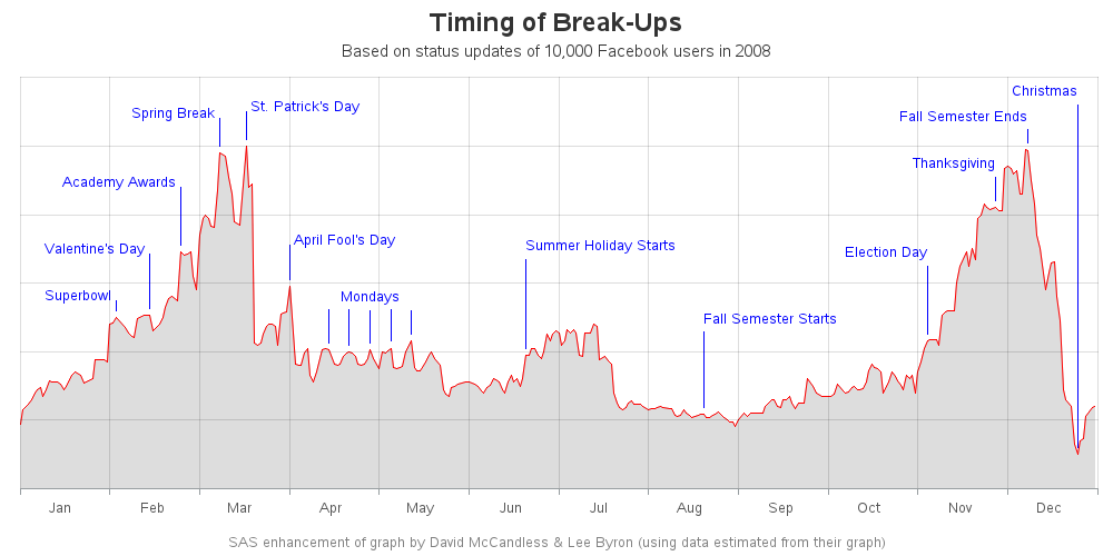
Has anyone ever broken up with you, and left you thinking "Wow, I didn't see that coming!" In hindsight, maybe you could have seen it coming. At least from a statistical perspective. Let's dive into this topic with some lighthearted discussion, and plot some Facebook data... When it comes to
Suppose you are using SAS Studio and the statistical task you need to perform is not a supported option or feature in SAS. I know that sounds almost impossible because the statistical tasks in SAS Studio are so awesome. But, just in case you need to tweak a program or
Maybe programming isn’t quite as dangerous as a lightsaber battle, but if you think using SAS to turn data into action feels a little bit like magic, you should know that nobody is better at harnessing “the Force” of DS2 than SAS Jedi Mark Jordan. Mark has a resume that
If you consider yourself as a visualization expert, you strive to create graphs that set you apart from the data analysts and statisticians. Graphs that merely plot the data in a clear/concise manner aren't enough for you. You want your graphs to also be intuitive, easy to read, and provide
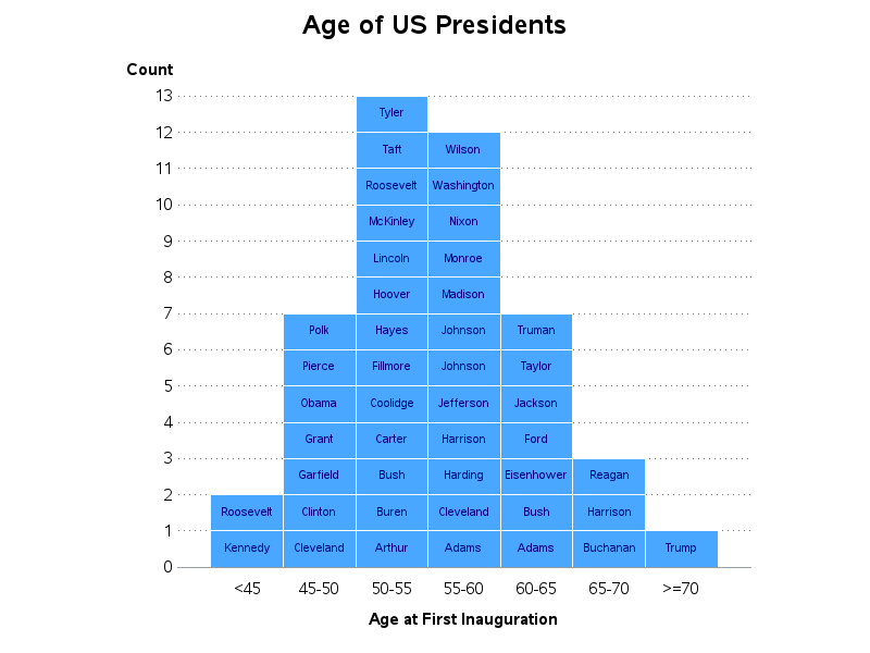
Recently, my fellow SAS blogger Rick Wicklin wrote a post showing how to graph the ages of all the US presidents. And Chris Hemedinger showed how to create a bar chart showing the number of presidents having each of the 12 zodiac signs. Both are interesting graphs, but I wanted to
Are you the lone-wolf SAS programmer in your company - managing the data, performing the analyses, and graphing the output for everyone else? And what's the only format they all know how to work with, and wish they had your output in? Let's face it ... that's probably an Excel
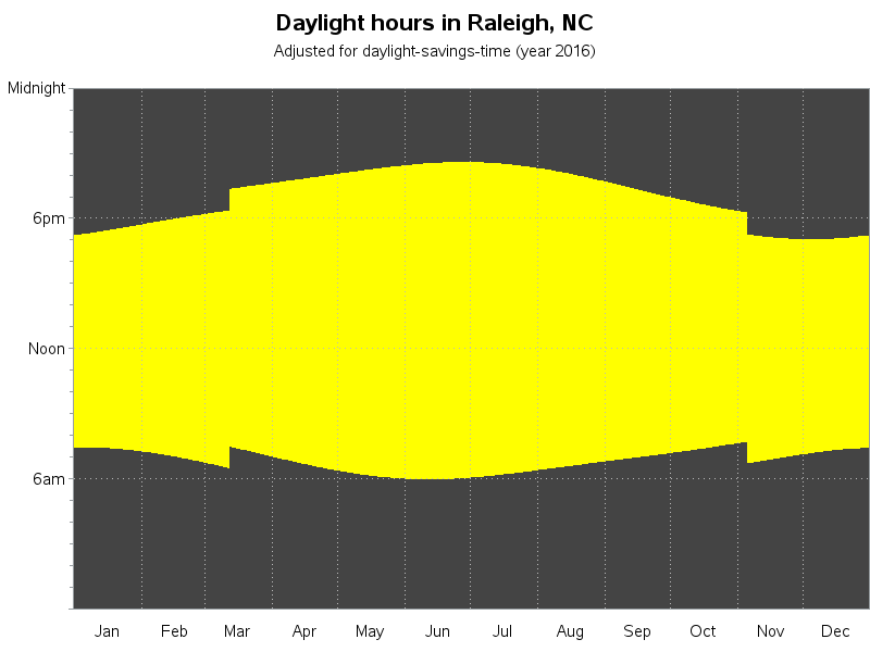
Does it seem like there just aren't enough daylight hours to get things done these days? It might not be that you've got more to do - it might be that we actually have fewer daylight hours in the winter (here in the northern hemisphere). And since "seeing is believing,"