Elections in the US are a 'target rich environment' for data analysts. There are surveys and forecasts before the election, and the presentation of results during and after the voting. What's your favorite election-related graph of all time?
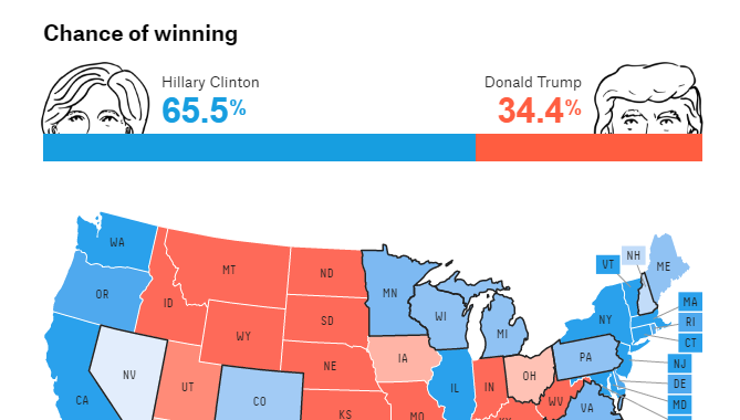
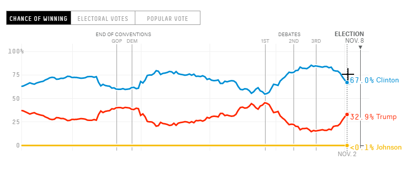
For the current (2016) presidential election, my favorite graphs are on the fivethirtyeight.com website. They have a nice map, and a really nice line plot (see partial screen-captures below, and click on the images to see the real thing). They put a lot of thought into these graphs, and they contain a lot of information. The best part is that they use several data sources, and update their graphs any time new data is available (often several times a day!). They also allow you to plot the data in several different ways (such as popular vote, electoral vote, chance of winning), via buttons above the graph, and along the left side of the page. (Based on their articles, I think they might be slightly biased towards Hillary, so keep that in mind when you view their graphs - aside from that little caveat, these are some great graphs.)
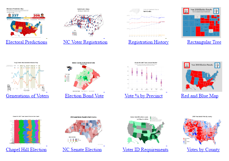
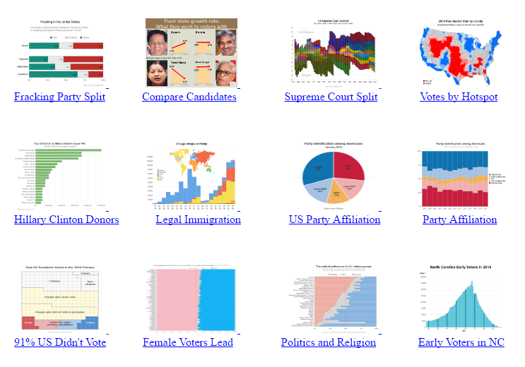
So, what other types of graphs might be helpful in understanding the flood of data around election time? Over the years, I've created quite a few election-related graphs, and I've now pulled them together into one location for your easy viewing. Click the screen-capture below to go to my samples page, where you can drill into each graph thumbnail to see all the details. Note that when you click the text-link below the thumbnails, there's a link to the SAS code, and I've also added links to previous blogs about the graphs. (Are you overwhelmed yet!?! Hahaha!)
Did any of my graphs catch your attention? Which one is your favorite? And which election-related graph (other than mine) is your favorite? Feel free to leave your reply in a comment, and elaborate on what you do and don't like in election graphs!


3 Comments
Pingback: My top 10 graph blog posts of 2016! - SAS Learning Post
I looked through your election graphs. It's awesome how many slices of data/visualization methods you present.
I particularly like the North Carolina voter registration and the 2008 election by US county - it's neat to take a look at it at a granularity lower than a state-level, which we typically see reported.
The political preferences by US religious groups is really neat.
And I like how your 2012 Presidential prediction map is a lot like the one on fivethirtyeight. If I have to vote for one "candidate graph", it's this one; it's the best standalone infographic, and I like how you can hover on each state. If you had unlimited free time, maybe clicking on each state could get to a map showing which way each county in each state voted, in addition to voter registration by party.
Thanks for the great feedback, Paul!