I recently read an article that claims 35% of men, and 40% of women in the US are now obese. Yikes! I wondered when this happened, and whether it had been a gradual or sudden change. If I only had some graphs ... which the article didn't provide. I did some
Uncategorized
When I travel for work, I want to get the most out of my trip. So while I was in Las Vegas in April for SAS Global Forum, I used my free time to check out what’s in store for the Analytics Experience at the Bellagio, Sept. 12-14. Take a
With recent advances in quadcopters, or drones, they have become pretty capable and fun flying machines. And just about anybody can afford the entry-level models. They've recently become prevalent enough that the government has started coming up with rules, and the Federal Aviation Administration (FAA) started requiring owners to register drones that
The one thing, above all others, that I wish PROC REPORT could do is know which observations from my data set that I want kept together on a single page of non-Listing output. This is problematic for two reasons. 1. PROC REPORT cannot read my mind! 2. PROC REPORT does
For the first time in 4.5 years, we had a day with zero sunspots - I think this special occasion calls for some sunspot graphs! But before we get started, here's one of the many pictures my friend Kirk took of the sun down in Marco Island, Florida. Spots or no
A reader posed a question in the comments to an earlier Jedi SAS Trick, asking how to write the results of a DS2 DATA _NULL_ program to a text file. It's an interesting question, as DS2 currently has no text file handling statements or capabilities. Take, for example, this traditional
If you have taken a SAS Deployment exam in the past 9-12 months, you may have wondered why there are pre-test test questions. While it might seem like I am providing warmer-upper questions out of the goodness of my heart, these pre-test tests are actually called candidate surveys. Their purpose?
When using visual analytics, it's important to realize that WYSIWYG (what you see is what you get) is not always true. By recognizing a few optical illusions and tricks, you might become a better data analyst ... and have some fun along the way. Let's start with the Koffka Rings
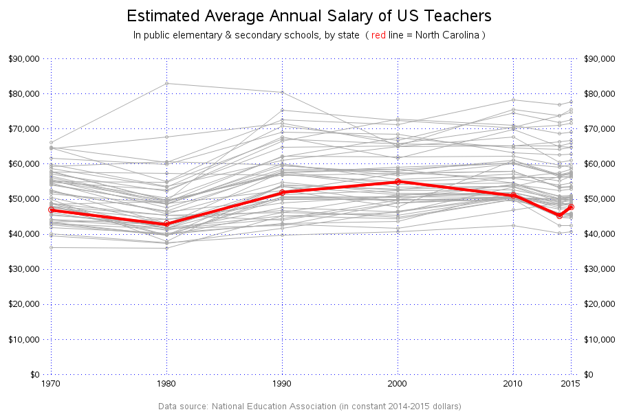
Teacher salaries have been a hotly debated issue in our state for the past few years. In this blog post, I examine a graph that recently appeared in our local news, point out some deficiencies, and create an alternate graph. But before we get started, here's a picture of my
Have you been kicking around ideas for a great SAS book, but don’t know how to get started? Don’t wait another day – connect with the Publish with SAS community and let those amazing folks at SAS Press help you get your project rolling. You won’t regret it! I’m SO