When using visual analytics, it's important to realize that WYSIWYG (what you see is what you get) is not always true. By recognizing a few optical illusions and tricks, you might become a better data analyst ... and have some fun along the way.
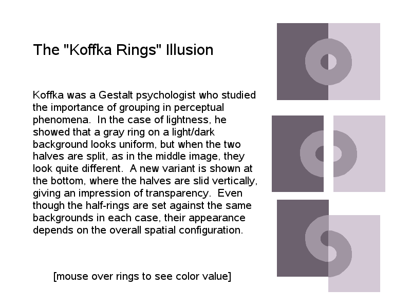
Let's start with the Koffka Rings Illusion. In the image below, both the left and right side of the 'ring' is exactly the same shade of gray in all three pictures, but your brain probably perceives it as different shades because of the shades around it. This is one reason it is very important to pick colors and shades that are easily discernible for your graphs. You can click the image below to see the interactive version, and then each of the colored areas will have mouse-over text showing the exact hex code of the color used, so you can verify that the left and right half of the rings are indeed the same shade of gray (cxA095A2).
This graph (as are all the examples in this blog post) was created with SAS software. Here is a link to the SAS code used to create it.
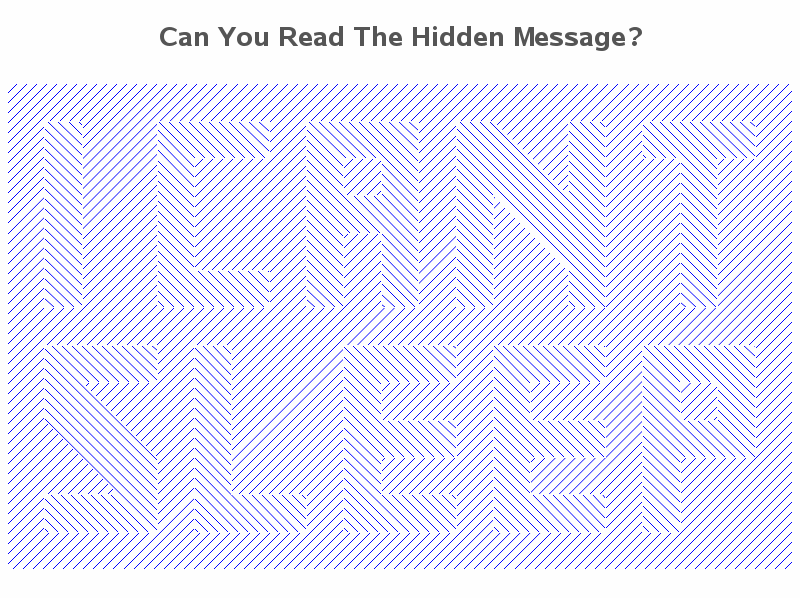
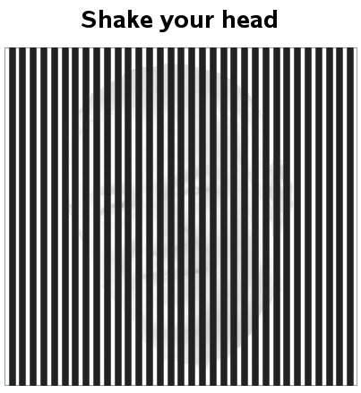
Visual analytics can often help you see patterns that might otherwise be hidden in the data. If you're the one creating the visualization, you want to help the user see the patterns as easily as possible. This fun example goes to the opposite extreme - how many of you can see the hidden pattern in this image? If I truly wanted to convey this message, I should probably just use text instead of graphics, eh?!? (code)
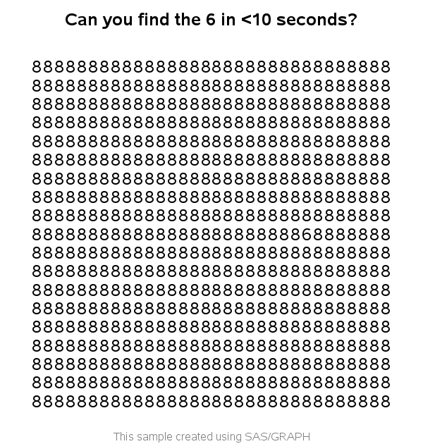
Sometimes when analyzing data, most of the values are the same, and you want to make it easy to find the outliers. You can help users identify the outliers by graphing them, or showing them in a contrasting color, for example. Wouldn't it be much easier to find the '6' in the following grid of numbers, if it was in a different color from the 8's? (code)
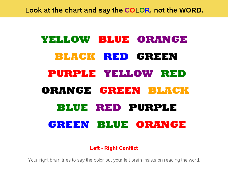
When you create a data visualization, it is important to have the shapes, colors, and words all agree. If they don't agree, then the brain will start playing tricks on the user, and they will likely perceive things incorrectly. Here's a fun example that demonstrates this. (code)
Were you able to see all the hidden messages and such in these examples? Do you have a favorite optical illusion other than these? (feel free to tell us about it in a comment!)