I've seen a lot of recent news articles purportingĀ income inequality in the U.S. ("the rich get richer, and the poor get poorer") ... and I wondered if the graphs were a true/unbiased representation of the data. For example, I recently saw a couple of graphs in an article on the
Author
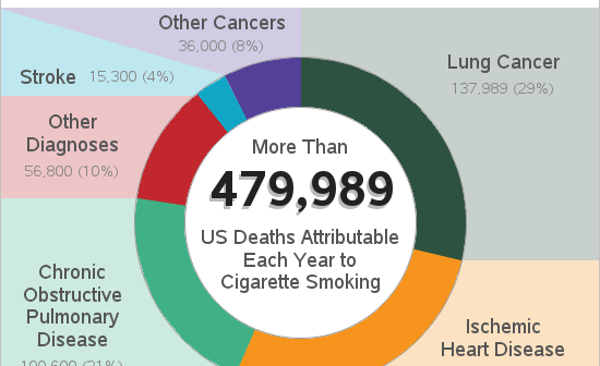
Smoking is an addictive habit that can kill you - if you don't believe me, check out the infographic in this blog post. Recently a friend of mine was on the episode of the Dr. Phil show that focused on "quitting smoking." Here's a picture of Traci with Dr. Phil
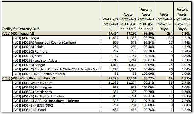
Data about the monthly wait times at VA facilities in the US are now available, but it's a bit overwhelming to try to analyze them in tabular form - plotting the data on a map made itĀ a lot easier!... Here in the US, when our soldiers finish their commitment in
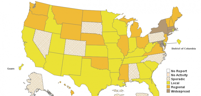
Has this year's flu been better or worse than you thought it would be? There are a lot of factors that help determine whether or not you're likely to get the flu. Is there a bad strain going around? Did the flu vaccine target the right strain? Did you get
How simple is too simple, when it comes to analyzing data on a map? The KISS principle can be applied to many things, including graphs and maps. What is the KISS principle, you might ask? Well, it's not the rock band that my friend Patricia (pictured below) has been known
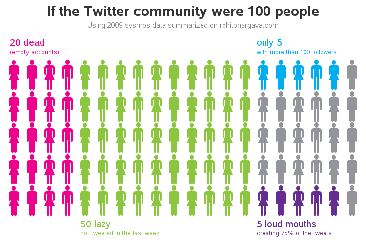
One of our customers asked if I could show him how to reproduce a stickman graph that David McCandless (ala, Information is Beautiful) had created - see screen capture below. I'm not sure that it's the best kind of graph for the occasion, but of course SAS can be used
Would you rather see a list of the world's 50 best roller coasters, or an interactive map? (... how about both!) Before we get started on this ride, here's a picture of my friend Jennifer's daughter, getting an early/young start on riding roller coasters (she's in the back, with her
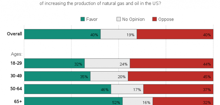
The topic of fracking has been in the news a lot lately - this blog post explores some of the finer points of plotting opinion data related to fracking ... I recently saw the following graph on dadaviz.com. It showed some interesting data, and presented the data in a way
This blog post discusses the use of a black background in a graph. But before we get started, I invite you to have a listen to one of my favorite songs - "Paint it Black" by the Rolling Stones. Perhaps this song subliminally persuaded people to use black backgrounds in
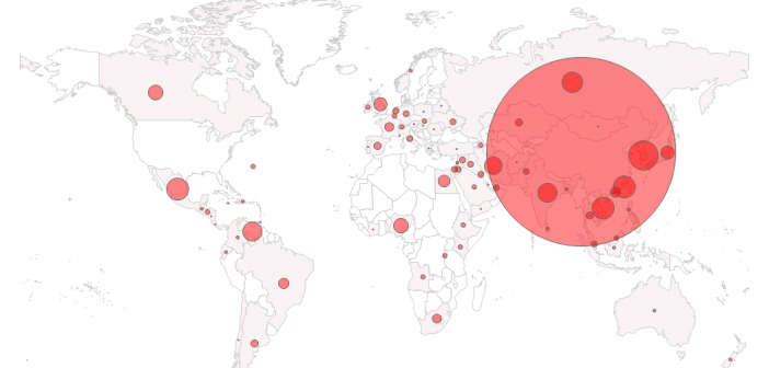
Having spent many years in graduate school, and living in the Research Triangle Park (RTP) in North Carolina, I have a lot of friends from other countries. Therefore when I recently saw some stories & graphs about EB-5 visas (where you invest a cool half-million US $ to bypass the