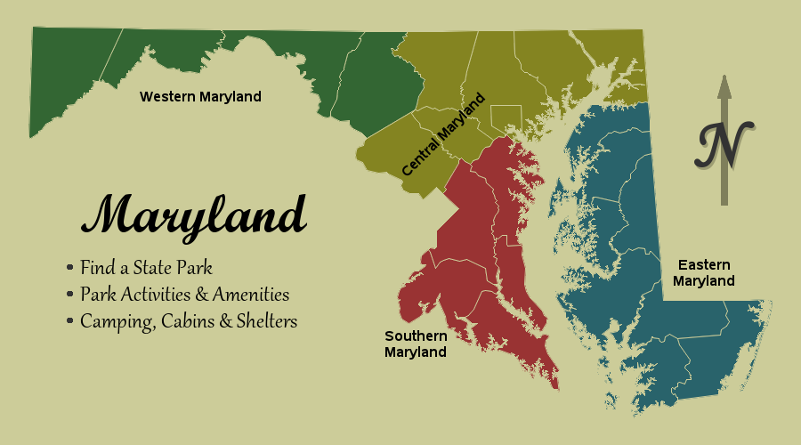
I usually create very technical maps, to display data spatially - and they usually have a certain look. They're clear, crisp, and to the point. I typically only use color to represent the data, and I choose a font that is simple and easy to read (such as arial). But
Author
Are you one of those people who get easily bored at amusement parks? Would you like something to do while your friends/family are waiting in line for a ride? Perhaps I have an alternate idea, to keep you busy - survey markers! When surveyors are measuring and marking areas for
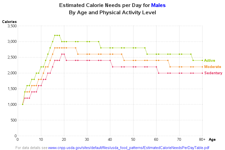
"They'll eat you out of house & home! Their food bill will put you in the poor house! ... And they never gain an ounce!" - That's what my friends say about their teenage sons. They're probably exaggerating a little, but since it's a recurring theme, there's probably some truth
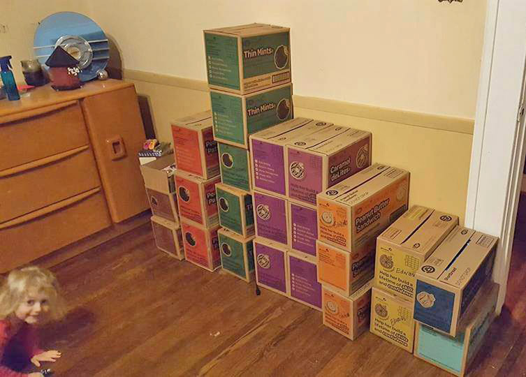
Here in the US, it's Girl Scout cookie season. This is when you get to spend a few bucks on cookies, break your New Year's resolution about losing weight ... and feel good about it, because the money's going to a good cause. Or is it? - Let's break down
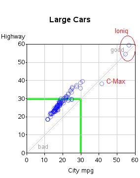
For many years, the Toyota Prius was the hybrid with the best mpg - but in 2017 that's changing! Let's examine the data ... For analyses like this, I have found the fueleconomy.gov website to be a wonderful source of information. In recent years, they've even made all their data
They say "a picture is worth 1000 words" - and I think it might be more like 2000 when it comes to planning out fun/interesting things to do in a new city! I'm going to the SAS Global Forum (#SASGF) conference in Orlando this year, and I was wondering where
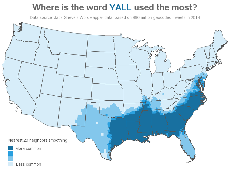
If you do much traveling in the United States, you're bound to hear a few words and expressions that are unique to certain areas. Well y'all get ready, because I'm fixin' to analyze some of those words for ya! I recently found a really neat web application called The Great
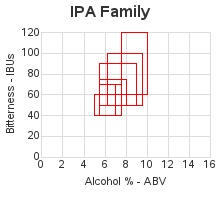
Data analysis can be used for many things ... how about finding other beers you might like, so you don't keep drinking the same old brand every time? Hang on tight - I think we're about to make a beer run! I recently read an interesting article on the Flowingdata website,
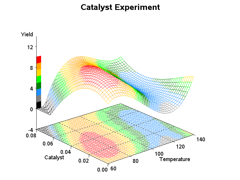
Are you a visualization & graphing expert? Can you identify which tool (R, Excel, Tableau, SPSS, Matlab, JS, Python, or SAS) was used to create each of these graphs? No cheating! I recently read Tim Matteson's blog where he presented 18 graphs, and had his readers try to guess which
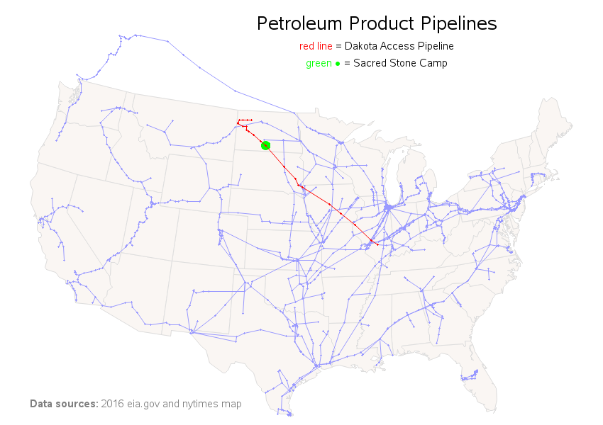
You've probably seen dramatic pictures in the news lately about the protests against the Dakota Access Pipeline - Native Americans versus bulldozers, protesters and tipis in a blizzard, and things like that. But do you really know much about this pipeline? For example, where will it go, and where have the