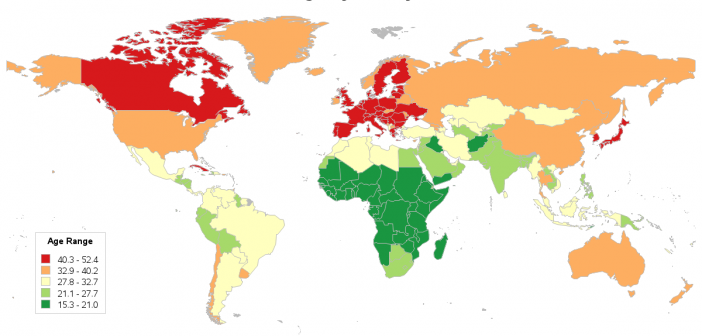
If countries have a similar median age, does that mean they are also similar in other ways? My best guess at an answer is - probably. Perhaps if we plot the data on a map, we'll be able to see the answer more clearly. I first started thinking about this
Author
When I was in college, I lived in the Alexander dorm, where each room had an American student and an International student. I learned a lot about the rest of the world, and I also heard a lot of different languages being spoken. I'm really impressed when I hear people
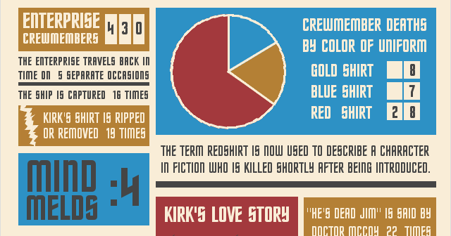
If you were a fan of the original Star Trek television series, you probably remember lots of little details about the show. And you might even feel sorry for the people who don't get the clever references you make to things from the show. If you're that person, then you'll
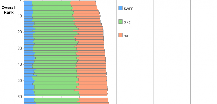
This past weekend, I was a volunteer helping with an Ironman 70.3 race. I was really impressed & inspired by the athletes ... I was also excited about the quantity and variety of data generated by this type of race (compared to a regular marathon). And as a 'graph guy' I
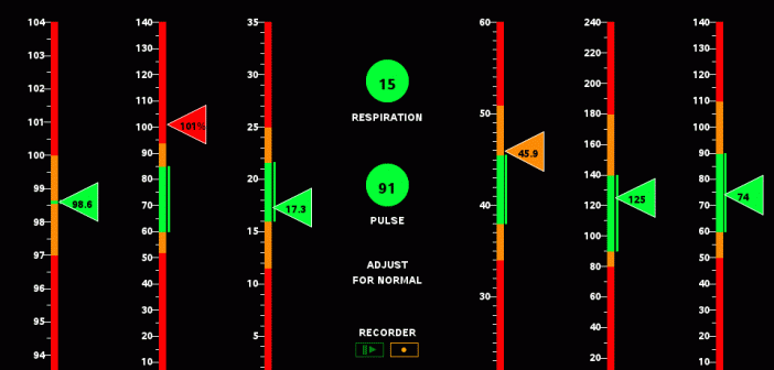
As a kid who grew up in the 60s & 70s, I was a big fan of the original Star Trek TV series. And in the years since, I have seen lots of the Star Trek “technology” become a reality: cellphones, portable tablet computers, talking computers (Alexa/Siri), etc. But I
To stack the deck means to cheat or to fix something so a desired outcome is achieved. This term originated in card games, but can also be applied to other things. And here, I apply it (both metaphorically and literally) to creating a better graph! I recently saw the following
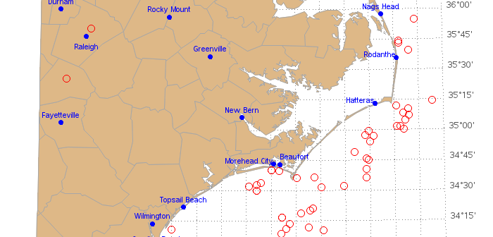
North Carolina is a very diverse state - especially when it comes to outdoor recreation opportunities. This weekend you could go hiking or kayaking in the mountains, watch a hot air balloon festival near Raleigh, and go wind surfing or fishing at the coast. And if you've got your SCUBA
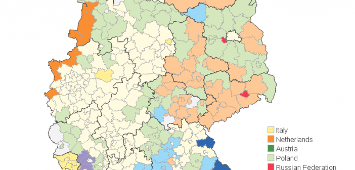
These days, more and more people move to where the work is. And for many people in Europe, that 'where' is Germany. I recently saw a map of Germany, that showed which country had the most foreigners living in each area. It was an interesting map, but I thought I might
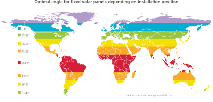
In recent years, solar panels have become much more economical, and therefore more popular. But because of the curvature of the Earth, the angle at which you need to install the panels varies, depending on where you live. In this example, I demonstrate how to visualize this kind of data
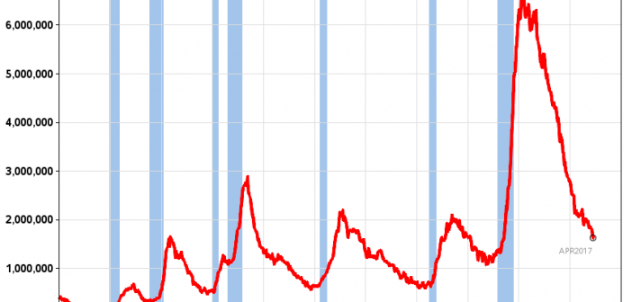
The US unemployment rate was down to 4.4% in April, which is the lowest we've seen since before the big recession (about 10 years ago). But a single number seldom tells the whole story, so let's look at unemployment data in several different ways, to get a more complete picture...