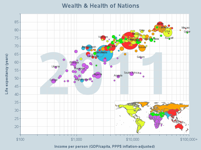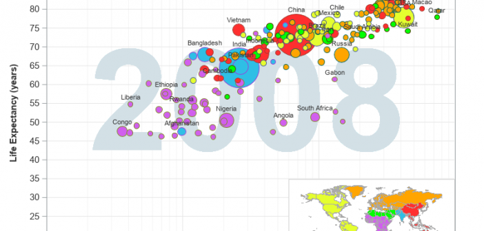
As we're approaching the anniversary of Hans Rosling's passing, I fondly remember his spectacular graphical presentations comparing the wealth and health of nations around the world. He certainly raised the bar for data visualization, and his animated charts inspired me to work even harder to create similar visualizations! What better way
Search Results: animation (33)
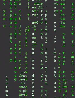
Do you remember The Matrix movies, that started coming out in 1999? Hopefully this movie franchise didn't give you a fear of virtual reality and AI. The thing I remember most from the movie was the really cool slow-motion video effects (from multiple angles) in the fight scenes. And the
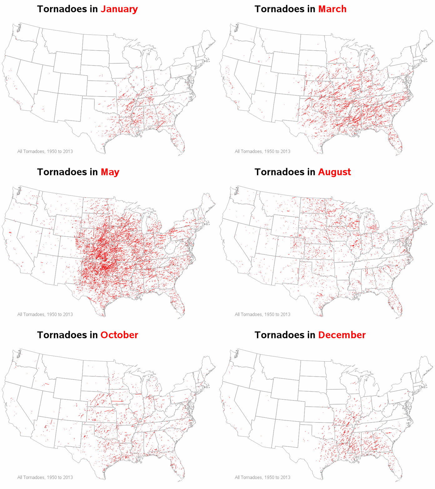
With tornadoes in the news lately, I wondered how I might could use SAS to analyze tornado data. How about animating 60 years of tornado path data? ... I was using Google to search for ways to analyze tornado data, and found an example on ustornadoes.com that animates the tornado
They say "Imitation is the most sincere form of flattery"... Therefore when I imitate Hans Rosling's famous world-data animation, it's not that I'm jealous, but that I'm paying homage to him! (OK, and maybe also a little bit jealous! LOL) Well, anyway, for those of you who haven't seen it,
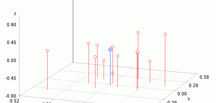
Hopefully you know that a gif animation can be used for more than just showing a cartoon animal doing cute tricks! Being a savvy data-meister, I'm sure you are also aware that you can use gif animations to see how data changes over time. But perhaps you didn't know you could
It might snow this weekend here at the SAS headquarters! This would be the first snow of the season for us, and it got me thinking about snow again (see some of my previous blog posts about snow). Apparently these thoughts have manifested themselves in my computer graphics work ...
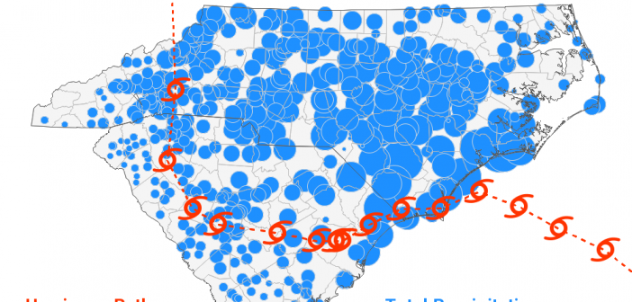
"We been through every kind of rain there is. Little bitty stingin' rain, and big ol' fat rain, rain that flew in sideways, and sometimes rain even seemed to come straight up from underneath." Was that a quote from the Forrest Gump movie, or something said regarding Hurricane Florence? Could be either one! Hurricane Florence recently came through
When I'm at a social gathering, someone always asks what type of work I do. I like to keep my social life separate from my work, therefore I usually give a vague answer such as "software" (and quickly change the topic). How vague or specific is your response? How vague
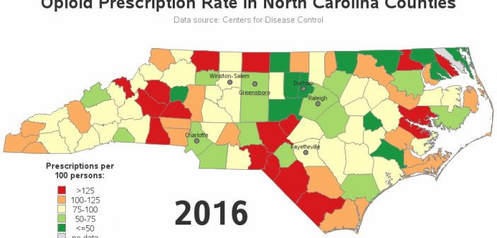
My buddy Rick Wicklin recently pointed me towards an animation of some opioid prescription rate data for Illinois. And, of course, I decided we needed a similar animation for North Carolina (with a few improvements...) Here's the original, and here are the problems that jump out at me: Counties with
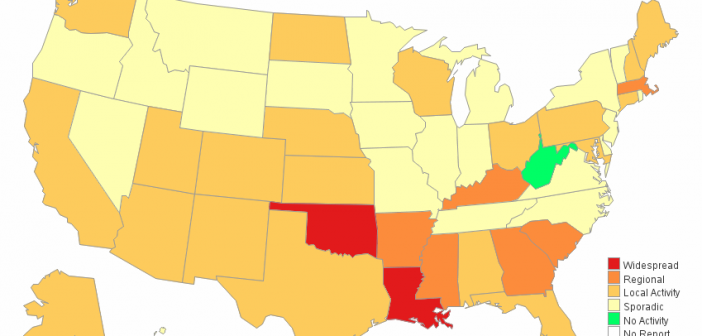
The flu seems to be especially potent this year. "How potent is it," you might ask? ... Well, let's plot some data on a map to help find out! Here in the US, the Centers for Disease Control and Prevention (CDC) compiles data about diseases, and provides reports and graphs