Are you ready for the supermoon on December 14? This will actually be the 3rd supermoon in 2016! With these big-looking full moons we're having this year, I got to wondering exactly how big is the moon compared to Earth? This seems like a good question to answer with some SAS graphs!...
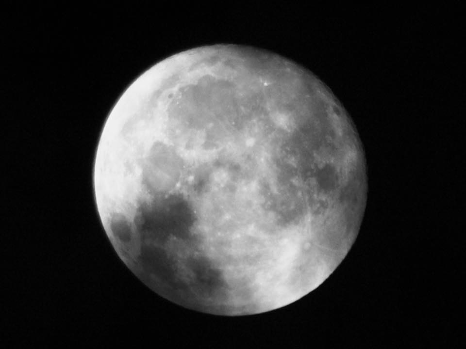
But before we get started, here's a picture my friend David took of the a supermoon this year. The weather wasn't great, but he managed to get a pretty decent shot!
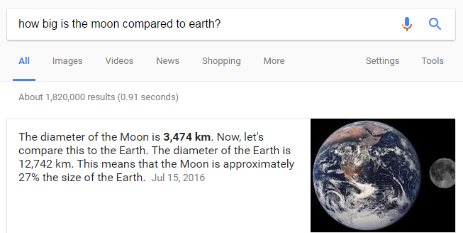
As with most things I'm curious about, I started my quest for knowledge with a Google search. I asked Google "How big is the moon compared to Earth?" Google found about 1.8 million results, and showed me the following summary at the top:
I have often heard that the moon is about 1/4 (25%) the size of the Earth, but I was a little distrusting of that number. For example, look at the picture in the Google summary - the moon doesn't look 25% the size of Earth, does it? As with many things, it depends...
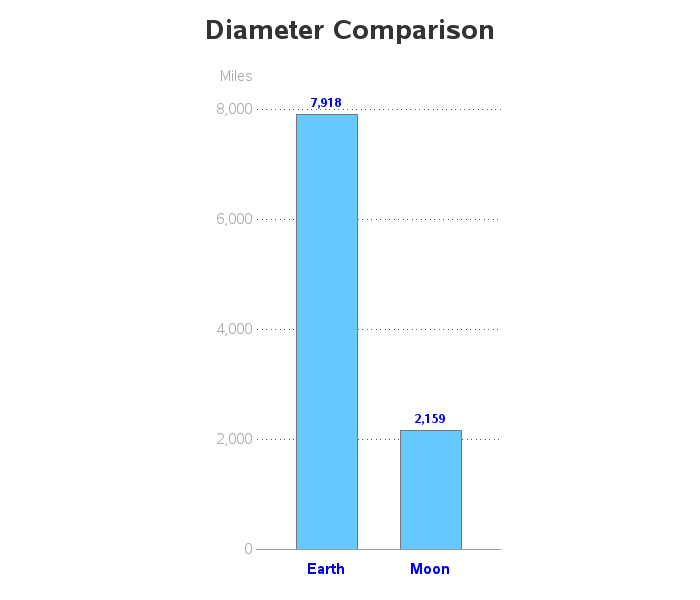
The 25% number comes from comparing the diameters. The moon's diameter is indeed about 25% the size of Earth's diameter, which is easily shown in a simple bar chart:
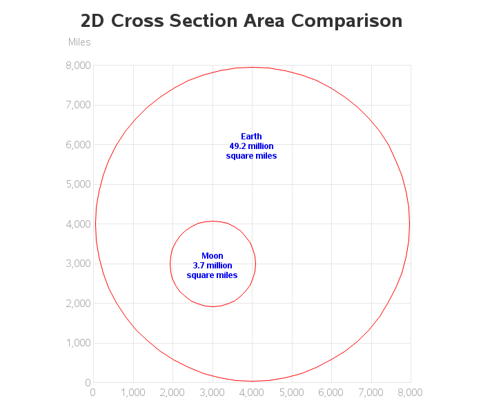
But if you look at the earth and moon side-by-side (as in the image in the Google results above), does your brain compare the diameter, or does it compare the amount of area taken up in the image? Here's a visualization of the cross section area of the moon and Earth laid out on a gridded graph, so it is easy to visually compare them (each square area in the grid represents 1,000 x 1,000 = 1 million square miles).
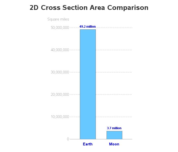
The above graph is a nice visual comparison that people can relate to (since the circular shapes correspond to the moon and Earth), but let's make it even easier to compare the areas, by plotting the them in a bar chart. Here, you can see that the cross-sectional area of the moon is much less than 25% the size of the Earth.
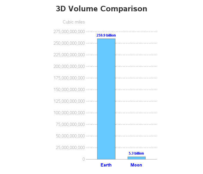
And what about the volume of the spheres? As you've probably guessed by now, that's an even bigger difference!
So, when somebody asks how big the moon is compared to Earth, the answer is "It depends!"
If you're a data analyst, you might be thinking ... "Hmm, I wonder if this same issue might affect bubble chart visual perception? - Should I be sizing the bubbles based on the diameter, the area, or the volume of the bubbles?" (and yes, this is an important issue that many people creating bubble charts don't even think about). Feel free to leave a comment with your thoughts/preferences on bubble chart sizing!


6 Comments
So far we've got ratios of 1:4, 1:13 and 1:49 for diameter, surface area and volume respectively. But the one generally of most interest to astronomers is mass - the one measure which always factors into Newton's laws of gravitation, and which is 1:81 for the Moon compared to the Earth. Combining radius (from diameter) with Mass and Mr. Newton, we get the remaining important ratio, 1:6, which represents the surface gravity of the Moon compared with Earth - important should one ever want to do something like land, walk on, and return from the Moon (Why not 1:81 for the surface gravity as well? Because with the smaller diameter you're closer to the center of mass, and the radius factor gets squared in Newton's equation). The difference between 1:81 and 1:49 (mass and volume) comes from the 60% difference in density - consisting mostly of cheese, the Moon has nothing like Earth's nickel-iron core.
Nice summary, and taking of this to the logical conclusion!
(and nice to see you put in a little 'extra' to make sure people are paying attention!) :)
No code example this time? Great post! It would be interesting to replicate this for the planets and the sun. A logarithmic scale may be necessary...
Good idea! - Here's a link to the code...
http://robslink.com/SAS/democd90/earth_and_moon_info.htm
Surely you should be using the 2D area calculation for bubbles. Like cookies on a cookie sheet, the bubbles are flat on the page. I don't see them as spheres, does anyone?
You would think nobody would use spheres in a bubble chart! ... but I've seen them before! :) More often than spheres, I see 2d bubbles with a "3d shading/sheen" applied to them - I assume they think this makes them 'prettier', but it gives them a 3d/sphere look, which then makes me wonder are they sized based on the 3d volume, or the 2d area? Here are a few random examples I just now found with a Google search:
https://help.syncfusion.com/aspnet-classic/chart/chart-types_images/chart-types_img30.jpeg
https://i.stack.imgur.com/Gs9YB.png
http://www.advsofteng.com/images/threedbubble_m_p.png
http://mystocksinvesting.com/wp-content/uploads/2014/08/Singapore-REIT-Bubble-Chart-Value-Aug6-2014.png