In the US presidential election, each of the 50 states has a certain number of electoral votes, based on the population. Typically, most states cast all their electoral votes for the candidate who wins in their state (all or nothing). But states can split their electoral votes if they want - and that's exactly what Maine did this year ... which apparently caught some of the election map-making software by surprise!
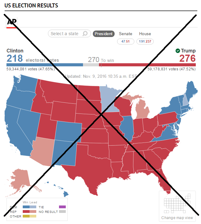
For example, here's the election map I saw on our local news website this morning, attributed to the AP. Notice that Maine (in the top/right corner) is all blue, which visually makes you think that Hillary Clinton won the entire state. But actually, she only won 3 of the 4 electoral votes there.
Of course, I was ecstatic to see such a mapping challenge come along, so I could show off how a SAS programmer can customize a map, and represent this type of non-standard data! (the ability to customize the graphs is one of SAS' strong points)
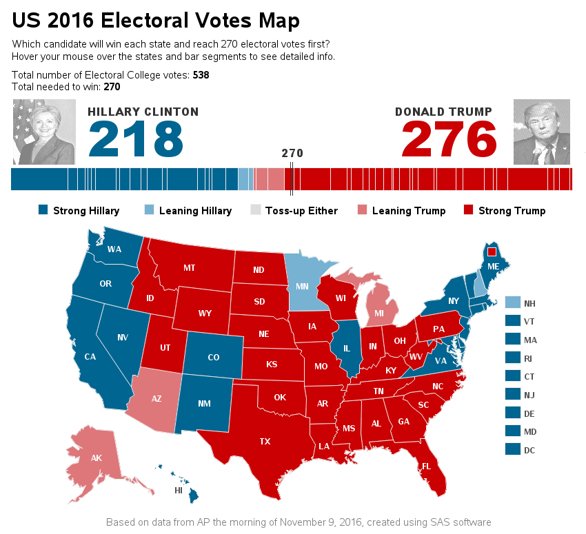
Here's what I came up with ... I added a rectangular map area overlapping the northeast section of Maine (ME), and called it ME2. And rather than Maine in the hover-text, I set that to "Maine, district 2". I won't bore you with the coding details, but the end result is a map that's visually more correct than the official AP map. :)
Feel free to click my map snapshot below, to see the full-size version, with html mouse-over text for the states and the segments of the horizontal bar (each bar segments represents a state, with the size of the bar segment representing the number of electoral votes).
And I'll leave you with a cool picture of my friend Hannah. She's an artist, and it even shows in her selfies! :)


1 Comment
The answer is cheating to me. The three swing states it must be recount, because I think three states will win by Hillary Clinton 0.3% to 0.7%.