With the US Affordable Care Act (ACA) and other health topics in the news lately, I wondered how much people spend on healthcare in various countries. Of course spending varies from person to person, so I decided to take a look at the average per capita spending in each country (it's not perfect, but it's still interesting!).
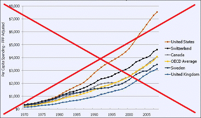
First, I decided to look around to see what's already out there. I found the following graph in a Kaiser Family Foundation (KFF) publication. It was generally what I was looking for, but only showed a handful of countries, and wasn't the easiest to read.
I did a little digging, and found that similar data were available for several other countries too. So I downloaded the csv from the Organisation for Economic Co-operation and Development webpage (oecd.org), and read it into SAS.
Since I was including more countries in my graph, I knew that having a different color for each country was not going to work (it was already difficult to discern the 6 colors used in the original graph). Instead of using colors and a color legend, I added html hover-text with the country names to each line (you'll need to click the snapshot below, to see the interactive version), and labeled certain countries to provide some quick/easy reference points.
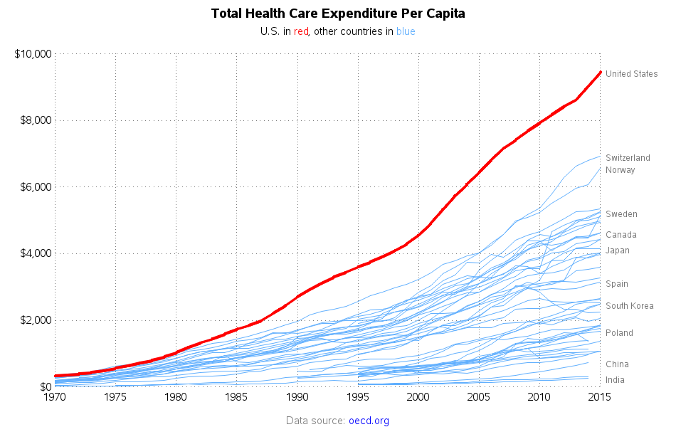
I liked my graph better than the original, but it was still difficult to compare the values in the 1970s and 80s. Since the graph showed current-dollar values, the more recent years had much higher values (because of inflation), which squished the values on the left side of the graph. I tried using the consumer price index (cpi) and converting all the values to constant (~1983) dollars, but I wasn't really confident that applying the US cpi to other countries was a valid thing to do. Also, I wasn't sure whether to use the cpi for all items, medical care, or something else.
Let's take a little intermission, while we think of a different way to visualize this data. Here's a picture that my friend Margie made for me (special, just for this blog). What better way to take a "closer look" at data, than to use a magnifying glass!?! Thanks Margie!

And now, with my mind cleared and thinking outside the box, I came up with a different way to graph the data. What I really wanted to do was compare the other countries with the US, therefore why not do something more direct, such as calculate the other countries' spending as a percent of the US spending! This way, I have a number that I can compare from year to year much more easily.
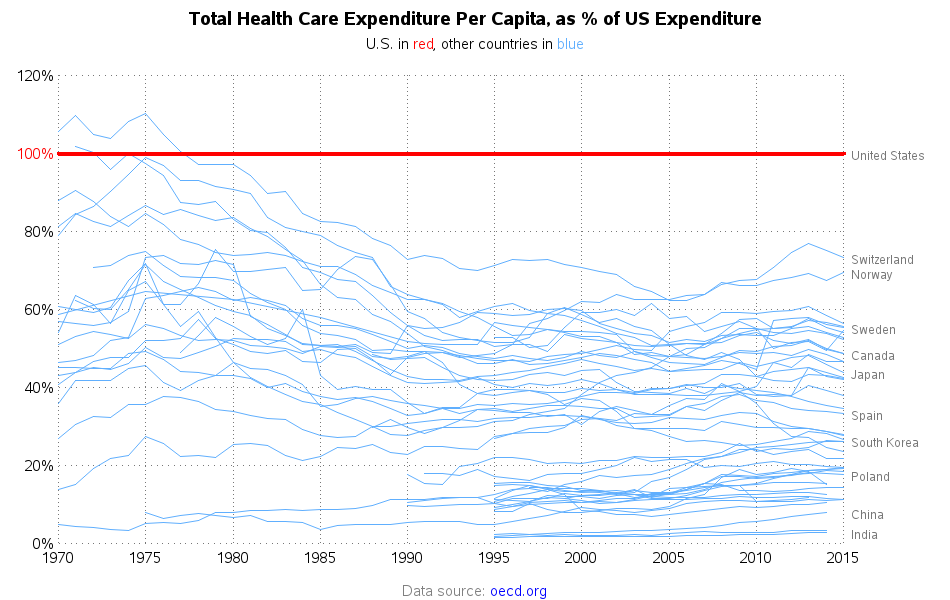
This graph shows that since about 1990, the other countries have spent less than 75% of what the US spent on per capita healthcare (most of them way less). If the US spends more, do we get more? If other countries spend less, do they get worse healthcare? I guess those are the big questions ... and hopefully I will find some data to answer those questions in an upcoming blog!
So, what are your theories and thoughts on healthcare, and why the US spends so much more per capita than the other countries? I wonder if there's a lot of variance on the per capita spending, depending on income level, and such? What's the "right amount" to spend, for an acceptable level of health care? Feel free to share your thoughts and suggestions in the comments section!


11 Comments
Do the dollars for the US include all types of plastic surgery/augmentation?
I would hope/assume not, but I didn't see that spelled-out in any of the things I read. Maybe someone a bit more familiar with this data can provide more specifics(?)
Pingback: How much does it cost to live to 100? - SAS Learning Post
Can look at life expectancy and infant mortality rate as general health outcomes?
I think those would be a good start!
It might be interesting to look at the percentage of Healthcare $ per capita versus income per capita.
agreed
Excellent piece of work, Robert. Can you pick out which of the blue lines is the UK? I suspect we're always towards the bottom. Thanks, Roger
Excellent question! - I would recommend downloading the code (http://robslink.com/SAS/democd89/healthcare_spending_info.htm) and the data (http://robslink.com/SAS/democd89/DP_LIVE_13102016192442914.csv) and then change the code to make UK the red line ... then it will be easy to see! :)
This is a great blog post! There is more information, with a plethora of sources and interactive graphs on OurWorldInData.org. There is data on healthcare expenditure per capita vs. GDP.
Great website with interesting graphs & data, Paul! Thanks for the link!