Just like my hero Mike Rowe on the Dirty Jobs TV show, I'm finally diving into an area involving water quality ... and poop! Let's take a graphical look at just how clean (or dirty) the water is, at the lake where my Raleigh Dragon Boat Club practices...
Before we get into the data analysis, here's a picture of our dragon boat team. The boat is about 43 feet long and there are 20 paddlers, a drummer, and a steersperson. Several boats line up at the starting line, and it's a straight-line race to the finish line (generally 300 to 500 meters). The paddlers usually get a little wet from water splashing off of the paddles, and there's always the chance of a boat getting swamped if the water is choppy, so you kinda want that water to be clean. See how I sneaked my way back into the data analysis topic!?! ;)
Our team's boat is housed at Lake Wheeler - a small lake on the south side of Raleigh, with not too much motorboat traffic. Several years ago, the lake got a somewhat bad reputation for being dirty because it was frequently closed due to high levels of bacteria found in poop. Although it had this reputation, I had never personally witnessed it being closed while attending dragon boat practice there, once or twice a week for the past ~3 years. I wondered if maybe the lake's water quality had improved ... and of course a good way to find out would be through some data visualization!
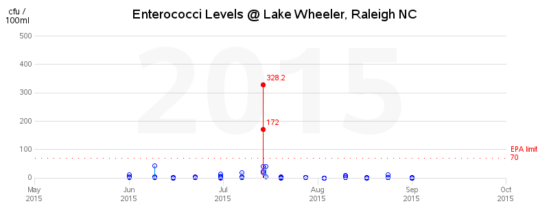
After a bit of web searching, I found a page on the Wake County website that had data tables for 2009-2015. The tables were color-coded to help identify the bad days, but I felt like I could get a much better grasp of the information using a graph. So I copy-n-pasted the data from the pdf documents into text files that SAS could read, and imported the values into a SAS dataset. I plotted the enterococci level for the most recent year, and the levels didn't look too bad ... the readings were only above the EPA limit on one day (July 14).
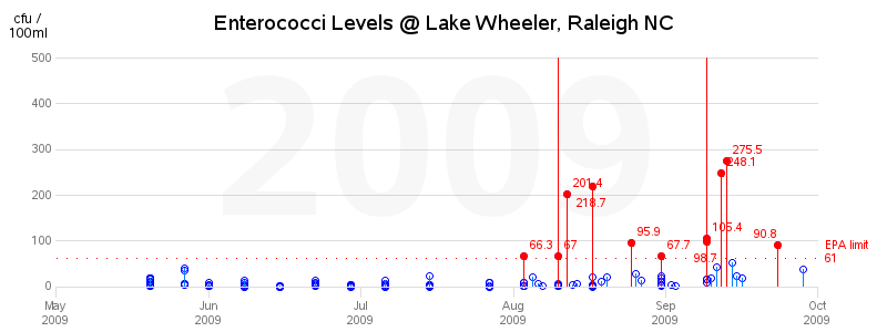
I wondered how this past year compared to the years when it got the bad reputation, so I also plotted the oldest data available (year 2009) to compare. That year had many days over the EPA limit, and two of the days even went "off the charts" for the axis scale of 500 (a number that I arbitrarily chose).
Getting down and dirty with lake water quality data #dataviz Share on XBeing a curious person, I wanted to find out what was causing these high bacteria levels, and I did some web-searching to see what I could find on the topic. Apparently storm water run-off and septic tanks can contribute to the problem. Also, Cary had an 8 million gallon sewage spill which closed the lake in 2006 (I don't have data from that year to plot though). And a 2009 article claims that bird poop is probably to blame for many of the closures, with part of the solution being for the park staff to pick up the poop rather than sweeping it into the water. The lake was also made a primary water supply for Raleigh in 2010, which perhaps prompted an increased vigilance for keeping the water clean(?) Whatever the reason, or combination of reasons, the water quality seems to have gone up since 2009/2010, according to the graphs.Bird poop causing the lake closures might sound a little far-fetched, but I can actually believe it. There is quite a large population of ducks and geese at the lake, and they love to hang out on the docks ... and poop. Many times when we have dragon boat practice early in the morning, the docks are literally covered with poop (for example, a piece of poop about every 6 inches) and there's a lucky park worker clearing it off with a pooper scooper. And even if removing the bird poop from the docks doesn't improve the water quality, it sure makes getting into our dragon boat more pleasant! :)
If you want to see the plots for enterococci, and e. coli. for all the years, you can click these links. And here's a link to the code, so you can see how I created them.


5 Comments
Log scale would allow everything to fit and is more appropriate for this kind of data
Perhaps ... but my main focus is on the lower values right near the borderline of acceptable/unacceptable, rather than seeing how high the highest values go. :)
Rob,
Is it possible to label the off-the-chart points with their values?
For the ones that went outside the axes, I contemplated maybe showing a marker, or showing a label (using annotate) ... but I decided to do neither. A marker might be misleading, and if I add a label, then I would have to handle the case of possibly overlapping labels. For the markers inside the axes, if their labels overlap, you can still hover over the marker to see what the value is (and the gplot 'pointlabel' does some built-in collision avoidance) ... but if I annotate labels, they won't be able to use either of those things in the case of overlapping labels.
I'm still contemplating maybe doing 'something' though! :)
Rob,
That's some great coding that I plan to use often! And thanks for the link to the pooper-scoopers. I had no idea there were so many models. That GoGo Stik looks like it would come in more handy than even your code!