Are you a legitimate hard-working company that has been threatened with a lawsuit, by a patent troll? If so, the graphs in this blog should make you happy!
Speaking of 'happy' and 'troll' - here's a picture of a happy Troll Doll from my friend Hannah. Don't you just hate how patent trolls give the word 'troll' a bad name? Hannah commented that, "Patent trolls could learn a thing or two from good luck Trolls," and I wholeheartedly agree! - hahaha!

In recent years, patent trolling has been very profitable. Perhaps that is one of the reasons that the number of patent legal-case filings had been increasing (in combination with other factors, such as the joinder provisions of the American Invents Act that block a patentee from filing suit against multiple unrelated parties in a single lawsuit).
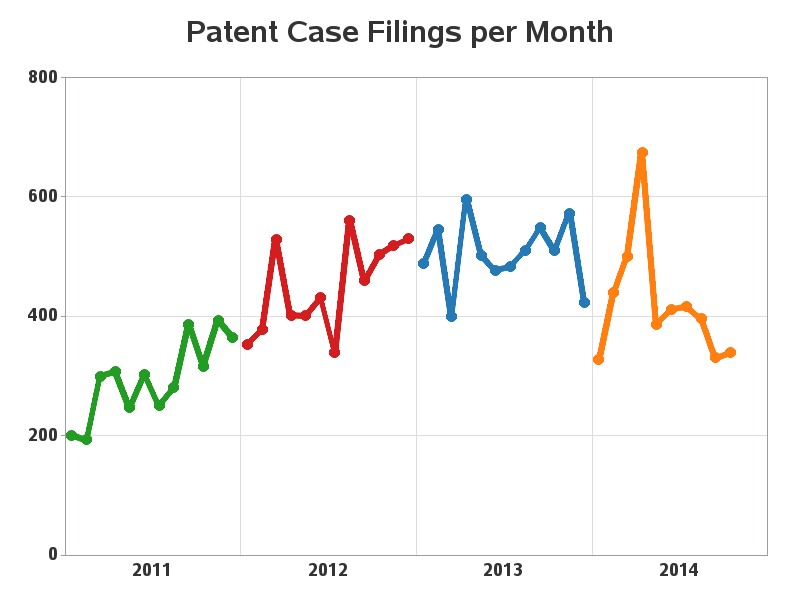
But enough about the number of patent case filings going up - we're here to talk about them recently going down! I found an interesting article by Lex Machina in which he showed a graph of the number of patent case filings per month since 2011, and the graph showed that the number of filings had gone down considerably during the past few months.
I decided to create a similar SAS graph, and I include it below (click the graph to see the full size version, with html hover-text on the plot markers). Note that I suppressed the horizontal axis tick marks and values, and annotated the years along that axis instead (annotate is so handy that way!)
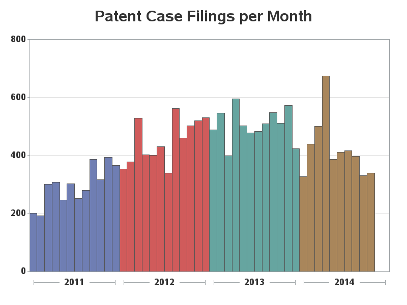
Although a line plot is a good way to show trends, I always like to plot data in several different ways to get a more complete mental picture. With quantities, I often like to use bar charts, because the heights of the bars give you a way to visually compare the quantities, and the 'area' of the bars gives you a more direct visual representation of the data. So here's a bar chart of the same data, grouped by year, and using the SAS default colors for the htmlblue style. Note that no annotation was required in the bar chart (the year labels are provided by the group axis).
So, which do you prefer in this situation - the line chart or the bar chart, and why?