Earth is an explosive world! Data from the Smithsonian Institution's Global Volcanism Program (GVP) documents Earth's volcanoes and their eruptive history over the past 10,000 years. The GVP database includes the names, locations, types, and features of more than 1,500 volcanoes. Let's look closer into volcanic eruptions across the globe and find out what is the most active volcano, most common volcano type and most active regions.
Similar to my previous post about meteorites striking earth, I wanted to create an infographic visualization highlighting the most interesting facts around volcanic eruptions.
Data preparation for the infographic
You can download a spreadsheet version of the data from here. After import into SAS Visual Analytics you can start exploring the data. You may want to rename some of the data items in the data panel and configure the Name column as geographical item. This means telling the application about the fact that this data item represents a geographical location on earth. The required latitude and longitude columns are part of the data source.
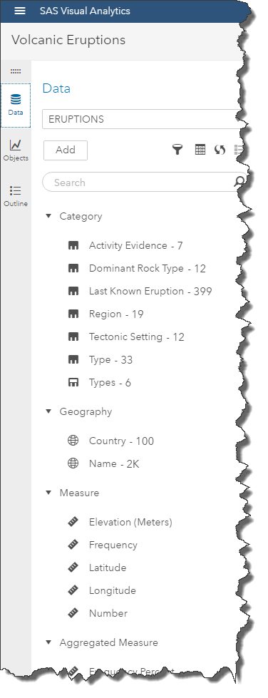
As part of data preparation you may also want to run some basic analysis to understand distribution and available measures. SAS Visual Analytics shows you the available data items in the data panel along with distinct count for each of the categorical values:
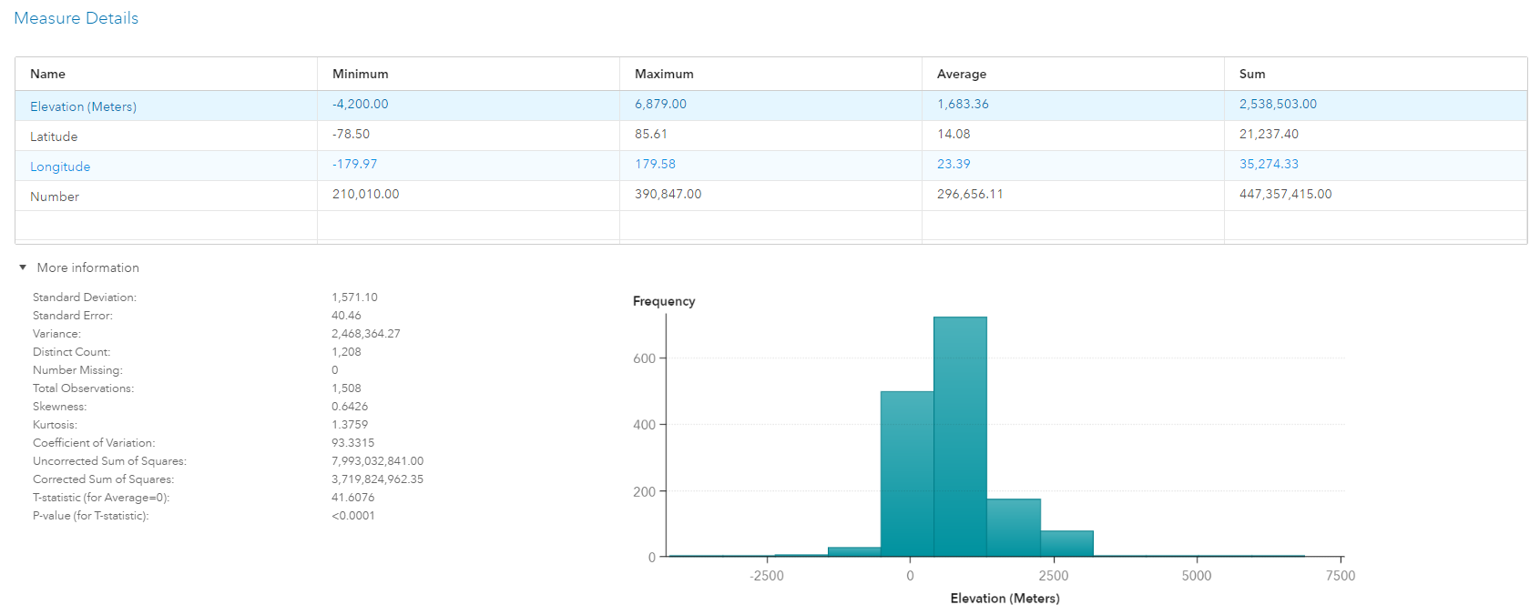
You also have access to measure details, which gives you a good understanding of aggregation ranges such as min and max. For instance, you can see the highest volcano is almost 7,000 meters high.
Designing your infographic
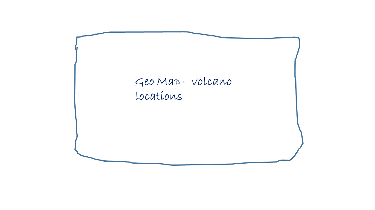
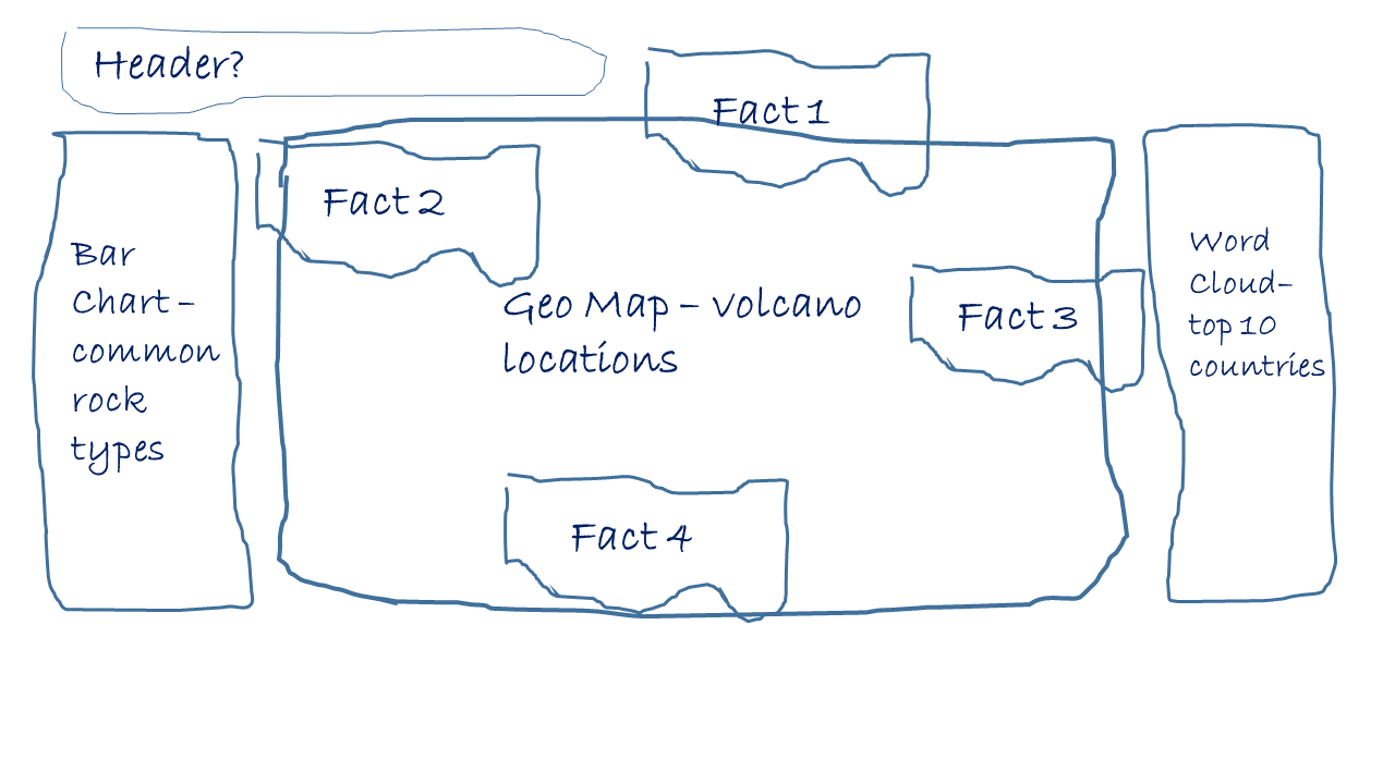
Given the data structure and provided volcano locations, I'm making a geographical map the centerpiece of the report again. To make the report a bit more interesting I'm also planning to add a few key values such as highest volcano, most active region, etc. To round things up I'm going to add a few interesting facts around volcano eruptions.
First design attempt:
Second design with the bar chart and word cloud to the sides:
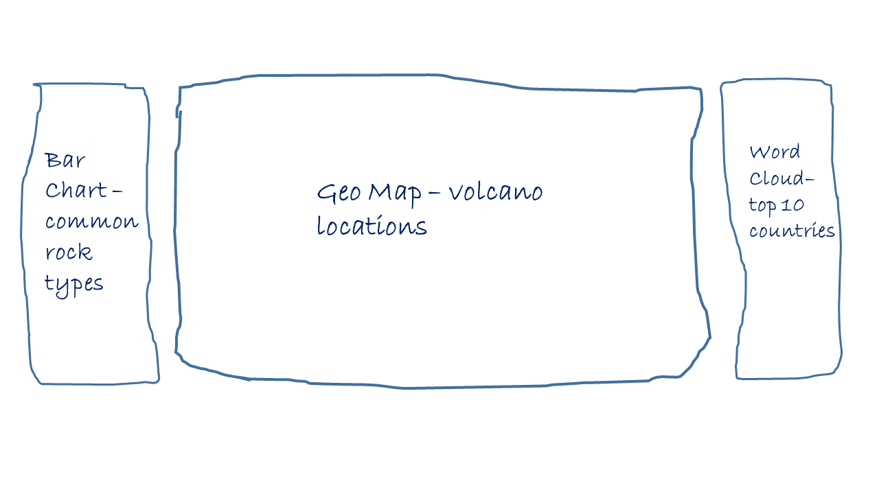
I'm probably going to add header to the top left and volcano facts on top of the map. Final positions I will figure out later when building the report:
Building the infographic report
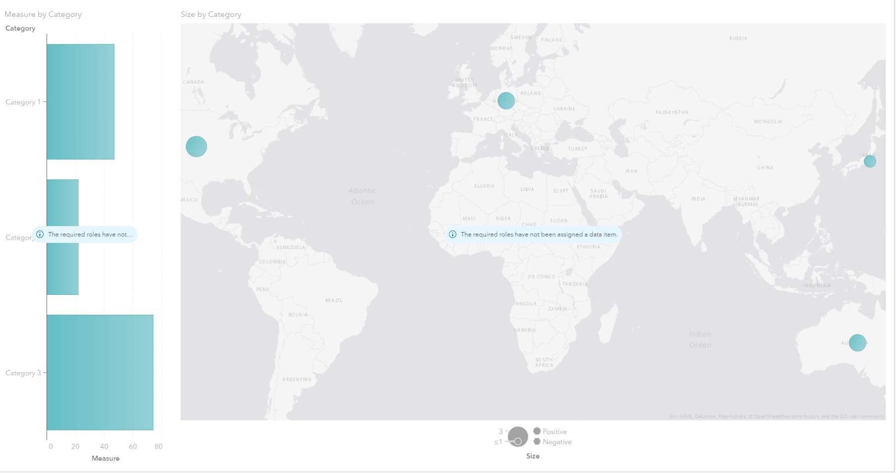
Given our previous design ideas I'm using SAS Visual Analytics 8.1 to build the actual report. Starting with the main geographical map in the center of the canvas and the common rock type bar chart to the left:
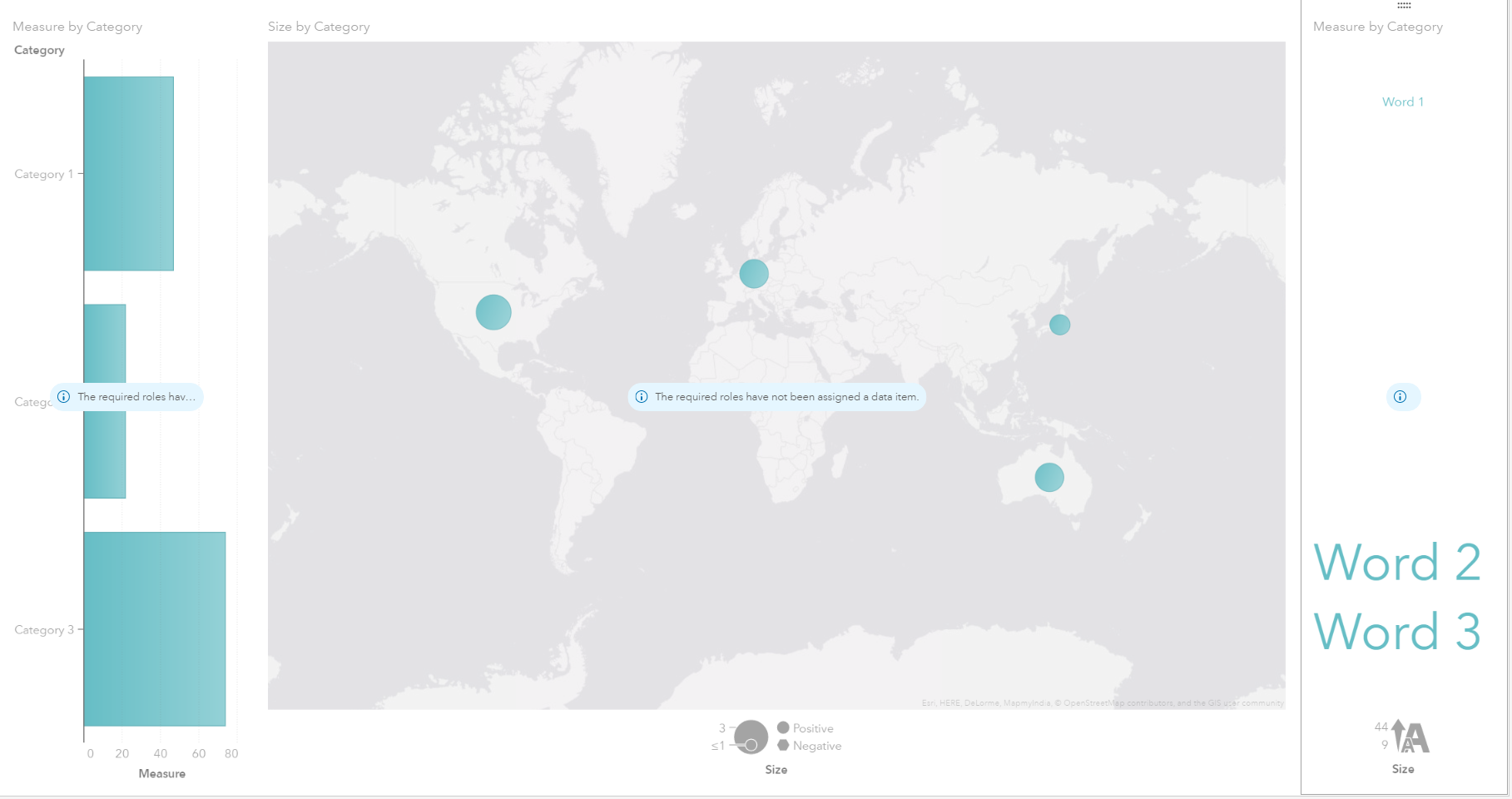
Next, I'm adding the top countries visualization to the right:
Let's bring the visualization to life by assigning data items and color volcanic eruption locations by the type of volcano:
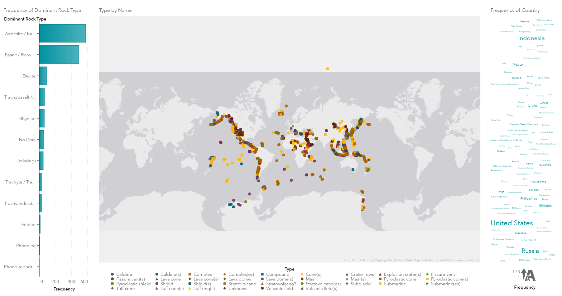
We probably can improve a few things here. Given the distinct count of volcano types (33 in total as shown in the data panel above) we get too many colors, making our map rather confusing and less readable. I'm going to merge some of the types by creating a custom category. The custom category builder makes this task very straight forward:
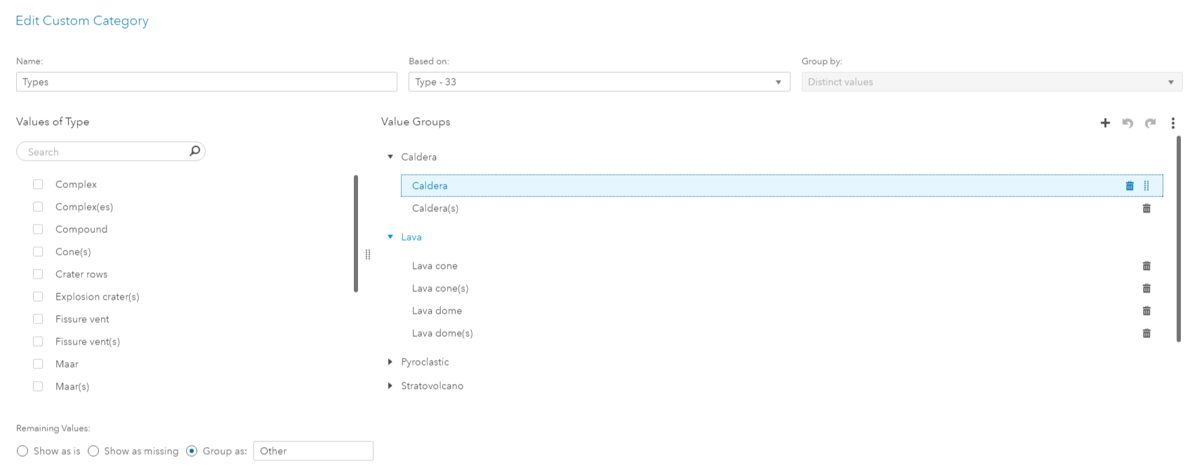
I'm also going to filter out eruptions in Antarctica to move the focus to the main continents. We are getting too many of the dominant rock types (bar chart) and too many countries (word cloud) - so let's apply a top 5 and top 10 rank each:
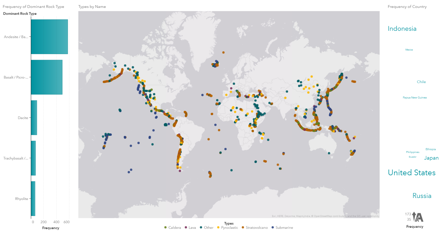
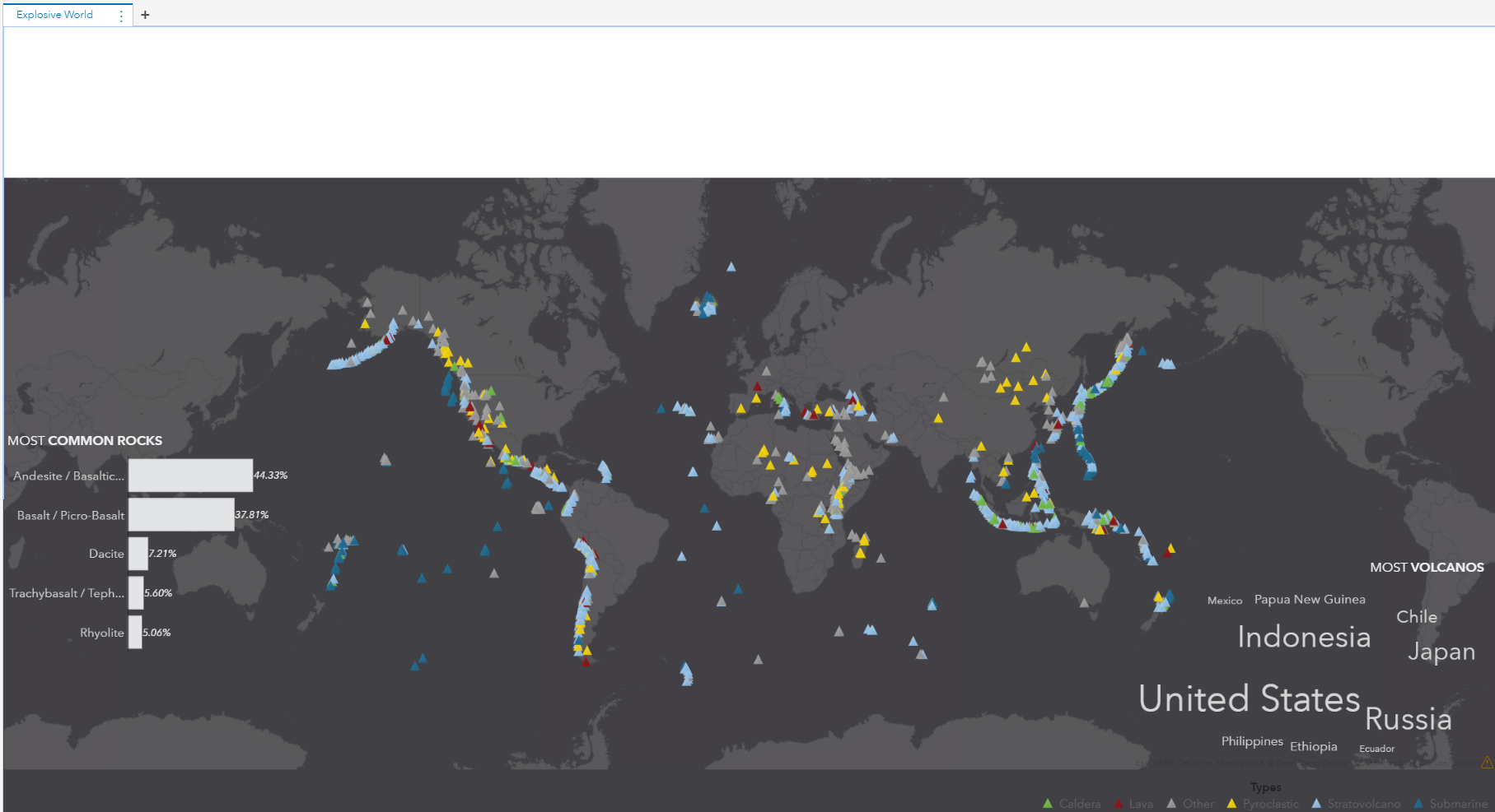
In order to overlay the charts on top of the main map - I'm going to use a precision container with the map almost taking up the entire report canvas. I will leave some space (about 10%) at the top for the banner added later. With a slightly darker map background we get:
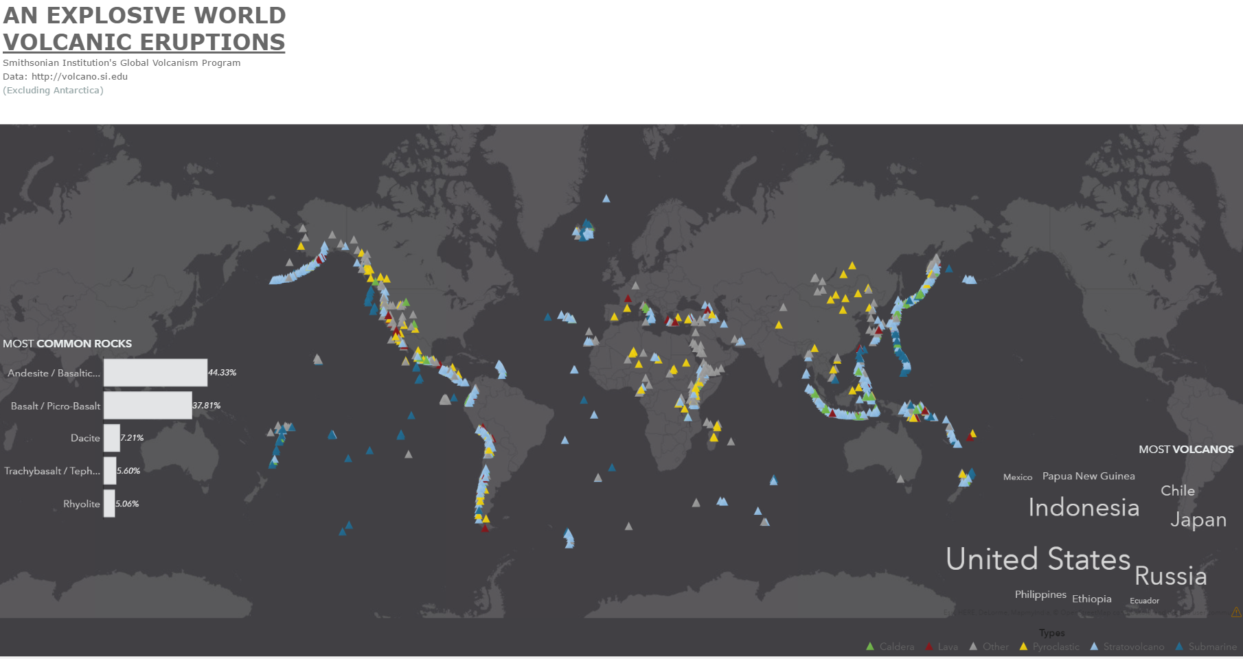
Let's add a title and use formatting tools to make this bold and match the color code (x414044) of the map background:
To make things more interesting I searched the web for a few interesting facts about volcanoes (largest eruption, most active volcano, etc.). I'm adding these to the side of the report:
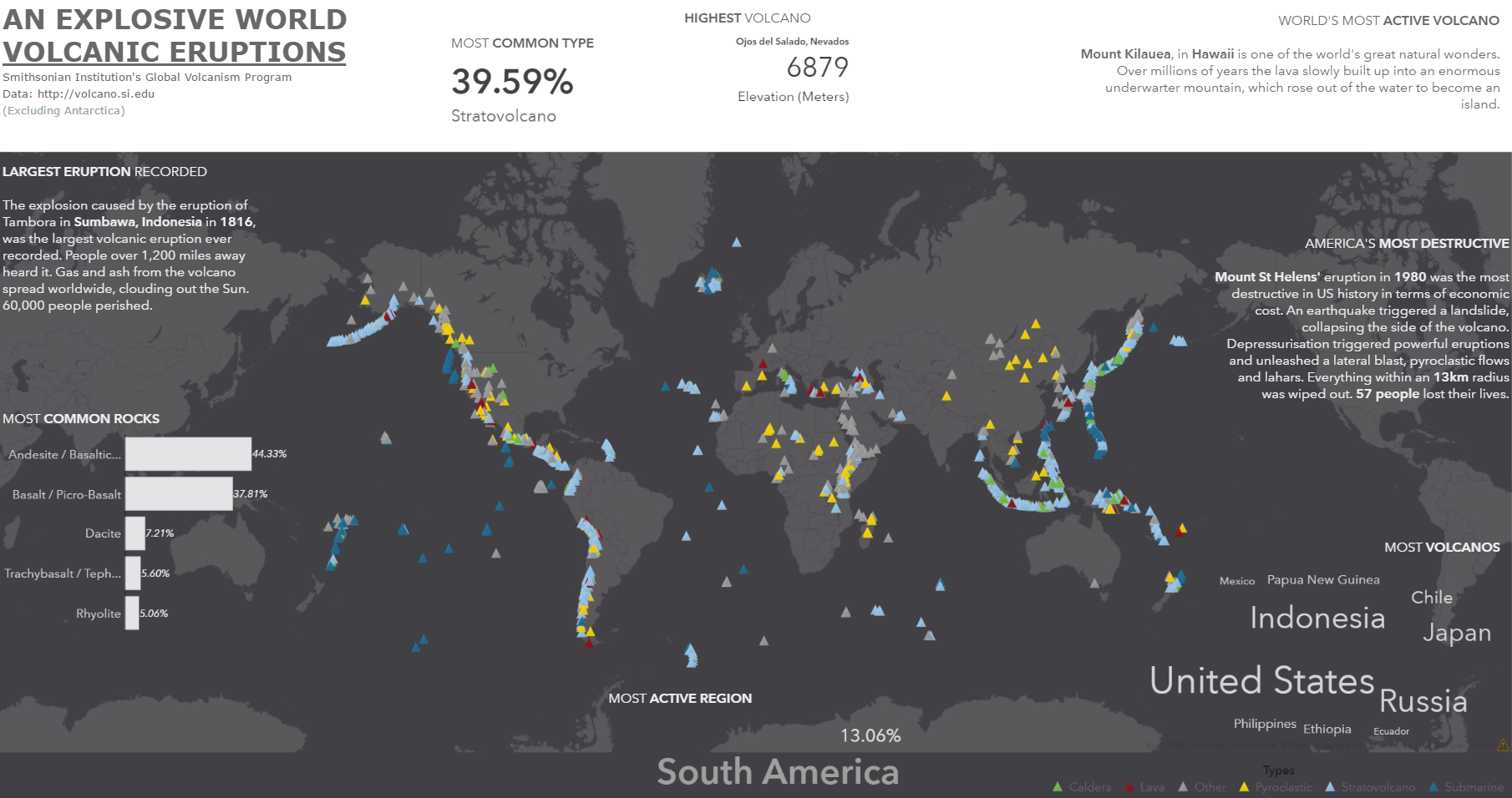
To round things up and make the report look more like the inforgraphic style, I'm going to add a few volcano images. One at the top spanning the entire report width (I used an imaging tool to match the map background color) and one at the bottom left overlaid on top of the map. Make sure the image is aligned correctly and doesn't leave a gap. This will have the illusion the map and image being one large visualization. The final report will come up as:
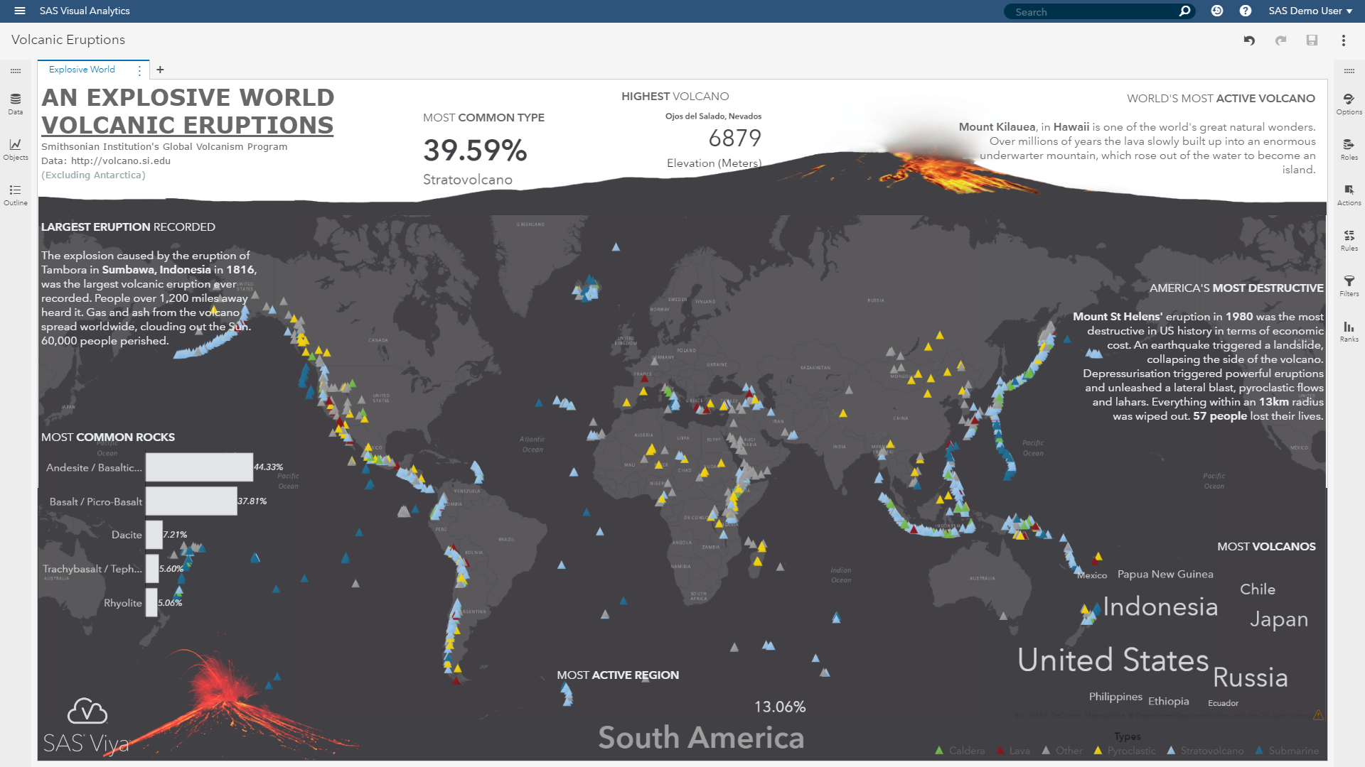
Not bad for a bit of drag'n'drop!
Conclusion
SAS Visual Analytics is not only an impressive data scientist and business analyst tool. It also provides a range of tools to create modern data visualizations using ready-to-use controls in a self-service interface. Use your imagination and make your analytical reports even more appealing and interesting. If your boss asks for a shiny report, give him one!
References
Global Volcanism Program, 2013. Volcanoes of the World, v. 4.5.4. Venzke, E (ed.). Smithsonian Institution. Downloaded 31 Mar 2017. http://dx.doi.org/10.5479/si.GVP.VOTW4-2013

5 Comments
Adding the images made a total change. Cold we include gif or video to make it more dynamic?. Thank you for Sharing.
Yes, you can include any web enabled content including animated gif or web videos (e.g. youtube). Hope this helps! Cheers, Falko
Very Impressive use of VA to create an infographic/poster! - The Graph Guy
Nice job Falko, very creative and shows the power of SAS using the latest version of Visual Analytics. Data driven art is such a powerful and engaging medium. Thanks for sharing
Falko, thanks for the overview. I'm a long time user of SAS GMAP and annotate. I shutter to think how much time this would take to code in Base SAS. You and VA make it look easy. Thanks. again.