 The study of social networks has gained importance over the years within social and behavioral research on HIV and AIDS. Social network research can show routes of potential viral transfer, and be used to understand the influence of peer norms and practices on the risk behaviors of individuals.
This example analyzes the results of a study of high-risk drug use for HIV prevention in Hartford, Connecticut, using Python and SAS. This social network has 194 nodes and 273 edges, which represent drug users and the connections between those users.
Background
SAS support for network analysis has been around for a while. In fact, I have shown related techniques using SAS Visual Analytics in my previous post. If you are new to social network analysis you may want to review the blog first as it provides a great introduction into the world of networks.
This post is written for the application developer or data scientist who has programming experience and seeks self-service access to comprehensive analytics. I will highlight how to gain access to SAS® ViyaTM using REST API in Python as well as demonstrate how to drive a simple analytical pipeline to analyse a social network.
The recent release of SAS Viya provides a full set of innovative algorithms and proven analytical methods for exploring experimental questions but it's also built based on an open architecture. This means you can integrate SAS Viya seamlessly into your application infrastructure as well as drive analytical models using any programming language. This blog post highlights one example of how this openness can be used to access powerful SAS analytics.
Prerequisites
While you could go ahead and simply issue a series of REST API calls to access the data – it's typically more efficient to use a programming language to structure your work and make it repeatable. I decided to use Python, as it's very popular among young data scientists and very common in universities.
For demonstration purposes, I'm using an interface called Jupyter, an open and interactive web-based platform capable of running Python code as well as embed markup text. The SAS community also hosts many additional examples for accessing SAS data with Jupyter. In fact, Jupyter supports many different programming languages, including SAS. You may also be interested in trying out the related SAS kernel.
After installing Jupyter you will also need to install the SAS Scripting Wrapper for Analytics Transfer (SWAT). This package is the Python client to SAS Cloud Analytic Services (CAS). It allows users to execute CAS actions and process the results all from Python. SWAT package information and Jupyter Notebook examples for getting started are also available from https://github.com/sassoftware .
Accessing SAS Cloud Analytic Services (CAS)
The core of SAS Viya is the analytical run-time environment called SAS Cloud Analytic Services (CAS). In order for you to execute actions or access data, a connection session is required. You can either use a binary connection (which is recommended for transferring large amount of data) or use REST API via HTTP or HTTPS communication. Since I'm analyzing a very small network for demonstration purposes I will use the REST protocol. More information about Viya and CAS can be found in the related online documentation.
One of the first steps in any program is to define the libraries you are going to use. In Python, this is done using the import statement. Besides the very common matplotlib library, I'm also going to use networkx to render and visualize the network graphs in Python.
from swat import * import numpy as np import pandas as pd import matplotlib.pyplot as plt import matplotlib.colors as colors # package includes utilities for color ranges import matplotlib.cm as cmx import networkx as nx # to render the network graph %matplotlib inline |
Now the SWAT libraries have been loaded we can issue the first command to connect to CAS and create a session for the given user. Note, that parameters used will vary dependent on your environment. The variable "s" will hold the session object and will be referenced in future calls.
s = CAS('http://sasviya.mycompany.com:8777', 8777, 'myuser', 'mypass') |
Action sets
The CAS server organizes analytical actions into action sets. An action set can hold many different actions from simple data or session management tasks to sophisticated analytical tasks. For this network analysis I'm going to use an action set named hyperGroup that has only one action, also called hyperGroup.
s.loadactionset('hyperGroup') |
Loading data
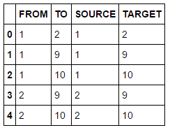
In order to perform any analytical modelling, we need data. We have several options to load data including using an existing data set on the server or uploading a new set from the local environment. The SAS community web sites shows additional examples how data can be loaded. The following examples uploads a local CSV file to the server and stores data into a table named DRUG_NETWORK. The table has only two columns FROM and TO of type numeric.
inputDataset = s.upload("data/drug_network.csv", casout=dict(name='DRUG_NETWORK', promote = True)) |
During analytical modelling you often have to change data structures, filter or merge data sources. The following code lines show an example of how to execute SAS Data Step code and derive new columns. The put function here converts both numeric columns to new character columns SOURCE and TARGET.
sasCode = 'SOURCE = put(FROM,best.); TARGET = put(TO,best.);\n' dataset = inputDataset.datastep(sasCode,casout=dict(name='DRUG_NETWORK2', replace = True)) |
Data exploration
A common task when building analytical models is to get an understanding of your data first. This includes simple tasks such as retrieving column information and descriptive statistics as well as understanding data distribution (max, min, etc.). The following example returns the first 5 rows of my previously updated data set.
dataset.fetch(to=5, sastypes=False, format=True) #list top 5 rows |
A simple summary statistics reveals more details including the total number of 273 edges in our data set.
dataset.summary() |

Graph layout
Now that prerequisites are done we can dive into the world of analytics. First we will visualize the network to get a basic understanding of its structure and size. We are going to use the previously loaded hypergroup action to calculate positions of vertices using a force-directed algorithm. Hypergroup can also be used to find clusters, calculate graph layouts and determine network metrics such as community and centrality.
Tip: For a full documentation of any given command, such as hypergroup, you can execute the help method, e.g. help(s.hyperGroup). This will show an overview about the given action including all supported parameters.
s.hyperGroup.hyperGroup( createOut = "NEVER", # this suppresses the creation of a table that’s usually produced, but it’s not needed here allGraphs = True, # process all graphs even if disconnected inputs = ["SOURCE", "TARGET"], # the source and target column indicating an edge table = dataset, # the input data set edges = table(name='edges',replace=True), # result table containing edge attributes vertices = table(name='nodes',replace=True) # result table containing vertice attributes ) renderNetworkGraph() # a helper method to create the graph using networkx package |
Note, the source code for the helper method "renderNetworkGraph" is in Appendix A.
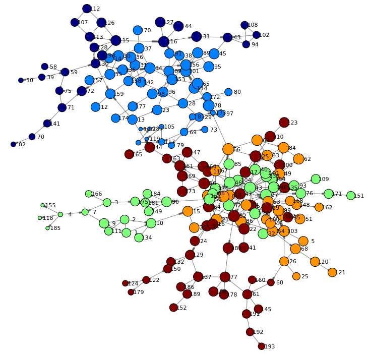
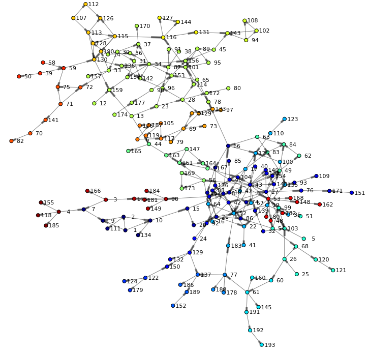
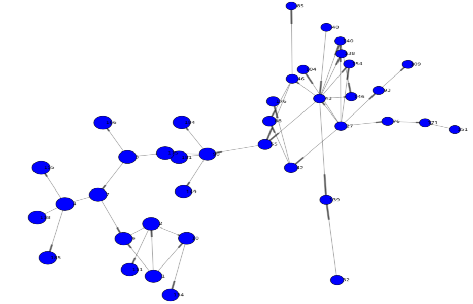
The following network is rendered and offers a first view of the graph. We can see two main branches and get an understanding of high and low density areas. You may also notice that just a few nodes connect both branches (such as node 44 or 66) - indicating specific individuals are involved in the routes of potential viral transfer across branches.
Community detection
In order to understand the relationship of users in the social network we are going to analyze the community an individual belongs to. Community detection, or clustering, is the process by which a network is partitioned into communities such that links within community sub-graphs are more densely connected than the links between communities. People in the same community typically share common attributes and indicate they are strongly connected. To enable community detection in hypergroup we are specifying the community parameter.
s.hyperGroup.hyperGroup( createOut = "NEVER", allGraphs = True, community = True, # set to true to calculate communities inputs = ["SOURCE", "TARGET"], table = dataset, edges = table(name='edges',replace=True), vertices = table(name='nodes',replace=True) ) |
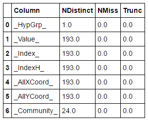
The updated nodes table now contains an additional column _Community_ with values for each node in our network. Given this data set we can perform basic statistics for example a distinct count across columns:
nodesOut = s.CASTable('nodes') nodesOut.distinct() |
Result table shows that hypergroup determined 24 communities in our network.
Let's look at the top 5 biggest communities and analyze node distribution. A simple topK analysis based on our community column in the nodes data set will give us the answer.
s.simple.topK( aggregator = "N", topK = 4, table = table(name='nodes'), inputs = ["_Community_"], casOut = table(name='topKOut',replace=True) ) topKOut = s.fetch(sortBy=["_Rank_"],to=10, table=table(name='topKOut')) |
Rather than using a tabular output we redirected the fetched rows into a Python variable. We are going to use this to generate a bar chart showing the top 5 biggest communities:
topKOutFetch = topKOut['Fetch'] ind = np.arange(5) # the x locations for the bars plt.figure(figsize=(8,4)) p1 = plt.bar(ind + 0.2, topKOutFetch._Score_, 0.5, color='orange', alpha=0.75) plt.ylabel('Vertices', fontsize=12) plt.xlabel('Community', fontsize=12) plt.title('Number of nodes for the top 5 communities') plt.xticks(ind + 0.2, topKOutFetch._Fmtvar_) plt.show() |
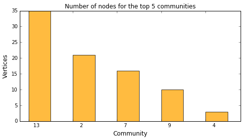
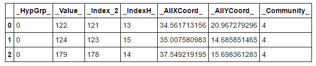
This shows that the biggest community 13 has 35 vertices. You may also drill into particular communities to see their members. The following example shows nodes within community 4:
nodesOut = s.CASTable('nodes', where="_Community_ EQ 4") nodesOut.fetch(to=5, sastypes=False, format=True) |
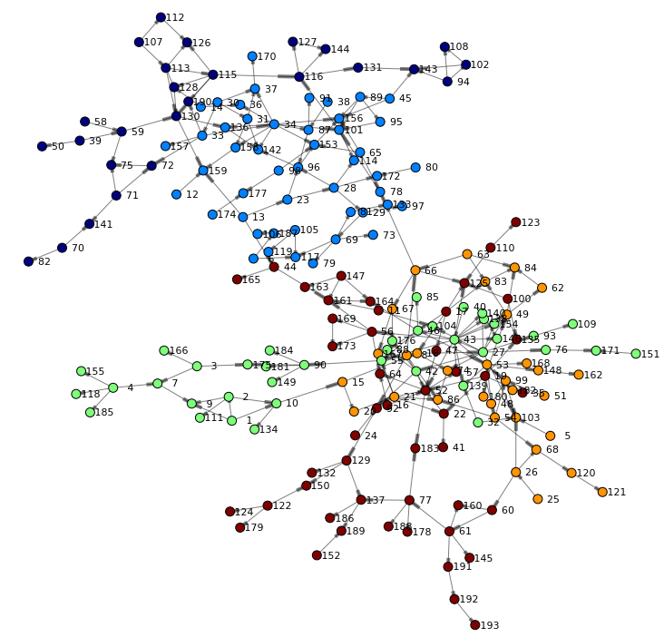
Finally, let's render the network again – this time taking the community into account when coloring nodes:
renderNetworkGraph(colorVar="_Community_") |
Often the number of communities need to be adjusted dependent on the size of your network and the desired outcome. You can control how hypergroup merges small communities into larger ones. Communities can be merged:
- into neighboring communities randomly
- into the neighboring community that has the smallest number of vertices
- by the largest number of vertices
- into communities that already have nCommunities vertices
The following will reduce the total number of communities to 5 by specifying the nCommunities parameter.
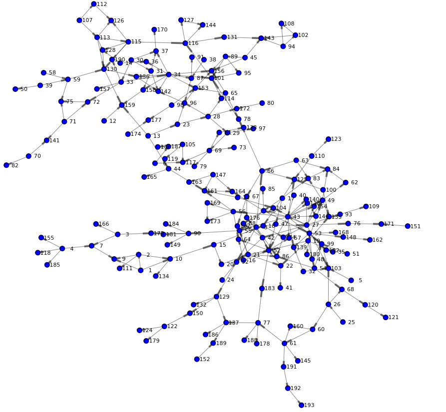
s.hyperGroup.hyperGroup( createOut = "NEVER", allGraphs = True, community = True, nCommunities = 5, # total number of desired communities inputs = ["SOURCE", "TARGET"], table = dataset, edges = table(name='edges',replace=True), vertices = table(name='nodes',replace=True) ) renderNetworkGraph(colorVar="_Community_") |
Centrality analysis
Analyzing centrality helps to determine who is important in the network. An important person will be well connected and as such has high influence to other individuals in the network. In terms of our social network for drug users – this would indicate potential viral transfer and related risk behaviors of individuals.
The following hypergroup statement includes the centrality and scaleCentralities parameter. This will request hypergroup to calculate network metrics such as:
- Reach indicates the distance between a given node and the farthest connected node.
- Stress indicates how close a node is to all of its connected nodes.
- Betweenness measures the number of shortest paths an actor is on - which indicates how often actors can reach each other through it. A high score indicates it is a likely path for information flows.
- Centrality is proportional to the centrality of an actor’s neighbors. A high score indicates the actor is popular among popular actors.
- Closeness indicates the relative distance to all other actors. Closeness is based on the distance between actors, where distance is given by the shortest path between a pair of actors. A high score indicates the actor is close to everyone.
Each of the metrics is represented as output column in the nodes data set.
s.hyperGroup.hyperGroup( createOut = "NEVER", allGraphs = True, community = True, nCommunities = 5, centrality = True, scaleCentralities = "CENTRAL1", # returns high centrality values closer to 1 inputs = ["SOURCE", "TARGET"], table = dataset, edges = table(name='edges',replace=True), vertices = table(name='nodes',replace=True) ) |
Let's render the network again using one of the centrality measures as node size. The betweenness centrality for example quantifies the number of times a node acts as a bridge along the shortest path(s) between two other nodes. As such it describes very well the importance of an individual in a network.
renderNetworkGraph(sizeVar="_Betweenness_") |
Subset a network branch
Looking at our network, it appears users in community 2 play an important role. This is indicated by the overall centrality of the community but also by the high beetweenness value of the majority of individuals in this community. The following code filters and renders the network for community 2 only giving us a better visualization of this sub network.
renderNetworkGraph(filterCommunity=2, size=50, sizeVar="_CentroidAngle_", sizeMultipler=10) |
Further analysis could now research unique attributes of individuals in this network cluster in order to learn more about their influence in the overall social network.
Further reading and research
You can download the complete Jupyter notebook and data used here. You may also check out the SAS Viya online documentation for deployment and API references.
The example above utilizes the standard two-dimensional force-directed graph layout. In more complex scenarios you may also want to consider making use of an additional dimension when analyzing network structures. The hypergroup action supports three-dimensional graph layouts which opens up an entire new dimension when looking at node relationships. Requesting 3D layouts is done using the parameter threeD as shown in the following example.
s.hyperGroup.hyperGroup( createOut = "NEVER", community = True, threeD = True, farAway = 8, inputs = ["SOURCE", "TARGET"], table = dataset, edges = table(name='edges',replace=True), vertices = table(name='nodes',replace=True) ) |
Utilizing a graph engine such as jgraph produces an interactive visualization for the user to navigate in. In future blogs I will explore more details behind this exciting new world of network research. You may also download to the 3D version of the Jupyter notebook here for further research.

Conclusion
SAS Viya provides self-service access to comprehensive analytics for any data of any size, in one managed and monitored platform. It not only gives you access to powerful SAS Analytics but also data science experts the power of choice, with native interfaces for programmatic actions written in SAS or other languages – like Python, Java and Lua.
Appendix A
def renderNetworkGraph(filterCommunity=-1, size=18, sizeVar="_HypGrp_", colorVar="", sizeMultipler=500): # build an array of node positions and related colors based on community nodes = table(name='nodes') if filterCommunity >= 0: nodes.where = "_Community_ EQ %F" % filterCommunity nodesOut = s.fetch(nodes, to=1000) nodes = nodesOut['Fetch'] nodePos = {} nodeColor = {} nodeSize = {} communities = [] i = 0 for nodeId in nodes._Value_: nodePos[nodeId] = (nodes._AllXCoord_[i], nodes._AllYCoord_[i]) if colorVar: nodeColor[nodeId] = nodes[colorVar][i] if nodes[colorVar][i] not in communities: communities.append(nodes[colorVar][i]) nodeSize[nodeId] = max(nodes[sizeVar][i],0.1)*sizeMultipler i += 1 communities.sort() # build a list of source-target tuples edges = table(name='edges') if filterCommunity >= 0: edges.where = "_SCommunity_ EQ %F AND _TCommunity_ EQ %F" % (filterCommunity,filterCommunity) edgesOut = s.fetch(edges, to=1000) edges = edgesOut['Fetch'] edgeTuples = [] i = 0 for p in edges._Source_: edgeTuples.append( (edges._Source_[i], edges._Target_[i]) ) i += 1 # Add nodes and edges to the graph plt.figure(figsize=(size,size)) graph = nx.DiGraph() graph.add_edges_from(edgeTuples) # Size mapping getNodeSize=[nodeSize[v] for v in graph] # Color mapping jet = cm = plt.get_cmap('jet') getNodeColor=None if colorVar: getNodeColor=[nodeColor[v] for v in graph] cNorm = colors.Normalize(vmin=min(communities), vmax=max(communities)) scalarMap = cmx.ScalarMappable(norm=cNorm, cmap=jet) # Using a figure here to work-around the fact that networkx doesn't produce a labelled legend f = plt.figure(1) ax = f.add_subplot(1,1,1) for community in communities: ax.plot([0],[0], color=scalarMap.to_rgba(community), label="Community %s" % "{:2.0f}".format(community),linewidth=10) # render the graph nx.draw_networkx_nodes(graph,nodePos,node_size=getNodeSize,node_color=getNodeColor, cmap=jet) nx.draw_networkx_edges(graph,nodePos,width=1,alpha=0.5) nx.draw_networkx_labels(graph,nodePos,font_size=11,font_family='sans-serif') if len(communities) >0: plt.legend(loc='upper left',prop={'size':11}) plt.title('Hartford drug user social network', fontsize=30) plt.axis('off') plt.show() |

1 Comment
Great article Falco. Even though I'm always saying .... don't do 3D - I really dig the 3D image. 🙂