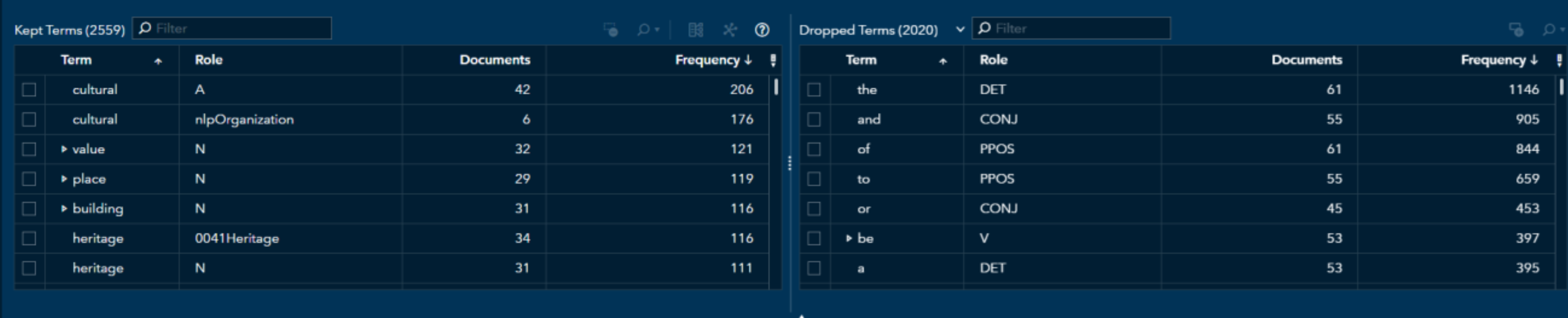
English

Data Visualization
Sanjay Matange 0
Overlay Bar Charts

A couple of days back, Rick Wicklin forwarded me a link to an article on the BadHessian Blog on creating a Bar Chart using six different freeware packages in R, Python and Julia.   The target bar chart was one produced by the Jetpack stat module with WordPress.  The graph is shown below. The unique feature of

Programming Tips
Jason Xin 0
Partitioning in Hadoop, sorting in SAS--same results, different methods

SAS In-Memory Statistics for Hadoop is a single interactive programming environment for analytics on Hadoop that  integrates analytical data preparation, exploration, modeling and deployment. It’s principle components are the IMSTAT procedure (PROC IMSTAT) and the SAS LASR Analytic Engine (or SASIOLA engine for input-output with LASR). Within the SAS In-Memory Statistics

Data Visualization
Sanjay Matange 0
Group order in GTL

This post could be titled something like "Everything you wanted to know about Group Order in GTL - and more."   The group ordering shows up in three different ways in your graph. Assignment of attributes (color, marker symbol) to group values. Position of group values in the graph. Display of the group

Analytics
Nele Coghe 0
Hot hot heat map

Although I’m not particularly excited about football (I admit, I don’t completely understand what offside means), I did follow the last World Cup with more than average attention. Not only for the handsome players, but especially for all the fascinating statistics that appeared. It struck me that heat maps popped

Analytics
Carl Farrell 0
Energized about energy

I’ve been told I have rocks for brains before, but right now I have rocks on the brain – the kind that are millions of years old and contain precious stores of oil and gas. One reason I have petroleum on my mind is that I’ve just returned from Brazil, where

Rick Wicklin 0
Add a prediction ellipse to a scatter plot in SAS

It is common in statistical graphics to overlay a prediction ellipse on a scatter plot. This article describes two easy ways to overlay prediction ellipses on a scatter plot by using SAS software. It also describes how to overlay multiple prediction ellipses for subpopulations. What is a prediction ellipse? A

Rick Wicklin 0
How to create and detect an empty matrix

An empty matrix is a matrix that has zero rows and zero columns. At first "empty matrix" sounds like an oxymoron, but when programming in a matrix language such as SAS/IML, empty matrices arise surprisingly often. Sometimes empty matrices occur because of a typographical error in your program. If you

Work & Life at SAS
Amanda Pack 0
Summer Sweatin': Part I

I love summer. I love the sunny days, the sound of the happy birds in the morning, growing tomatoes in my back yard, and playing outside with my family.  Beach or mountains – I’m 100% beach.  Sunshine or snow?  100% sunshine, palm trees, sand, and the beautiful sound of waves

Analytics
Renee Nocker 0
You snooze, you lose.....

This was probably my favorite of the myth-busters webcasts I have been spewing about, and now I definitely want to meet James Dallas so we can discuss and nod emphatically at each other’s insights on this topic! The “You can’t have analytics without IT” myth is the fourth myth covered

1 231 232 233 234 235 326