The DO Loop
Statistical programming in SAS with an emphasis on SAS/IML programs
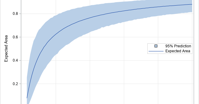
In my book Simulating Data with SAS, I show how to use a graphical tool, called the moment-ratio diagram, to characterize and compare continuous probability distributions based on their skewness and kurtosis (Wicklin, 2013, Chapter 16). The idea behind the moment-ratio diagram is that skewness and kurtosis are essential for
Did you add "learn something new" to your list of New Year's resolutions? Last week, I wrote about the most popular articles from The DO Loop in 2019. The most popular articles are about elementary topics in SAS programming or univariate statistics because those topics have broad appeal. Advanced topics
Many SAS procedures can automatically create a graph that overlays multiple prediction curves and their prediction limits. This graph (sometimes called a "fit plot" or a "sliced fit plot") is useful when you want to visualize a model in which a continuous response variable depends on one continuous explanatory variable
Last year, I wrote more than 100 posts for The DO Loop blog. The most popular articles were about SAS programming tips for data analysis, statistical analysis, and data visualization. Here are the most popular articles from 2019 in each category. SAS programming tips Create training, testing, and validation data
A 2-D "bin plot" counts the number of observations in each cell in a regular 2-D grid. The 2-D bin plot is essentially a 2-D version of a histogram: it provides an estimate for the density of a 2-D distribution. As I discuss in the article, "The essential guide to
Rockin' around the Christmas tree At the Christmas party hop. – Brenda Lee Last Christmas, I saw a fun blog post that used optimization methods to de-noise an image of a Christmas tree. Although there are specialized algorithms that remove random noise from an image, I am not going to