The DO Loop
Statistical programming in SAS with an emphasis on SAS/IML programs
I always emphasize efficiency in statistical programming. I have previously written about why you should never multiply with a large diagonal matrix in the SAS IML language. The reason is that it is more efficient to use elementwise multiplication than matrix multiplication. Specifically, if d is a column vector, then

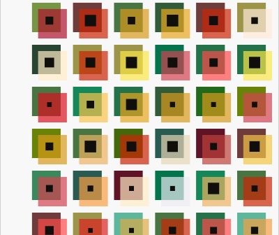
For Christmas 2021, I wrote an article about palettes of Christmas colors, chiefly shades of red, green, silver, and gold. One of my readers joked that she would like to use my custom palette to design her own Christmas wrapping paper! I remembered her jest when I saw some artwork

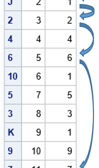
A probabilistic card trick is a trick that succeeds with high probability and does not require any skill from the person performing the trick. I have seen a certain trick mentioned several times on social media. I call it "ladders" or the "ladders game" because it reminds me of the
