The DO Loop
Statistical programming in SAS with an emphasis on SAS/IML programs
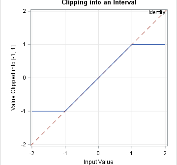
Years ago, I wrote an article about the "trap and cap" programming technique. The idea is that programmers should "trap" inputs to functions (like SQRT, LOG, and QUANTILE functions) to avoid domain errors. In addition, when visualizing a function's range, you should "cap" the output to improve graphs of functions

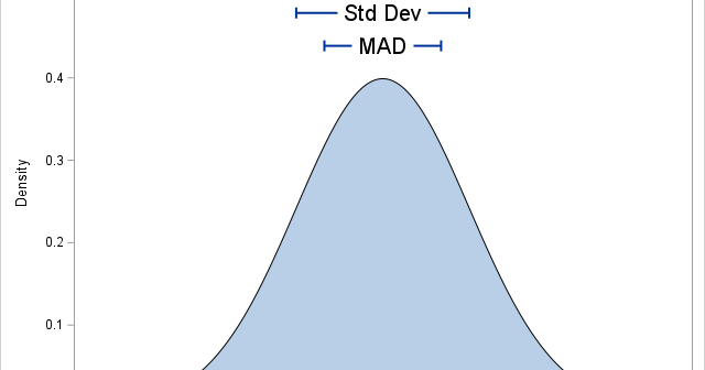
In statistics, the normal (Gaussian) distribution serves as a reference for many statistical quantities. For example, a normal distribution has excess kurtosis equal to zero, and other distributions are classified as leptokurtic (heavier-than-normal tails) or platykurtic (lighter-than-normal tails) in comparison. Similarly, the standard deviation of a normal distribution (σ) is

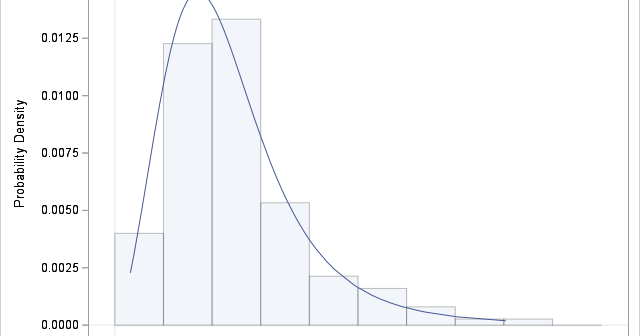
A previous article shows how to use PROC FCMP to define the PDF, CDF, and quantile functions for the three-parameter Burr XII distribution. I also defined the log-PDF function, which is used during maximum likelihood estimation (MLE) of parameters. This article shows how to fit the Burr distribution to data
