The DO Loop
Statistical programming in SAS with an emphasis on SAS/IML programs
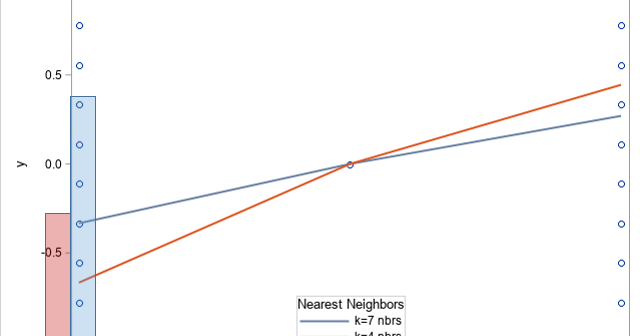
Did you know that the loess regression algorithm is not well-defined when you have repeated values among the explanatory variables, and you request a very small smoothing parameter? This is because loess regression at the point x0 is based on using the k nearest neighbors to x0. If x0 has

When SAS 9 programmers transition to SAS Viya, there are inevitably questions about how new concepts in Cloud Analytic Services (CAS) relate to similar concepts in SAS. This article discusses the question, "What is the difference between a libref and a caslib?" Both are used to access data, but they

I attended a seminar last week whose purpose was to inform SAS 9 programmers about SAS Viya. I could tell from the programmer's questions that some programmers were confused about three basic topics: What are the computing environments in Viya, and how should a programmer think about them? What procedures
