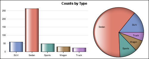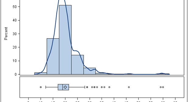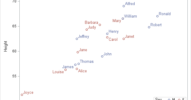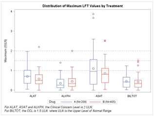
At SAS Global Forum, and again at PharmaSUG, we had the pleasure of attending many papers and presentations on various topics that included graphs in the power point decks or in the papers. More often than not, the graphs exist along other text, and occupy a smaller part of the screen
Tag: ODS Graphics
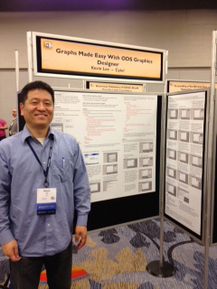
PharmaSUG 2012 conference drew to a close today, concluding two and a half days packed with papers, presentations, posters, hands-on demos and super demos by SAS staff. While the weather outside was a bit chilly from time to time, the conference what hopping with many user papers on how to
ODS Graphics system was initially motivated by the need for high quality graphs for SAS Base, STAT, and other analytical procedures. Use of SG Procedures, ODS Graphics Designer and GTL by users too has initially focused on analytical graphs. But just like wheels on carryon bags that started for the specific needs of flight
Creating a graph that looks nice, with readable, high resolution fonts is important and should be easy to do. With SG procedures and GTL, this is easy to do with a simple option, but not the default. Creating a high resolution (image) for a graph consumes higher system resources. When working on a graph,
Most users of the ODS Graphics system have probably had the need to adjust the dimensions of their graph output at times. The ODS GRAPHICS statement makes this easy to do. This statement supports the WIDTH= and HEIGHT= options. If you set just one of these, the system will calculate
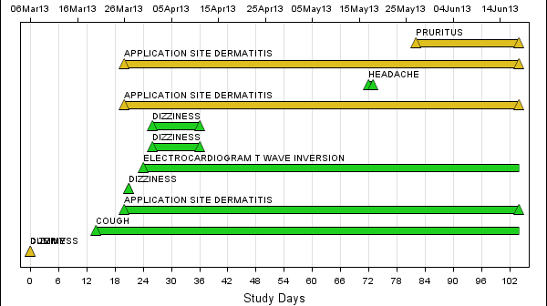
The Adverse Event Timeline graph posted earlier used the MARKERCHAR option of the SCATTER plot to draw the AE names. This option places a center-justified label at the marker position. There is no option in SAS 9.2 version to right-justify the label. Hence, we have to compute an offset in data
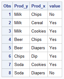
The parable of beer and diapers is often related when teaching data mining techniques. Whether fact or fiction, a Heat Map is useful to view the claimed associations. A co-worker recently enquired about possible ways to display associations or dependency between variables. One option is to show the dependency as a node
A new book from SAS Press, "Statistical Graphics Procedures by Example" co-authored by Dan Heath and I has now been published (phew!). For both Dan and I, this was our first foray into writing a book, so it was highly educational to say the least. The key idea behind the presentation
Calendar Heatmaps are an interesting alternative view of time-series data. The measured value is displayed as color mapped cells in a calendar. Calendar Heatmaps can be easily created with SAS 9.3 using just the HEATMAPPARM, SERIESPLOT and BLOCKPLOT statements in GTL and some simple data manipulation. The example below shows
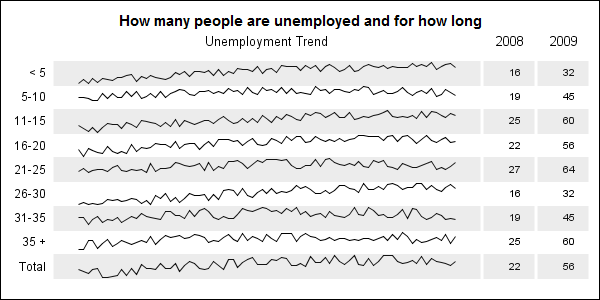
When viewing time series data, often we only want to see the trend in the data over time and we are not so concerned about the actual data values. With multiple time series plots, forecasting software can find clusters to help us view series with similar trends. Recently I saw a graph showing the trend of unemployment