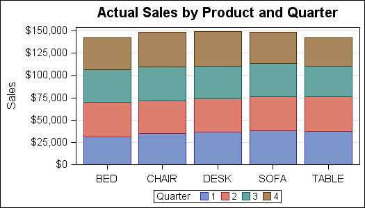
A couple of weeks back we had a question on how to make a bar chart with stacked and clustered groups. User also wanted to display the value for each stacked segment below the bars. The article Bar Charts with Stacked and Cluster Groups shows how to create such a
Tag: HighLow Plot
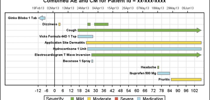
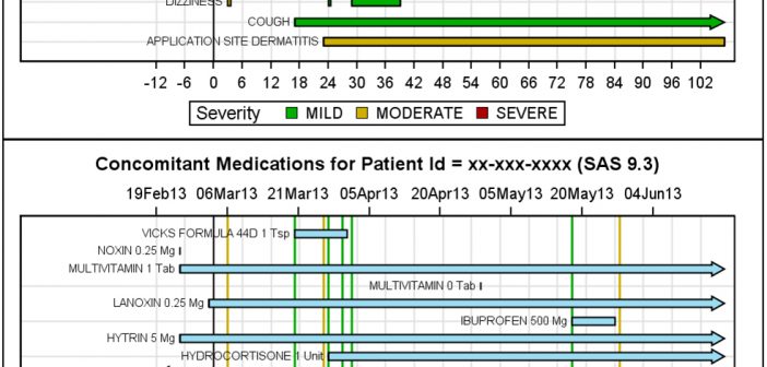
As promised, here is a better combined AE-CM graph, using some of the UI improvements suggested by our UI expert, Riley. His suggestions helped to reduce the clutter in the graph, while still keeping all the features preferred by our users. Click on the graphs for a higher resolution image.
At the SAS Global Forum 2013 in San Francisco, I presented a paper on making Patient Profile Graphs using SAS. You can follow the link to see the graphs presented in this paper. In that paper, I presented ways to create AE, CM, VS and Lab graphs. I discussed aligning the
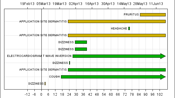
In my previous article on Adverse Event Timeline Graph, I wrote about how to create the AE timeline using SAS 9.2 code, using VECTOR plot and the MARKERCHAR option in SCATTER plot. I described a better way to place the labels at the lower end of the vectors. SAS 9.3 provides an easier way
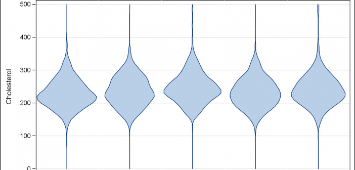
Over the past month or more, I have been in a conversation with SAS user James Marcus, on creation of some new displays for visual communication of uncertainty. These include display of densities using a "Violin" plot, "Density Strips" and more. With his permission, I can share some of the
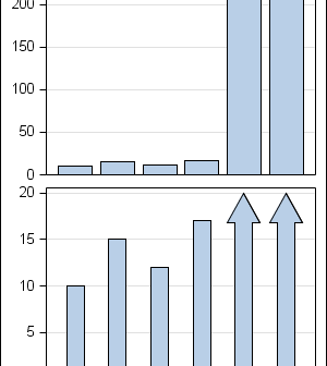
In the previous post on Broken Y-Axis, I reviewed different ways to display data as a Bar Chart, where the response values for some categories are many orders of magnitude larger than the other values. These tall bars force the display of other values to be squeezed down thus making it harder to compare
Often we want to display data as a bar chart where a few observations have large values compared to the rest. Comparison between the smaller values becomes hard as the small bars are squeezed by the tall bars. Here is an example data, and a bar chart showing the data. The large values
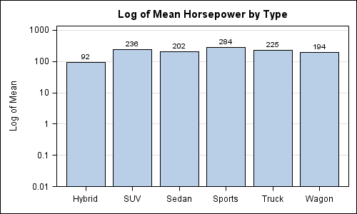
Creating bar charts with log response axis has come up a few times in the past few days. Before we look into how we could do this, it would be worth pointing out the considerable opinion in the blogosphere against use of log response axes for bar charts. See BizIntelGuru and
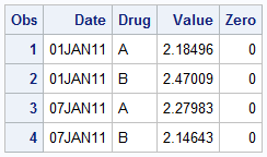
Recently, a user asked about creating a Bar Chart of Value by Date, where the dates are displayed on a scaled interval axis. Consider this simulated data set of value by date and treatment shown below. This data set only has one value for each date and treatment combination. We can use the VBAR statement
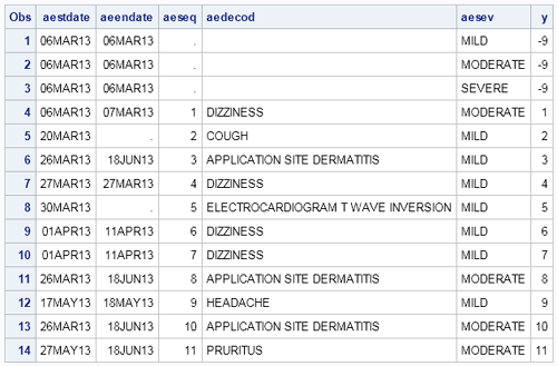
Here is the second installment of sample graphs from the SG Procedures book - The Adverse Event Timeline. This is a graph commonly used in patient profiles for clinical trials where we track the progress of a patient through a hospitalization event, tracking the dates and severity of the adverse events. The