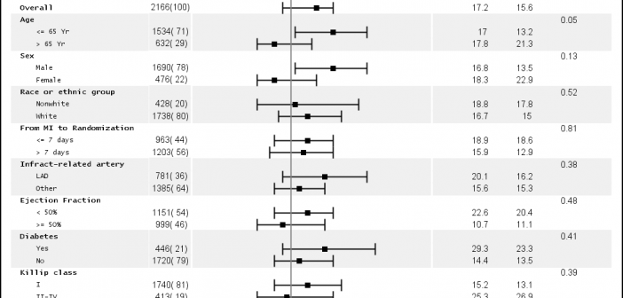
Just a few days ago our "super-duper tech support trooper" called in asking for the link to the subgrouped Forest Plot with bold headings. She was referring to this Forest Plot with Subgroups I had posted earlier. However, as you can see, while the subgroup values are indented from the subgroup headers, the headers
English
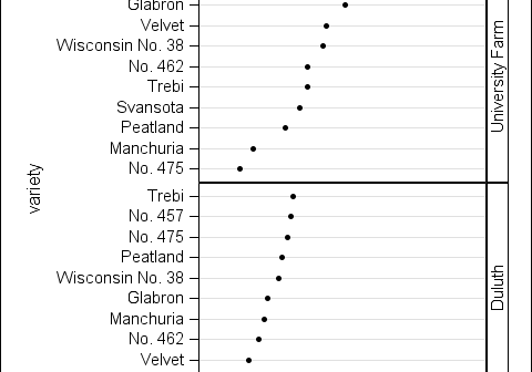
In this final post for 2012, I would like to finish up the panel sorting topic with a discussion on sorting the panel cells by statistic. With this sort, the response or dependent data in each cell is calculated down to a single statistic value (mean or median, for example). These values are
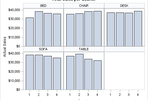
The SGPANEL procedure is used to create panelled graphics based on classification variables. The panelled cells are generated starting from either the top left (the default) or the bottom left of the panel, controllable by the START option. Currently, the ordering of the cells is determined by two criteria: 1.
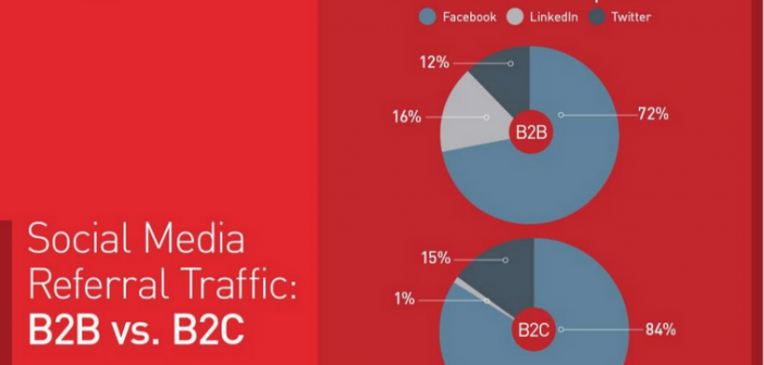
Naomi Robbins has posted a contest, part 1 of which is to submit alternative representations for the following graph: Clearly, usage of two pie charts to represent the share of the B2B and B2C referrals will invite many responses. To create the graph, I took the data shown in the Pie Charts themselves, so we are using percent
In addition to the Forest Plot with Subgroups, another popular graph in the clinical research space is the Most Frequent Adverse Events Sorted by Relative Risk graph. Recently, I worked with folks from some pharmaceutical companies to contribute SAS code for this graph to the CTSPEDIA resource for statistical graphics. The data for number
“So, you work for SAS?” asked my co-passenger. I was on the plane to Baltimore to attend my first NESUG conference and the tag on my laptop bag was the clue. I happened to be seated next to a SAS user who was familiar with ODS Graphics. I ended up
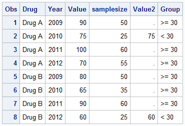
A recent question by a user lead led me to experiment with what is often referred to as conditional highlighting. The user wanted to display a bar chart of response by year, where each bar is colored by year, and show a cross hatch pattern on the bars where the
Last week I attended my first SCSUG conference, this one in Houston. Houston, the fourth most populous city in USA, is the world's capitol of the Oil and Gas industry. So it was no surprise I met many attendees from local oil and gas related companies. But, I also met many
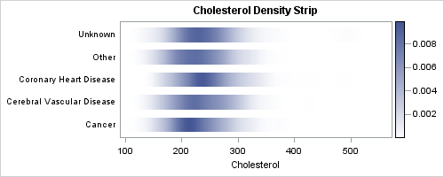
In the previous post on Violin Plots, we discussed the process to create custom density plots. This work was done in collaboration with SAS user James Marcus. This is the second installment on the same topic - Creating Density Strip Plots. We will use the same data and process to compute
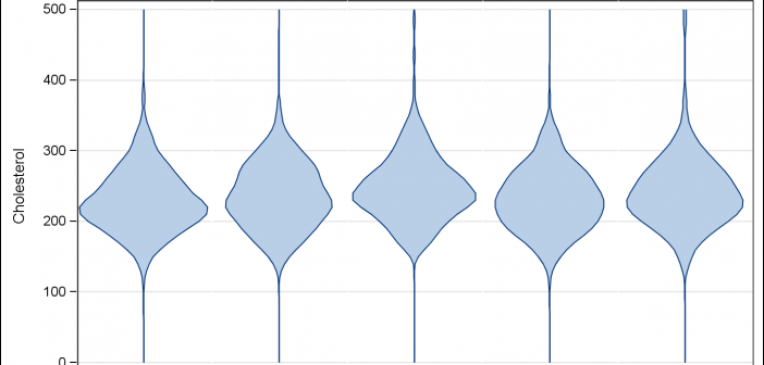
Over the past month or more, I have been in a conversation with SAS user James Marcus, on creation of some new displays for visual communication of uncertainty. These include display of densities using a "Violin" plot, "Density Strips" and more. With his permission, I can share some of the