Index of articles on "Getting Started with SGPLOT Procedure". Getting Started with SGPLOT - Part 1 - Scatter Plot. Getting Started with SGPLOT - Part 2 - VBAR. Getting Started with SGPLOT - Part 3 - VBOX. Getting Started with SGPLOT - Part 4 - Series Plot. Getting Started with
English
One of the key benefits of creating graphs using GTL or SG Procedures is their support of plot layering to create complex graphs and layouts. Most simple graphs can be created by a single plot statement like a Bar Chart. Complex graphs can be created by layering appropriate plot statements to
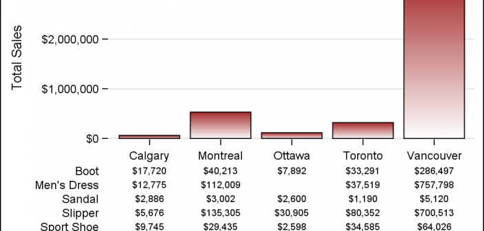
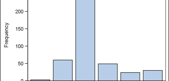
This is the 2nd installment of the "Getting Started" series, and the audience is the user who is new to the SG Procedures. It is quite possible that an experienced users may also find some useful nuggets here. One of the most popular and useful graph types is the Bar
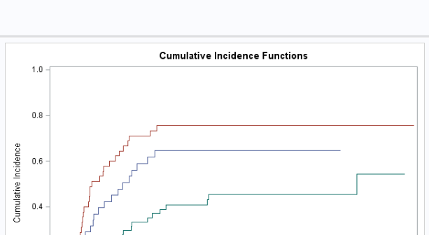
In my previous post, I showed you how to change the titles in graphs produced by analytical procedures; today I will show you how to remove subtitles that procedures display on some output pages. The following step creates output that contains a SAS title ('Illustrate the CIF Plot'), a PROCTITLE
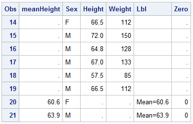
Last week a user asked about BY variable group processing for SGAnnotate with SGPLOT procedure. The user provided a simple use case for the question (always a good idea) using the sashelp.class data set. The graph included a display of reference lines for the mean value of height using annotation. The
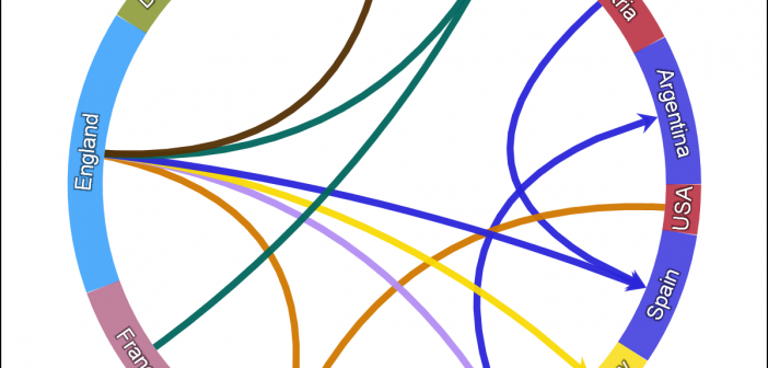
One request came in for the previous article on Circle link graph, for the addition of arrow heads to indicate the direction of the flow. Given that I am using a SERIES plot to render the links, it is relatively easy to add arrow heads to the links as the SERIES
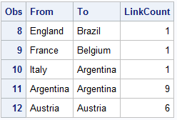
There has been some interest in "Circle Link Graph" diagrams where the nodes are laid out in a circle, with links going from one node in the circle to another. I recall seeing one diagram during the 2014 World Cup Soccer tournament, showing the number of players from one country that
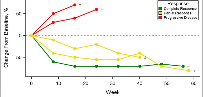
A Spider Plot is another way of presenting the Change from Baseline for tumors for each subject in a study by week. The plot can be classified by response and stage. Another way of displaying Tumor Response data was discussed earlier in the article on Swimmer Plot. This article is prompted
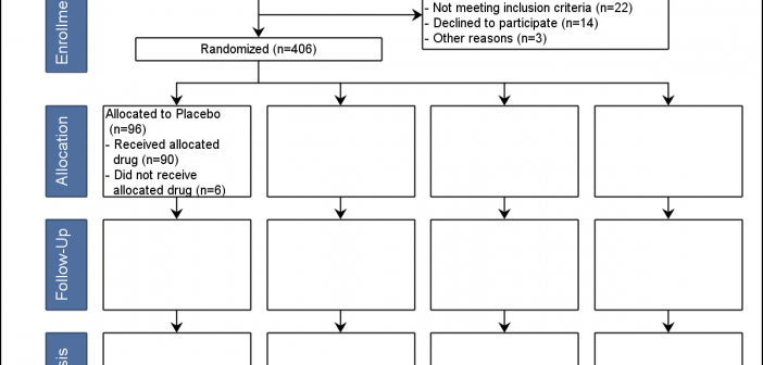
Over the past few weeks I have heard about the "Consort Diagram". This was mentioned in a Communities article, and also by a couple of users separately. This topic was also covered by Anusha Mallavarapu and Dean Shults from Cytel in a poster at PhUSE 2016 as shown on the
Have you ever wanted to modify a graph title that is produced by an analytical procedure? You can make a wide variety of changes by modifying the graph template. Modifying the graph template is straight forward. You specify ODS TRACE ON, run the procedure, find the template name, display the