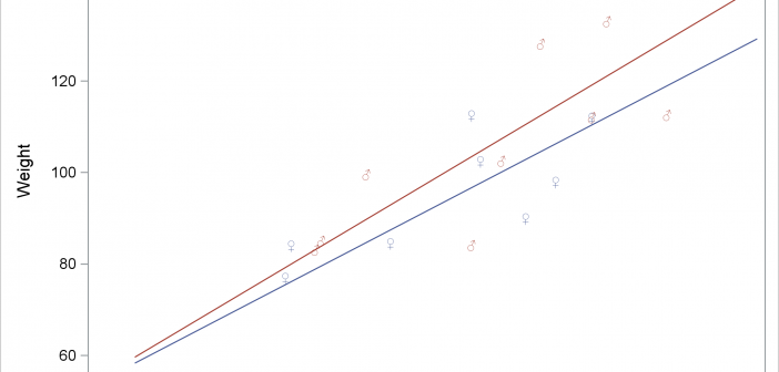
You can use Unicode to display special characters in SAS output including tables and graphs. With graphs that analytical procedures produce, you might need additional steps.

You can use Unicode to display special characters in SAS output including tables and graphs. With graphs that analytical procedures produce, you might need additional steps.
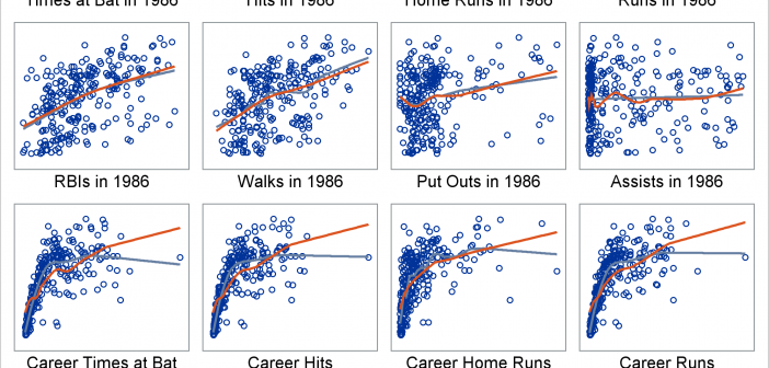
Marginal model plots display the marginal relationship between the response and each predictor. You can use a SAS autocall macro, %Marginal, to display marginal model plots.
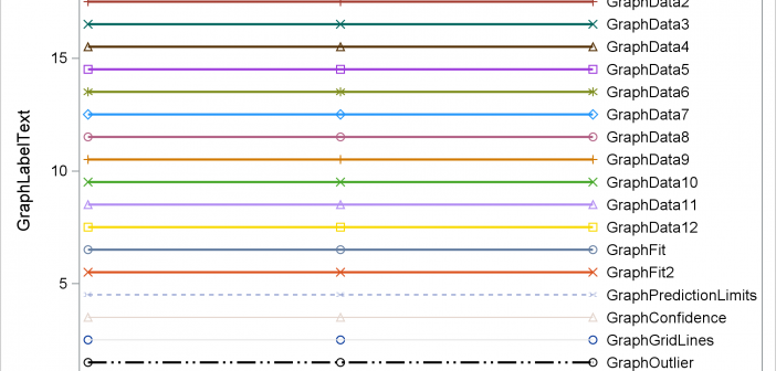
Have you ever wanted to see examples of all of the output styles that SAS provides? You can run a program and look at the resulting file, styles.html. This post explains more about the styles that you will see including a discussion of attribute priority.
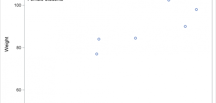
You can use PROC SGPLOT, BY variables, and a SG annotation data set together to put separate annotations into each BY group. However, you need two more steps to make it happen. This post shows all of the steps necessary to put different annotations into each graph when you have a BY variable.
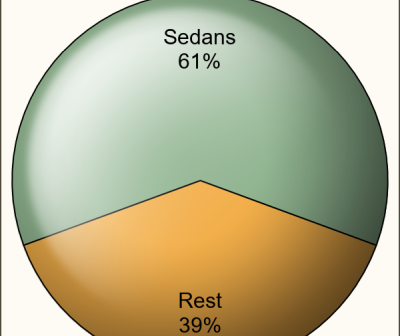
It seems only a few months back I posted an article on creating Pie Charts using a GTL based macro. Well, looking back, that was almost 6 years ago!! Recently, a colleague here at SAS needed to create Pie Charts in his report along with other plots created using SGPLOT
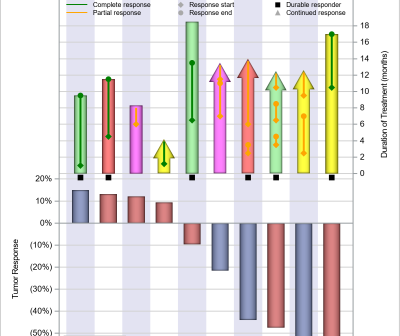
The PharmaSUG 2018 conference was held two weeks ago, with great enthusiasm and a record attendance. The highlight for me was the large spread on visual presentation of data, from papers to poster presentations. I will provide a more detailed report on all the exciting graphical presentations. One topic of
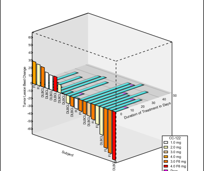
A while back a user requested to create a 3D WaterFall chart as presented by E Castanon Alvarez et. al. in "3D waterfall plots: a better graphical representation of tumor response in oncology" Annals of Oncology, Volume 28, Issue 3, 1 March 2017, Pages 454–456. I posted a blog article titled
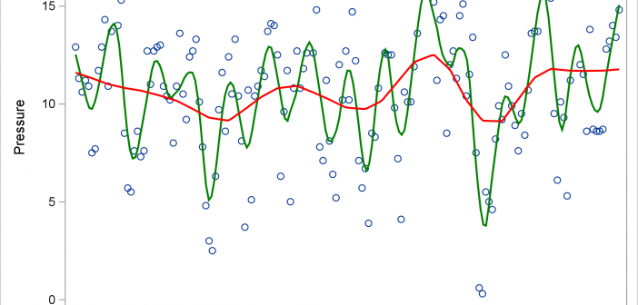
The LOESS statement in PROC SGPLOT finds a fit function while making no assumptions about the parametric form of the regression function.
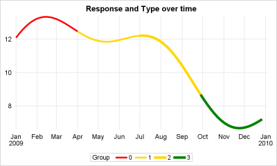
This article is motivated by a recent question on the SAS Communities board. This user wants to create a series or spline plot where the attributes of the line (color, thickness) can be changed based on another variable. In this case it may be a binary variable with "0" and
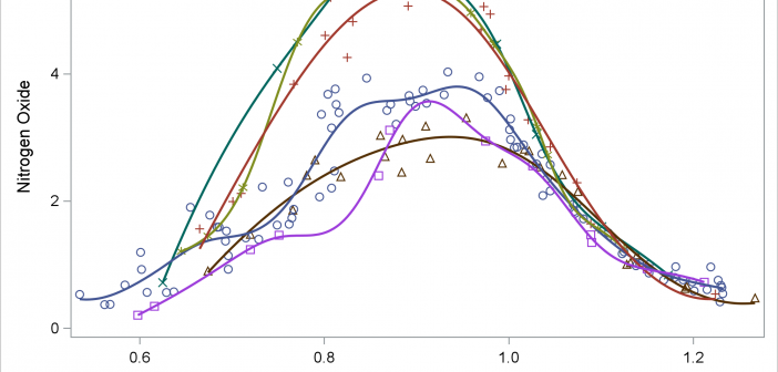
You can use penalized B-splines display a smooth curve through a set of data. The PBSPLINE statement fits spline models, displays the fit function(s), and optionally displays the data values.