Tips and Tricks

Data Visualization
Sanjay Matange 6
Bar-Line graph

A user recently posted a question in the SAS communities forum about  how to best display two measures by one classifier using a Bar-Line graph, where the scale of the two measures is vastly different.  This got me thinking about various different ways to represent such data.  Here are some of my thoughts,

Data Visualization
Sanjay Matange 0
Cluster groups

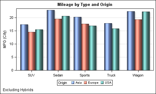
The topic of cluster groups comes up often.  By cluster group I am referring to the feature in bar charts where the group values are displayed side by side. With SAS 9.3, SG Procedures support stack or cluster grouping for Bar Charts and overlay or cluster grouping for all other

Data Visualization
Sanjay Matange 2
Let them eat pie

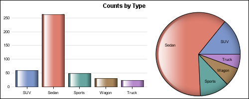
ODS Graphics system was initially motivated by the need for high quality graphs for SAS Base, STAT, and other analytical procedures.  Use of SG Procedures, ODS Graphics Designer and GTL by users too has initially focused on analytical graphs.  But just like wheels on carryon bags that started for the specific needs of flight

Data Visualization
Sanjay Matange 1
High resolution graphs

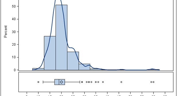
Creating a graph that looks nice, with readable, high resolution fonts is important and should be easy to do.  With SG procedures and GTL, this is easy to do with a simple option, but not the default. Creating a high resolution (image) for a graph consumes higher system resources.  When working on a graph,

Data Visualization
Dan Heath 9
Roses are red, violets are blue...

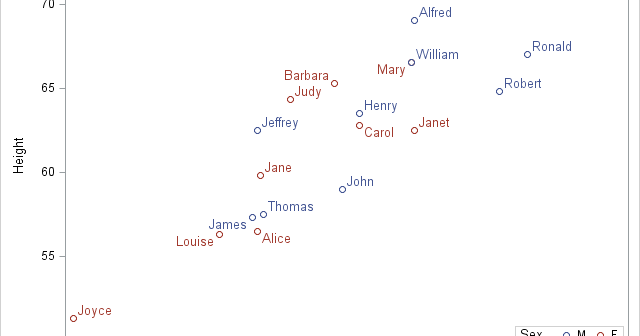
This classic start to a romantic poem assumes that the correct colors are always assigned to the correct flowers; but, for those who create graphs for reports, consistent color assignment can be more of a challenge than an assumption. This challenge is particularly true for the display of group values.

Data Visualization
Sanjay Matange 7
Dashboard graphs revisited

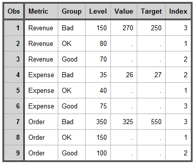
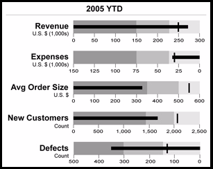
Here is the promised follow up on the Dashboard graph.  In the previous article, I posted the code to create a panel of bullet KPIs displaying three different metrics.  For each KPI, I used 5 columns of data which resulted in a wide and inconvenient structure. A more convenient data structure is

Data Visualization
Sanjay Matange 1
Dashboard graphs

In this blog we have been discussing graphs useful for analysis of data for many domains such as clinical research, forecasting and more.  SG Procedures and GTL are particularly suited for these use cases.  So, when I came upon a dashboard image from Steven Few's Visual Business Intelligence blog, showing the

1 30 31 32 33 34 35