Tips and Tricks

Data Visualization
Sanjay Matange 0
Fun with Bar Charts

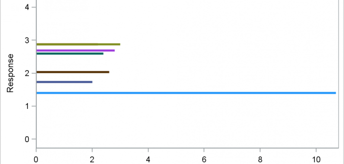
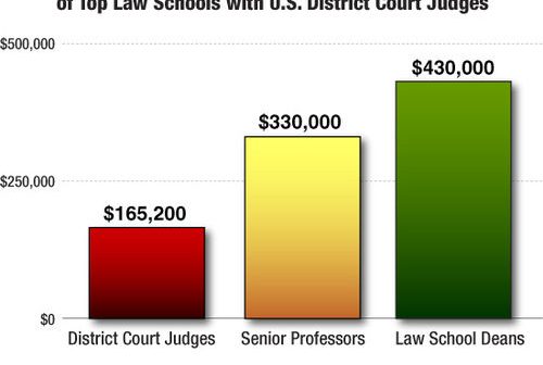
As Sheldon Cooper would say, this is the first episode of "Fun with Charts".  I did not find a cool term like "Vexillology" and "Cartography" is taken by map making, so let us go with "Chartology". Yesterday, I saw a couple of interesting bar charts as shown on the right.  I thought

Data Visualization
Sanjay Matange 5
Clinical Graphs

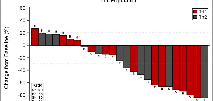
This week I had the opportunity to present a 1/2 day seminar on creating clinical graphs using the SG procedures during an In-House SAS Users' group meeting.  I have presented this seminar quite a few times now, and I always learn something. The audience was very receptive, with some people

Data Visualization
Sanjay Matange 1
Axis Thresholds

Have you ever wondered why sometimes a SGPLOT or GTL graph has markers drawn beyond the extreme tick and value on an axis and sometimes not?  And, if you prefer your graphs to always have tick values on the axis that cover the whole range of data, how can you

Data Visualization
Sanjay Matange 8
Bar with Statistics

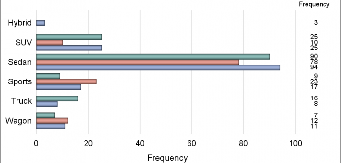
One of the key benefits of using a horizontal bar chart is the ability to display statistics for each bar.  This is a popular feature for the HBAR statement with the SAS/GRAPH GCHART procedure.  So, let us review the options available to us to create such graphs using SGPLOT. The

Data Visualization
Sanjay Matange 4
Likert Graphs

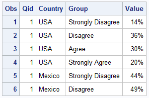
Just this morning I received a request for a brief survey from Apple on my feedback about the new iPhone6+.  Yes, I finally got one, dead last in the family.  The survey followed the usual format, with a number of questions on what I like or dislike about it, with

Data Visualization
Sanjay Matange 0
Report from MWSUG 2014

The Mid-West SAS Users' Group conference in Chicago was a great success, with over 400 attendees and great weather.  The conference hotel was in downtown with nice view of the river and a stroll down "Magnificent Mile".  The city does a great job with the flower beds down Michigan Ave., along

Data Visualization
Sanjay Matange 3
CandleStick Chart

A HighLow plot is very popular in the financial industry, often used to track the periodic movement of a stock or some instrument or commodity.  The CandleStick Chart is one specific type of high low plot, purportedly originating in Japan for tracking of financial instruments in the rice trade. Creating a

1 18 19 20 21 22 35