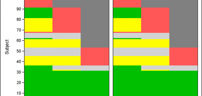
Let us continue our review of the Clinical Graphs included in the CTSPedia repository. Today, I noticed this Heatmap of Benefits and Risks over Time for Subjects in a study by Treatment, submitted by Max Cherny using "R" code. I thought it would be a good exercise to see how to build this
Clinical Graphs
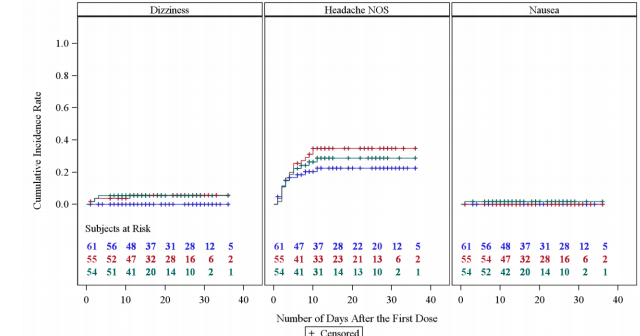
CTSPedia is a valuable resource for clinical research "... initiated to form an information resource created by researchers for researchers in clinical and translational science to share valuable knowledge amongst local researchers". This site includes a section on statistical graphs where you can find valuable information and a library of standardized
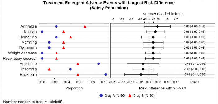
Early last year I wrote an article on how to create the "Most Frequent Adverse Events Sorted by Relative Risk" graph using the SGPLOT procedure. The key issue here is that such a graph normally displays two plots side by side, a scatter plot of the proportion values by treatment
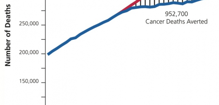
Significant progress in reduction of Cancer mortality is shown in a graph that I noticed recently on the Cancer Network web site. This graph showed the actual and projected cancer mortality by year for males. The graph is shown on the right. The graph plots the projected and actual numbers
This week I had the opportunity to present a 1/2 day seminar on creating clinical graphs using the SG procedures during an In-House SAS Users' group meeting. I have presented this seminar quite a few times now, and I always learn something. The audience was very receptive, with some people
The Third PharmaSUG-China conference was held in Beijing last week, and I had the pleasure to attend this excellent conference along with a record number of attendees. On Thursday, I presented two 1/2 day seminars on ODS Graphics. One titled "Advanced Topics in GTL" and another titled "Complex Clinical Graphs
Just getting back from PharmaSUG 2014 in San Diego. The conference was great, both inside and outside. The organizers ordered up some great weather for the Padres game and also for dinner on the flight deck of the Midway Carrier. Our focus here being on graphics, we were all extremely gratified by the presentations in
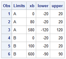
Recently a user new to GTL and SG procedures asked how to create a Bland-Altman graph on the SAS Communities site. He included an image of the resulting graph to indicate what he wanted, I described to him how that graph can be created, but since he is new to the art
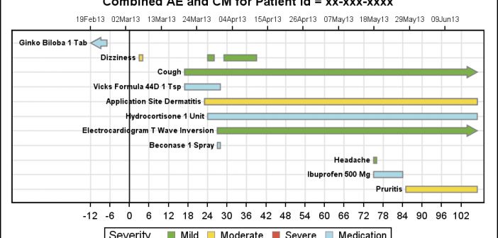
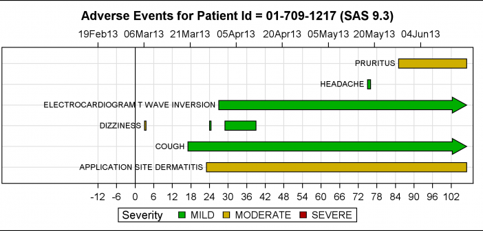
As promised, here is a better combined AE-CM graph, using some of the UI improvements suggested by our UI expert, Riley. His suggestions helped to reduce the clutter in the graph, while still keeping all the features preferred by our users. Click on the graphs for a higher resolution image.
The PharmaSUG 2013 conference in Chicago this week was awesome. From the perspective of graphics, there was great interest in using SG Procedures, Designer and GTL for building clinical graphs. It was nice to see many papers by users on how they are using these tools for creating graphs on a daily