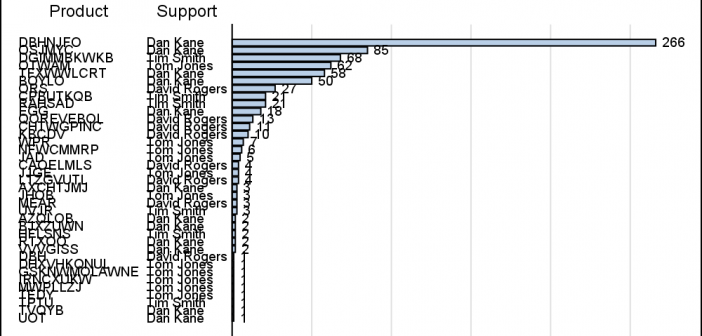
Recently, I needed to view the list of products with the highest number of defects. I have a data set of defects reported against various products. The data set has over 30 products, and each observation contains the product name, name of the primary support person, and other relevant details of
Author
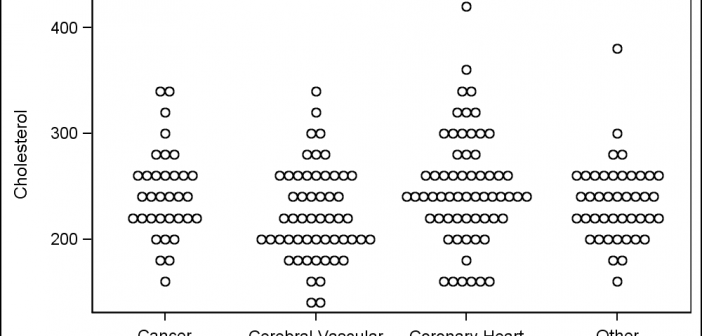
A Turnip Graph displays the distribution of an analysis variable. The graph displays markers with the same (or close) y coordinate by displaying the markers spread out over the x-axis range in a symmetric pattern. Recently, a question was posted on the SAS Communities page regarding such a graph. Here is an example of
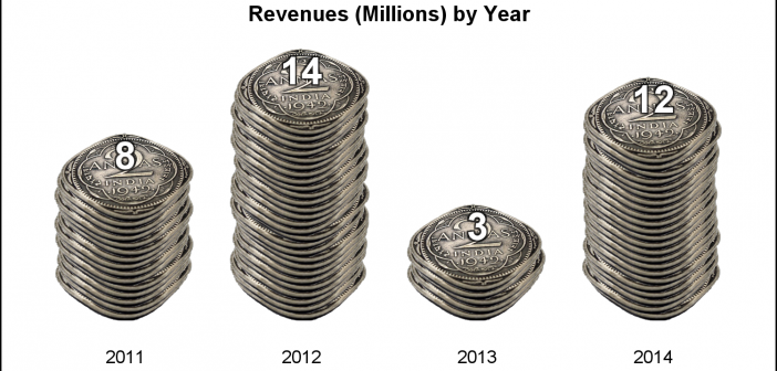
Often we see bar charts showing revenues or other related measures by a classifier using a visual of a stack of coins. Such visuals are not strictly for the purposes of accurate magnitude comparisons, but more for providing an interesting visual to attract the attention of the reader. In other words -
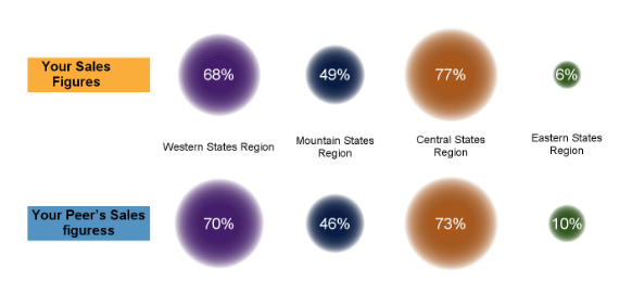
At the 2013 SAS Global Forum, I presented a paper titled "Make a Good Graph" which reviewed some of the features that make for a good graph. This paper presents an aggregation of ideas from various sources, including some recommendations from thought leaders in the graphics arena such as Edward Tufte,
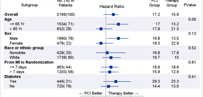
The advent of the AXISTABLE statement with SAS 9.4, has made it considerably easier to create graphs that include statistics aligned with x-axis values (Survival Plot) or with the y-axis (Forest Plot). This statement was specifically designed to address such needs, and includes the options needed to control the text attributes of
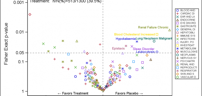
A Volcano Plot is a type of scatter-plot that is used to quickly identify changes in large data sets composed of replicate data. In the clinical domain, a Volcano Plot is used to view Risk difference (RD) of AE occurrence (%) between drug and control by preferred term. One example of
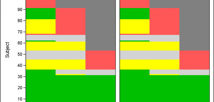
Let us continue our review of the Clinical Graphs included in the CTSPedia repository. Today, I noticed this Heatmap of Benefits and Risks over Time for Subjects in a study by Treatment, submitted by Max Cherny using "R" code. I thought it would be a good exercise to see how to build this
Last week I was at PharmaSUG 2016, where I presented a 1/2 day seminar on creating Clinical Graphs using SAS. I was gratified to have a enthusiastic audience of about 28 attendees and we had a great interactive session. I also presented a paper on Clinical Graphs Using SAS. More
CTSPedia is a valuable resource for clinical research "... initiated to form an information resource created by researchers for researchers in clinical and translational science to share valuable knowledge amongst local researchers". This site includes a section on statistical graphs where you can find valuable information and a library of standardized
A few weeks ago I posted an article describing how to display simple Network Diagrams with Curved Links using SGPLOT procedure. The key requirement is that the node positions have to be computed by user. Often, for simple diagrams, nodes can be positioned using a simple layered layout. Separately, I also