
This post shows you how to animate text to create a message that appears one character at a time.

This post shows you how to animate text to create a message that appears one character at a time.
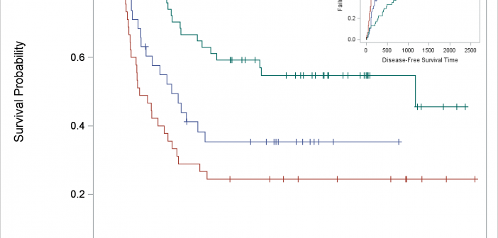
You can use SG Annotation (and its GTL equivalent) to display one graph inside another.
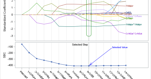
SG annotation is a powerful technique for adding text, lines, arrows, shapes, and images to graphs. This post provides a macro that can help you when you make a mistake in writing the annotations.
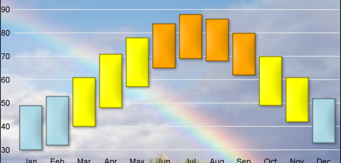
As many of the regular readers of this blog know, SGPLOT and GTL, provide extensive tools to build complex graphs by layering plot statements together. These plots work with axes, legends and attribute maps to create graphs that can scale easily to different data. There are, however, many instances where
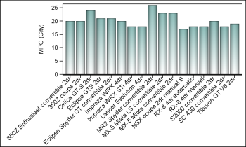
Fitting of long category values on a x-axis is usually a challenge. With SAS 9.4, the SGPLOT procedure tries to fit the values by first splitting the values at white space to see if the values will fit in the space available. This normally works well for a small number

In his recent blog article on Drawing Paths on a Map using SGPLOT, Robert Allison showed us visually the path computed by the captain of his return flight from Orlando. As usual, one can rely on Robert to put in visual form some interesting bit of information. Thanks, Robert. I
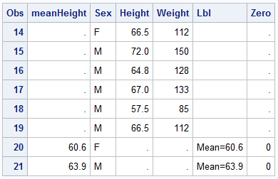
Last week a user asked about BY variable group processing for SGAnnotate with SGPLOT procedure. The user provided a simple use case for the question (always a good idea) using the sashelp.class data set. The graph included a display of reference lines for the mean value of height using annotation. The
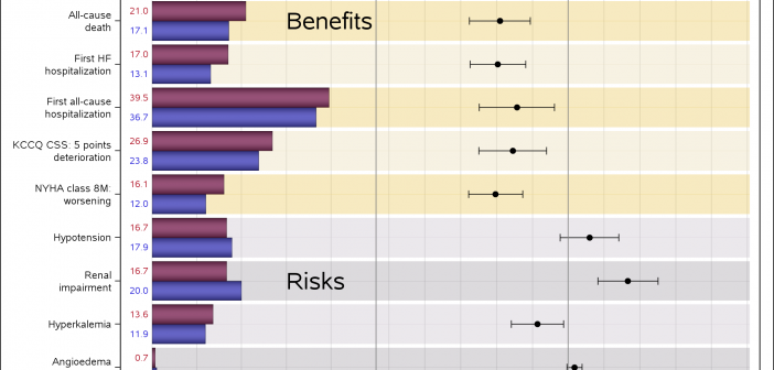
Often I have written articles that are motivated by some question by a user on how to create a particular graph, or how to work around some shortcoming in the feature set to create the graph you need. This time, I got a question about Clinical Graphs that were mostly working
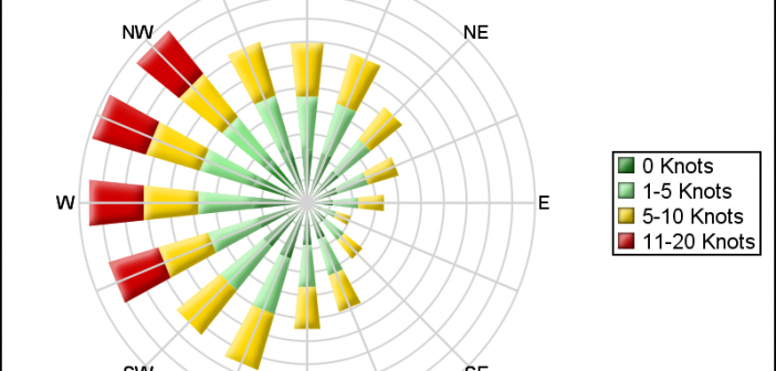
Last week I posted an article on displaying polar graph using SAS. When the measured data (R, Theta) are in the polar coordinates as radius and angle, then this data can be easily transformed into the XY space using the simple transform shown below. x=r*cos(theta * PI / 180); y=r*sin(theta * PI
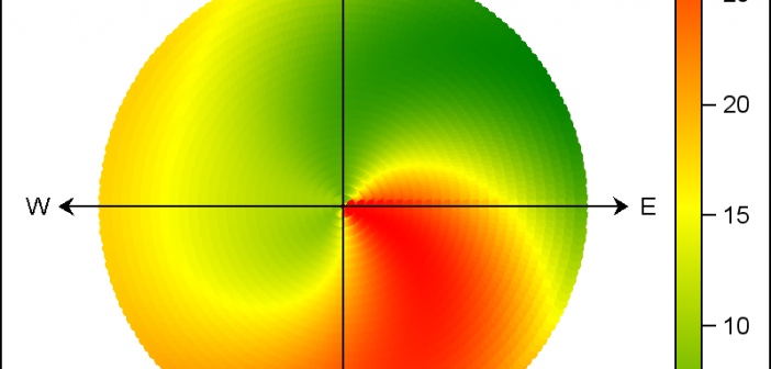
There are many situations where it is beneficial to display the data using a polar graph. Often your data may contain directional information. Or, the data may be cyclic in nature, with information over time by weeks, or years. The simple solution is to display the directional or time data