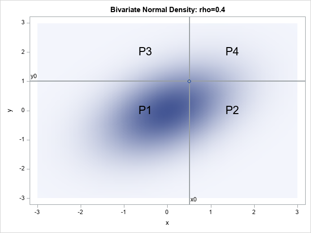
A profile plot is a way to display multivariate values for many subjects. The optimal linear profile plot was introduced by John Hartigan in his book Clustering Algorithms (1975). In Michael Friendly's book (SAS System for Statistical Graphics, 1991), Friendly shows how to construct an optimal linear profile by using
Author
A profile plot is a compact way to visualize many variables for a set of subjects. It enables you to investigate which subjects are similar to or different from other subjects. Visually, a profile plot can take many forms. This article shows several profile plots: a line plot of the
I recently blogged about how to compute the area of the convex hull of a set of planar points. This article discusses the expected value of the area of the convex hull for n random uniform points in the unit square. The article introduces an exact formula (due to Buchta,
The area of a convex hull enables you to estimate the area of a compact region from a set of discrete observations. For example, a biologist might have multiple sightings of a wolf pack and want to use the convex hull to estimate the area of the wolves' territory. A
Every year, I write a special article for Halloween in which I show a SAS programming TRICK that is a real TREAT! This year, the trick is to concatenate two strings into a single string in a way that guarantees you can always recover the original strings. I learned this
A SAS programmer asked how to create a graph that shows whether missing values in one variable are associated with certain values of another variable. For example, a patient who is supposed to monitor his blood glucose daily might have more missing measurements near holidays and in the summer months
I recently gave a presentation about the SAS/IML matrix language in which I emphasized that a matrix language enables you to write complex analyses by using only a few lines of code. In the presentation, I used least squares regression as an example. One participant asked how many additional lines
Recently, I needed to write a program that can provide a solution to a regression-type problem, even when the data are degenerate. Mathematically, the problem is an overdetermined linear system of equations X*b = y, where X is an n x p design matrix and y is an n x 1 vector. For most
On a SAS discussion forum, a statistical programmer asked about how to understand the statistics that are displayed when you use the TEST statement in PROC REG (or other SAS regression procedures) to test for linear relationships between regression coefficients. The documentation for the TEST statement in PROC REG explains
One of the benefits of social media is the opportunity to learn new things. Recently, I saw a post on Twitter that intrigued me. The tweet said that the expected volume of a random tetrahedron in the unit cube (in 3-D) is E[Volume] = 0.0138427757.... This number seems surprisingly small!
Have you ever typed your credit card into an online order form and been told that you entered the wrong number? Perhaps you wondered, "How do they know that the numbers I typed do not make a valid credit card number?" The answer is that credit card numbers and other
A previous article discusses the definitions of three kinds of moments for a continuous probability distribution: raw moments, central moments, and standardized moments. These are defined in terms of integrals over the support of the distribution. Moments are connected to the familiar shape features of a distribution: the mean, variance,
The moments of a continuous probability distribution are often used to describe the shape of the probability density function (PDF). The first four moments (if they exist) are well known because they correspond to familiar descriptive statistics: The first raw moment is the mean of a distribution. For a random
The correlations between p variables are usually displayed by using a symmetric p x p matrix of correlations. However, sometimes you might prefer to see the correlations listed in "long form" as a three-column table, as shown to the right. In this table, each row shows a pair of variables and the
The noncentral t distribution is a probability distribution that is used in power analysis and hypothesis testing. The distribution generalizes the Student t distribution by adding a noncentrality parameter, δ. When δ=0, the noncentral t distribution is the usual (central) t distribution, which is a symmetric distribution. When δ >
A common question on SAS discussion forums is how to use SAS to generate random ID values. The use case is to generate a set of random strings to assign to patients in a clinical study. If you assign each patient a unique ID and delete the patients' names, you
I recently showed how to represent positive integers in any base and gave examples of base 2 (binary), base 8 (octal), and base 16 (hexadecimal). One fun application is that you can use base 26 to associate a positive integer to every string of English characters. This article shows how
An integer can be represented in many ways. This article shows how to represent a positive integer in any base b. The most common base is b=10, but other popular bases are b=2 (binary numbers), b=8 (octal), and b=16 (hexadecimal). Each base represents integers in different ways. Think of a
Monotonic transformations occur frequently in math and statistics. Analysts use monotonic transformations to transform variable values, with Tukey's ladder of transformations and the Box-Cox transformations being familiar examples. Monotonic distributions figure prominently in probability theory because the cumulative distribution is a monotonic increasing function. For a continuous distribution that is
The SELECT-WHEN statement in the SAS DATA step is an alternative to using a long sequence of IF-THEN/ELSE statements. Although logically equivalent to IF-THEN/ELSE statements, the SELECT-WHEN statement can be easier to read. This article discusses the two distinct ways to specify the SELECT-WHEN statement. You can use the first
A SAS programmer was trying to understand how PROC SGPLOT orders categories and segments in a stacked bar chart. As with all problems, it is often useful to start with a simpler version of the problem. After you understand the simpler situation, you can apply that understanding to the more
A SAS programmer asked how to display long labels at irregular locations along the horizontal axis of scatter plot. The labels indicate various phases of a clinical study. This article discusses the problem and shows how to use the FITPOLICY=STAGGER option on the XAXIS or X2AXIS statement to avoid collisions
A SAS customer asked how to use the Box-Cox transformation to normalize a single variable. Recall that a normalizing transformation is a function that attempts to convert a set of data to be as nearly normal as possible. For positive-valued data, introductory statistics courses often mention the log transformation or
In the 1960s and '70s, before nonparametric regression methods became widely available, it was common to apply a nonlinear transformation to the dependent variable before fitting a linear regression model. This is still done today, with the most common transformation being a logarithmic transformation of the dependent variable, which fits
John Tukey was an influential statistician who proposed many statistical concepts. In the 1960s and 70s, he was fundamental in the discovery and exposition of robust statistical methods, and he was an ardent proponent of exploratory data analysis (EDA). In his 1977 book, Exploratory Data Analysis, he discussed a small
On Twitter, I saw a tweet from @DataSciFact that read, "The sum of (x_i - x)^2 over a set of data points x_i is minimized when x is the sample mean." I (@RickWicklin) immediately tweeted out a reply: "And the sum of |x_i - x| is minimized by the sample
A SAS programmer asked for help on a discussion forum: "My SAS session will not display any tables or graphs! I try to use PROC PRINT and other procedures, but no output is displayed! What can I do?" The most common reasons why you might not see any output when
When I was writing Simulating Data with SAS (Wicklin, 2013), I read a lot of introductory textbooks about Monte Carlo simulation. One of my favorites is Sheldon Ross's book Simulation. (I read the 4th Edition (2006); the 5th Edition was published in 2013.) I love that the book brings together
I've previously shown how to use Monte Carlo simulation to estimate probabilities and areas. I illustrated the Monte Carlo method by estimating π ≈ 3.14159... by generating points uniformly at random in a unit square and computing the proportion of those points that were inside the unit circle. The previous
It isn't easy to draw the graph of a function when you don't know what the graph looks like. To draw the graph by using a computer, you need to know the domain of the function for the graph: the minimum value (xMin) and the maximum value (xMax) for plotting