All Posts


“I really wish someone had shown me this function in SAS sooner, because it’s saved me a ton of time and effort,” said Brandi Rhoads as she opened her presentation at the Western Users of SAS Software (WUSS) conference in San Francisco.


I've been very fortunate to meet a lot of SAS users during my scant 3 year tour at SAS. I've met them while attending SAS Global Forum 2009, 2010, and 2011; NESUG 2009, 2010 and 2011; and SESUG 2010. Of course, like you, I want to go to all of the
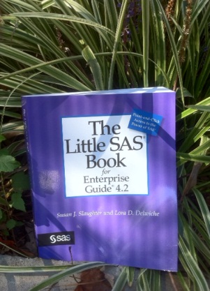

Super authors Susan Slaughter and Lora Delwiche and their bestselling Little SAS Book series have empowered the user community for years. This dynamic duo has uncannily anticipated what SAS users need to know. And they've produced thoughtful and accessible books with remarkable speed. One of their most recent books The Little SAS Book for Enterprise Guide 4.2 provides

In my Friday series about innovation, I've decided to include some personal stories of unusual and unique uses of SAS. Once a month or so, I'll swap out the Post-it Notes for a profile of someone who has used SAS in an innovative way to solve a problem or, like


Halloween is around the corner and children everywhere will wear masks throughout their neighborhoods for a night of trick-or-treating fun and, likely, too much candy. A masking has also occurred in education policy with the No Child Left Behind Act, sans the candy at the end of the night. That


Functionality to upload files onto the SAS server (from 9.2 on) is available using stored processes and an html input type="file". I introduced this topic last year in my blog post using the SAS Stored Process Developer Guide sample. Of course, it is never as easy as the sample is
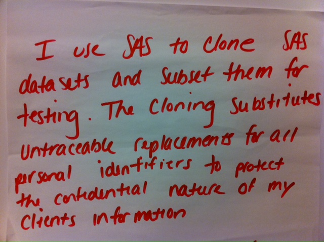
There are days that I could use code like this to make two of myself. No, that would never work; then I would be bored with so much time on my hands! In this new series, called Friday's Innovation Inspiration, we'll take a look at Post-It Notes from the 2011 Innovation Walls. SAS users filled


Picture this – a student grabs the Programming 1 textbook, scans it quickly seemingly searching for something specific, and shakes his head indicating an unsuccessful search. He plants himself smack dab in the front row, looks me squarely in the eye, raises one eyebrow quizzically and says, “Bad words?” I

The road to becoming a SAS Rock Star often starts at SAS Global Forum. Start making your mark by sharing how you use SAS at the 2012 SAS Global Forum, to be held in sunny Orlando, FL, from April 22 to 25. Submissions are being considered in the technology

SAS experts are gearing up to share knowledge, expertise and insights at SAS Global Forum 2012 In the last two months alone, we have launched SAS 9.3, created a think tank on healthcare analytics, hired a Chief Medical Officer, released a new version of Curriculum Pathways and offered flashcards for
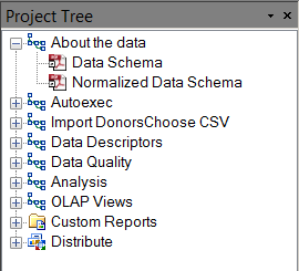

What is the best way to organize your SAS work in a SAS Enterprise Guide project? There are no project templates or enforced structure, really, but isn't there a best practice? I don't have a single prescription for the best project organization. I believe that it depends on the nature
Chris Hemedinger, author of the SAS Dummy blog, read last week's Innovation Inspiration post and was reminded of a couple of cool things he'd seen SAS users do. He also told me of one of his most recent rock star moments. (In all fairness to Hemedinger, he didn't call his

With an increasing volume of curriculum to cover and no time to spare, teachers often hit the ground running with the full throttle rigor and relevance critical to teaching and learning. However, I argue that the first two R’s are futile if teachers don’t have meaningful relationships with their students.
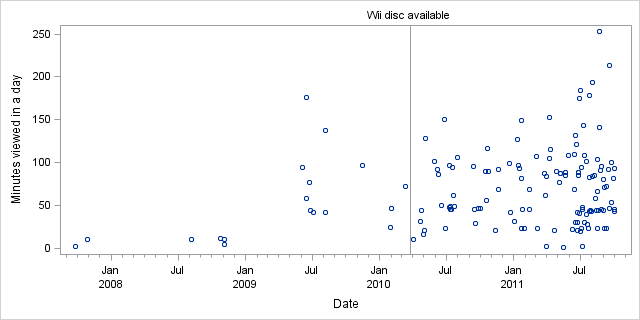
It turns out that I'm not receiving the maximum potential value from my Netflix streaming service. Perhaps it's because I place too much value on sleep. With my monthly subscription, I am permitted to view Netflix content 24 hours a day, 7 days a week. In my house I have
Most SUG presentations are written in PowerPoint – they may even be written in Word first, and then fancied up a bit in PowerPoint – but they are rarely written in SAS. But Louise Hadden, from Abt Associates Inc, had a need to produce a lot of PDF presentations. She