Search Results: xaxistable (13)

Data Visualization | Learn SAS | Programming Tips
Sanjay Matange 4
Survival plot with a twist using SGPLOT procedure

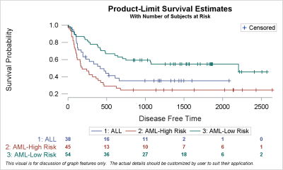
Survival plots are automatically created by the LIFETEST procedure.  These graphs are most often customized to fit the needs of SAS users.  One way to create the customized survival plot is to save the generated data from the LIFETEST procedure, and then use the SGPLOT procedure to create your custom

Data Visualization | Learn SAS | Programming Tips
Sanjay Matange 3
Legend items

Plot statements included in the graph definition can contribute to the legend(s).  This can happen automatically, or can be customized using the KEYLEGEND statement.  For plot statements that are classified by a group variable, all of the unique group values are displayed in the legend, along with their graphical representation

Data Visualization
Sanjay Matange 4
Stock chart

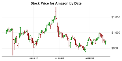
In the previous article on Getting Started with Vertical HighLow Plot, I described how we can use the HighLow plot to display the stock price by date.  The HighLow plot is specifically designed for such use cases as shown below. The data is downloaded from the Nasdaq web site, and

Data Visualization
Sanjay Matange 5
Scatter with mean value

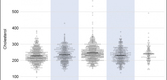
A frequently requested statistical graph is the scatter plot by with discrete categories along with mean value for each category.  Searching for a "Scatter with Mean" will return a lot of requests for such a graph in SAS, Stata, R and other statistical software. Such a graph is very easy

Data Visualization
Sanjay Matange 4
Spark and Summary Plots

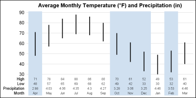
In the area of graphical visualization of data, Edward Tufte is a thought leader and has put forth many innovative ideas that enhance the understanding of the information in the graph with minimal distractions and potential for misinterpretation. One of his ideas has been the use of "Spark" plots.  As per my

Data Visualization
Sanjay Matange 6
Graph Table with Class

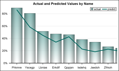
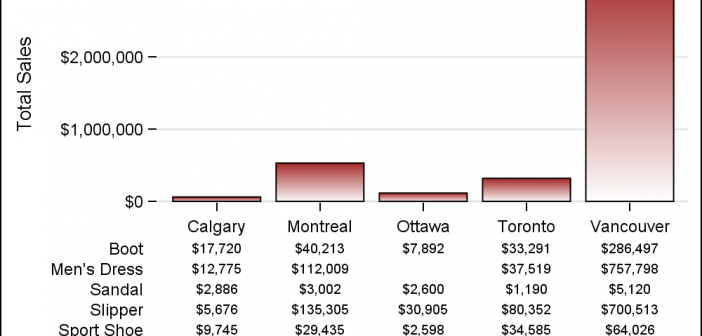
As often is the case, this article is prompted by a recent post on the SAS/GRAPH and ODS Graphics page communities page.  A user wanted to create a Graph Table showing a bar chart with tabular data for each of the category values along the x-axis.  The user was creatively using

1 2