Search Results: seriesplot (23)

Data Visualization
Sanjay Matange 8
Attribute Maps - 1

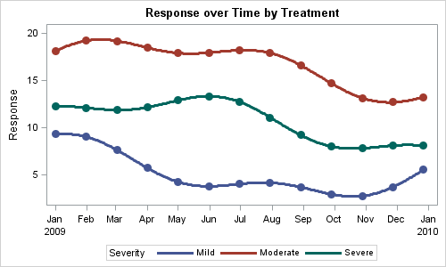
You created a graph of Response over Time by Severity where Severity has three levels, "Severe", "Moderate' and "Mild".  How do you ensure that "Severe" is always red in your graph, regardless of the data order? Normally, when creating any graph with a GROUP role, the distinct group values are assigned the style

Data Visualization
Sanjay Matange 4
Simpler is better

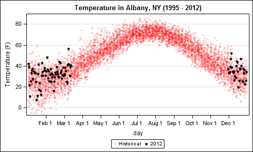
A recent article in the SAS and R blog was about current winter temperatures in Albany, NY.  The temperature data for the recent winter (Dec 2011 - Mar 2012) was plotted on a polar graph. Robert Allison posted an article on displaying the same data as a Polar Graph using SAS/GRAPH .  Here is his

Data Visualization
Sanjay Matange 6
Bar-Line graph

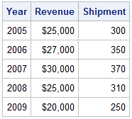
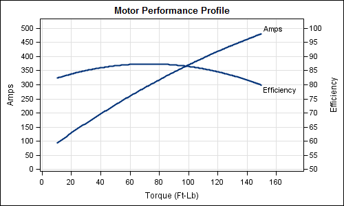
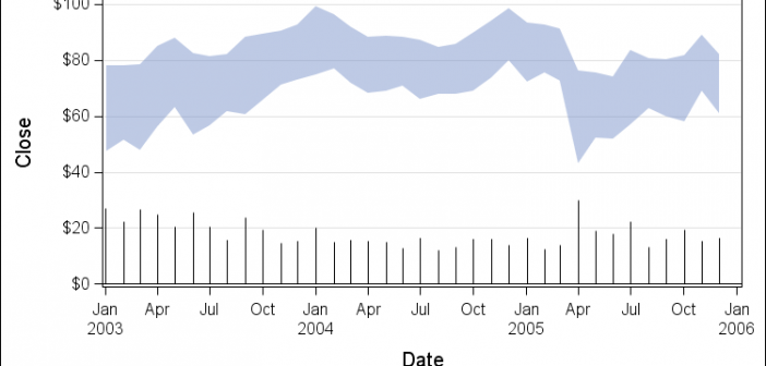
A user recently posted a question in the SAS communities forum about  how to best display two measures by one classifier using a Bar-Line graph, where the scale of the two measures is vastly different.  This got me thinking about various different ways to represent such data.  Here are some of my thoughts,

Data Visualization
Sanjay Matange 1
Timeseries plots with regimes

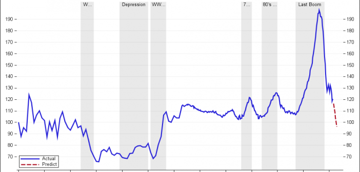
Recently we discussed the features of the Shiller Graph, showing long term housing values in the USA.  To understand the features necesary in the SGPLOT procedure to create such graph easily, it was useful to see how far we can go using GTL as released with SAS 9.2(M3). I got the data Shiller Housing index data

Data Visualization
Sanjay Matange 4
The more the merrier

Often it is useful to view multiple responses by a common independent variable all in the same plot.  SGPLOT procedure and GTL support the ability to view two responses, one each on the Y and Y2 axes by one independent variable (X) in one graph.  Yes, you can also have X

Data Visualization
Sanjay Matange 4
Map overlays

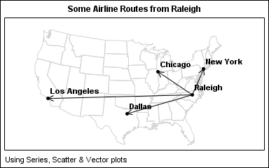
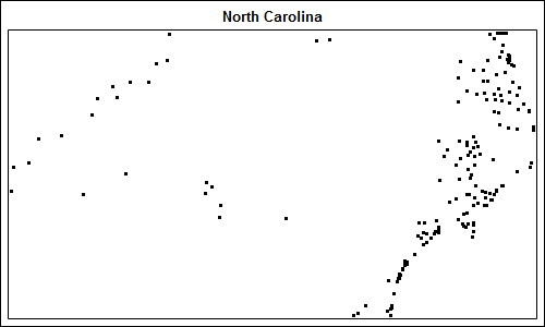
In Simple maps can go a long way, we discussed some techniques to create simple outline maps from map datasets in the MAPS library using GTL.  Now, let us take this a step further to do something more useful with this feature. For some graphs, the map information is an essential part of the

Data Visualization
Pratik Phadke 11
Calendar Heatmaps in GTL

Calendar Heatmaps are an interesting alternative view of time-series data. The measured value is displayed as color mapped cells in a calendar. Calendar Heatmaps can be easily created with SAS 9.3 using just the HEATMAPPARM, SERIESPLOT and BLOCKPLOT statements in GTL and some simple data manipulation. The example below shows