Search Results: polygon (47)

Data Visualization
Sanjay Matange 9
Funnel Graphs

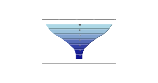
Funnel graphs are useful to track the number of visitors passing through various pages of a website or the number of patients in a study.  The graph shows visually the retention of users or subjects in a study across levels of a marketing cycle or the study. One common representation

Data Visualization
Sanjay Matange 4
Polar Graph - Wind Rose

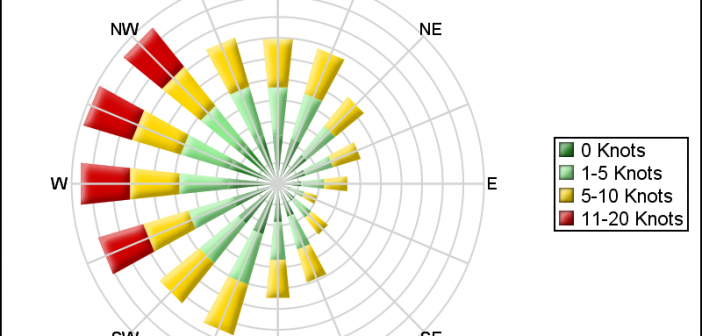
Last week I posted an article on displaying polar graph using SAS.  When the measured data (R, Theta) are in the polar coordinates as radius and angle, then this data can be easily transformed into the XY space using the simple transform shown below.     x=r*cos(theta * PI / 180);     y=r*sin(theta * PI

Data Visualization
Sanjay Matange 6
Is that Annotate?

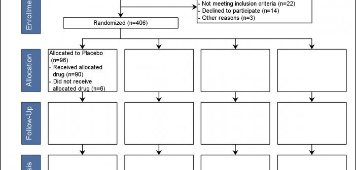
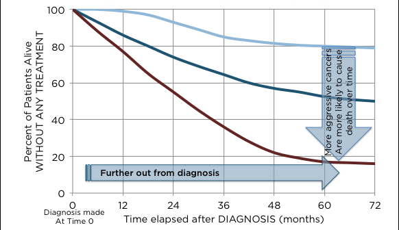
The SGPLOT procedures includes features to add annotations to your graph in many different ways.  Annotations provide you a flexible way to add features to your graph that are not available through the standard plot statements. Recently, I saw this graph on the web that caught my attention.  Clearly, this looks like

Data Visualization
Sanjay Matange 2
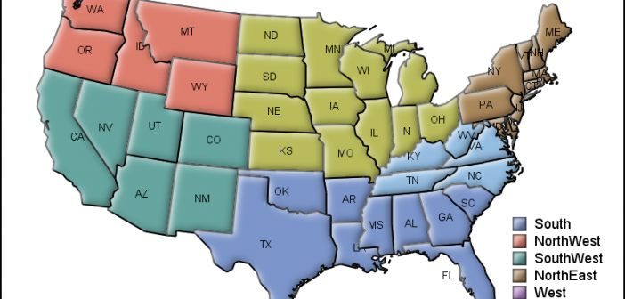
Micro Maps

MicroMaps are a powerful way to display data where the display includes small, lightweight maps to provide geographical information regarding the data.  This geographical information gives clues to the relationship between the data that could lead to more insight. The SAS SG Procedures and GTL do not currently have built-in