Search Results: highlow (67)

Data Visualization
Sanjay Matange 1
Clinical Graphs: A1c Plot

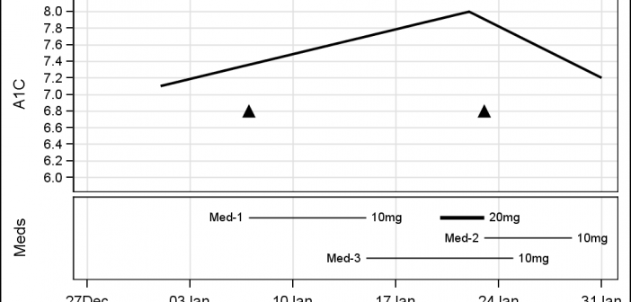
Last week I was visiting San Diego for the SANDS conference.  I always enjoy this conference as I get to interact closely with the users to hear of their pains and innovative solutions to creating Clinical Graphs. In the conference Ed Barber asked about displaying A1c data along with some

Data Visualization
Sanjay Matange 2
Stock Plots

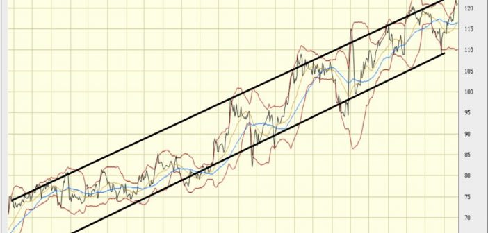
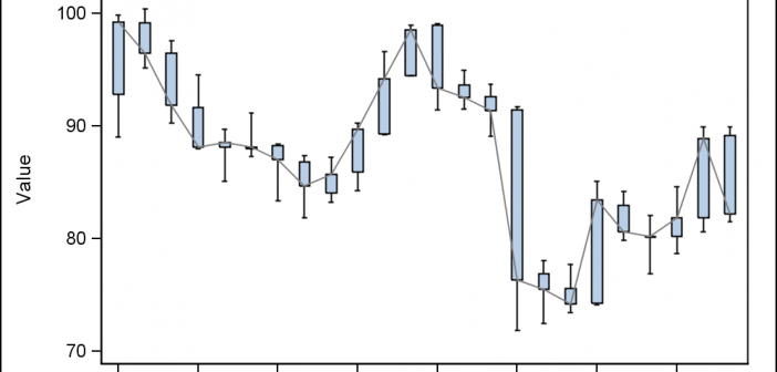
This weekend I was reviewing my portfolio of stocks as usual.  Yes, I do have a small stock portfolio with a few stocks, and normally I use free stock charting software to review the stock plots.  These sites allow you to view the daily stock prices along with many technical

Data Visualization
Sanjay Matange 4
Polar Graph - Wind Rose

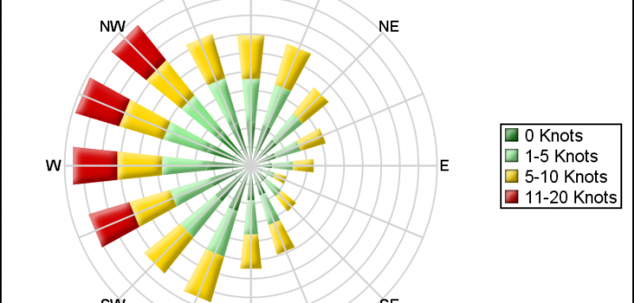
Last week I posted an article on displaying polar graph using SAS.  When the measured data (R, Theta) are in the polar coordinates as radius and angle, then this data can be easily transformed into the XY space using the simple transform shown below.     x=r*cos(theta * PI / 180);     y=r*sin(theta * PI

Data Visualization
Sanjay Matange 6
Scalable Turnip Graph

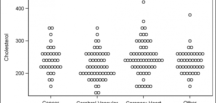
A Turnip Graph displays the distribution of an analysis variable.  The graph displays markers with the same (or close) y coordinate by displaying the markers spread out over the x-axis range in a symmetric pattern.  Recently, a question was posted on the SAS Communities page regarding such a graph. Here is an example of

Data Visualization
Sanjay Matange 2
Coffee Recipes

For a long time, Starbucks represented to me as the good coffee cup, with me paying upwards of $4 for a Latte.  But on a recent visit to San Francisco, my son introduced me to a few other options. Philz crafts a great cup of java, with the barista making

Data Visualization
Sanjay Matange 5
Legendary

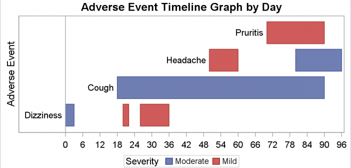
Entries in a legend are populated automatically based on the data.  When creating a graph with group classification,  the display attributes for each bar are derived from the GraphData1-12 style elements from the active style. The graph on the right shows you the result of creating an adverse event timeline

Data Visualization
Sanjay Matange 4
Report from PharmaSUG 2015

PharmaSUG 2015 in Orlando was held at the Renaissance had a record breaking attendance of over 650.  Weather was great, except for a huge downpour on the evening of the last day.  All the popular presenters were in attendance including Art Carpenter, Kirk Lafler, Arthur Li and many others. Presentations

1 2 3 4 5 7